ARCH 305
FALL 2020
PROF. LIVIA LOURIERO
ARCHITECTURAL DESIGN III
FALL 2020
PROF. LIVIA LOURIERO
ARCHITECTURAL DESIGN III
SITE LOCATION: Bryan, Texas
SITE ASPECTS: Sul Ross Park | Tejas Center
PROGRAM: Library | Pavilion
TYPE: Group Project | Graesen Johnson | Commerce Hollifield
SEMESTER: Fall 2020 | 5th
FROM THE PROFESSOR:
“The site analysis starts with the understanding of the intervention area through inventory and mapping processes that will help understand how the urban fabric was and is established and the crucial relationships triggered by the people that inhabit and uses the space. The precedent analysis starts with a sequence of analytical investigations, such as formal, organizational, and dimensional principals. Through the floor plans, sections, elevations, site plans, and significant material details, you should identify the design strategies that encapsulate the essential ideas of the studied precedents. Project should produce ideas on where city and urban concepts came from, what is the meaning of these concepts in the distinctive realities of Bryan and College Station, and what are new layered realities and definitions that need to be mapped in face of the contemporary transformations of the territory (urban, political, cultural, COVID-19)?
Each group will produce a community center on a researched site in either College Station or Bryan with a main program that fufills a missing need of the area. Throughout the semester they will work through city mapping + site identification + site analysis, precedents + site planning + parti, and urban intervention + architectural intervention. This is a semseter long project.”
Each group will produce a community center on a researched site in either College Station or Bryan with a main program that fufills a missing need of the area. Throughout the semester they will work through city mapping + site identification + site analysis, precedents + site planning + parti, and urban intervention + architectural intervention. This is a semseter long project.”
All Site Drawings By Graesen Johnson
All Library Drawings By Commerce Hollifield
All Pavilion Drawings By Rebekah Bryan

SITE ANALYSIS | USE MAP
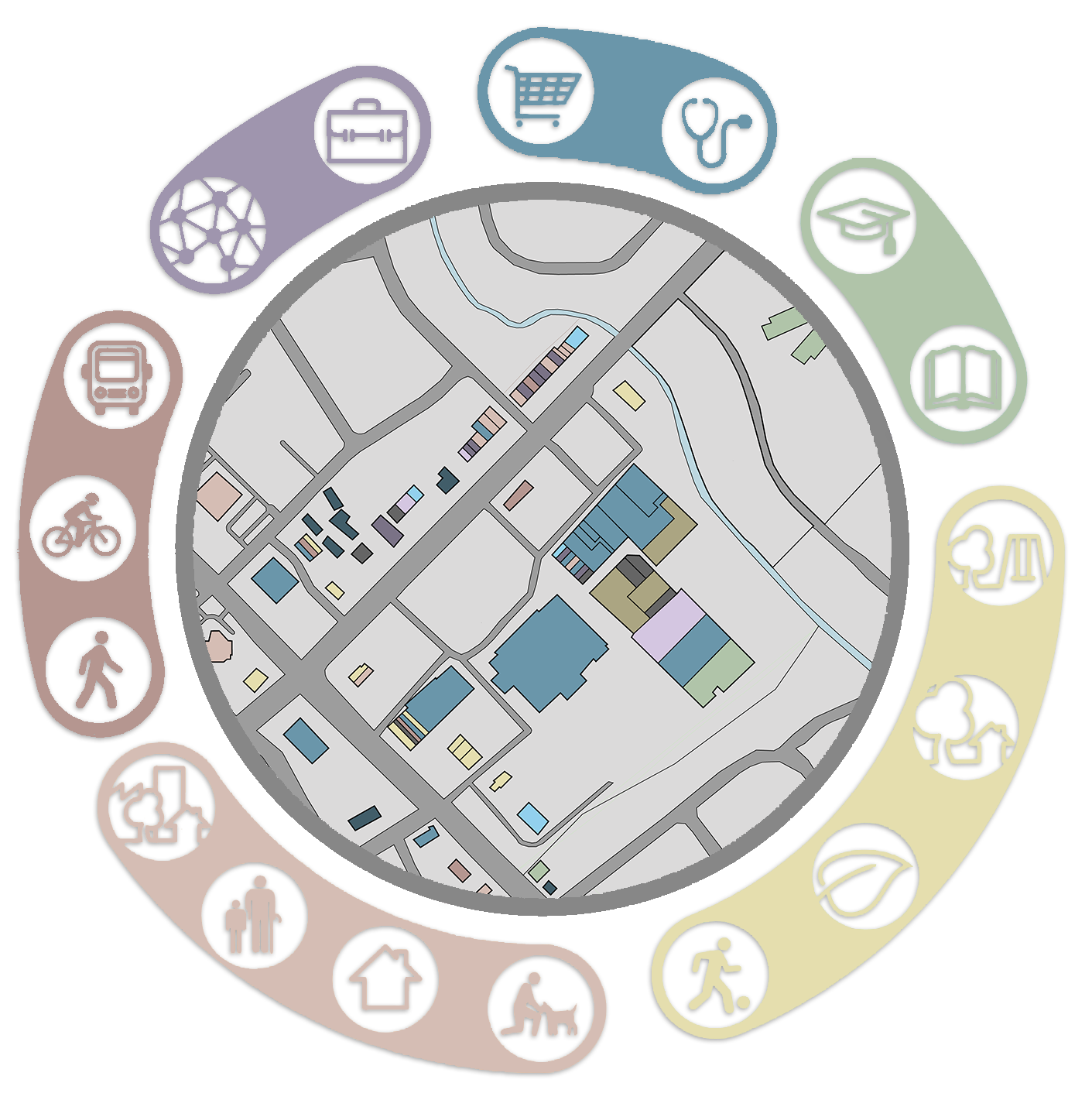
SITE ANALYSIS | 20 MINUTE CIRCLE

SITE ANALYSIS | FIGURE GROUND
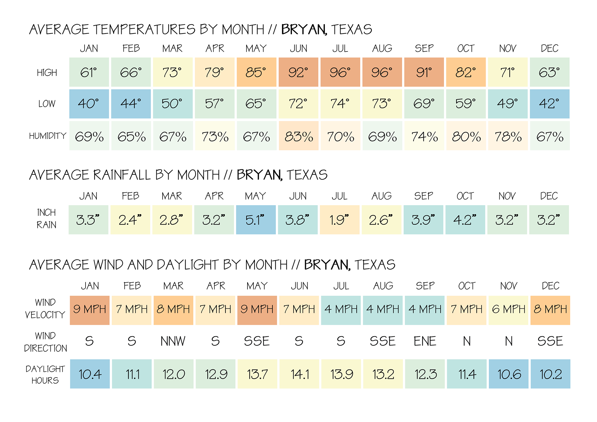
SITE ANALYSIS | WEATHER
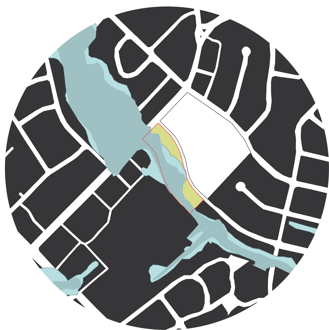
SITE ANALYSIS | FLOOD PLANE

SITE ANALYSIS | USE AND CIRCULATION
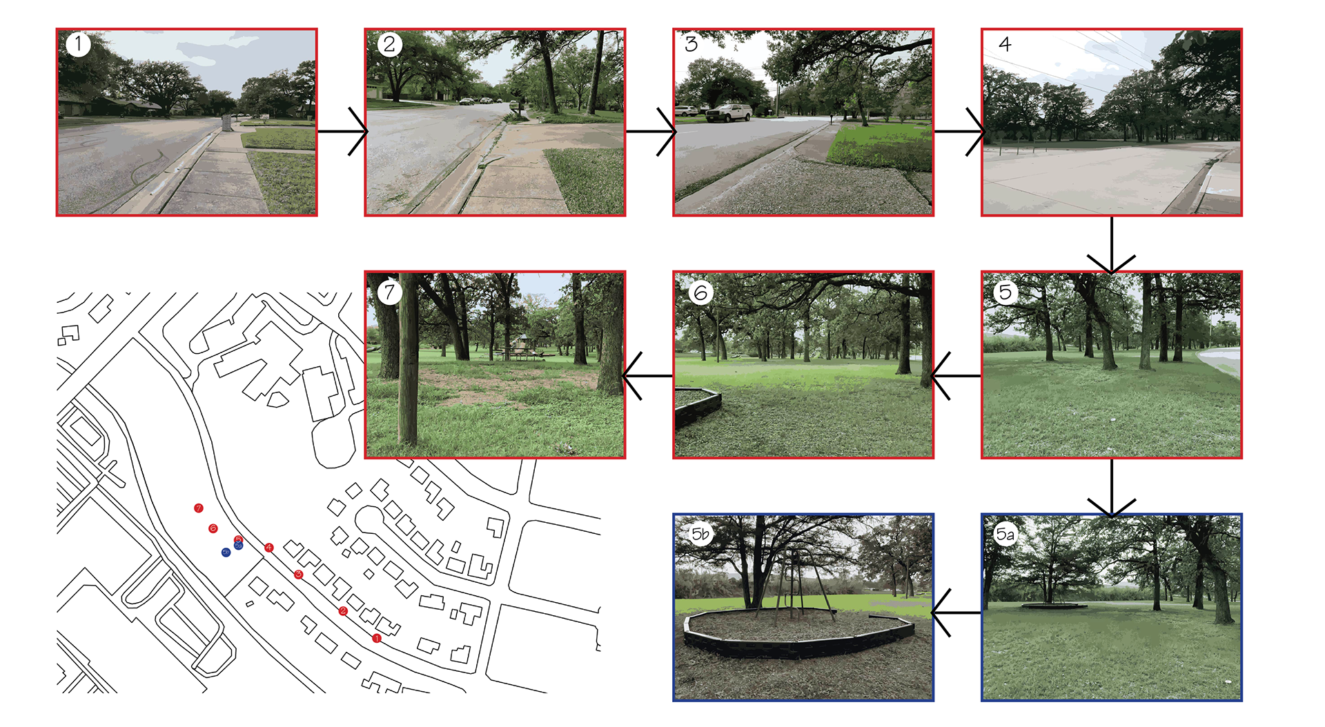
SITE ANALYSIS | SERIAL VISION
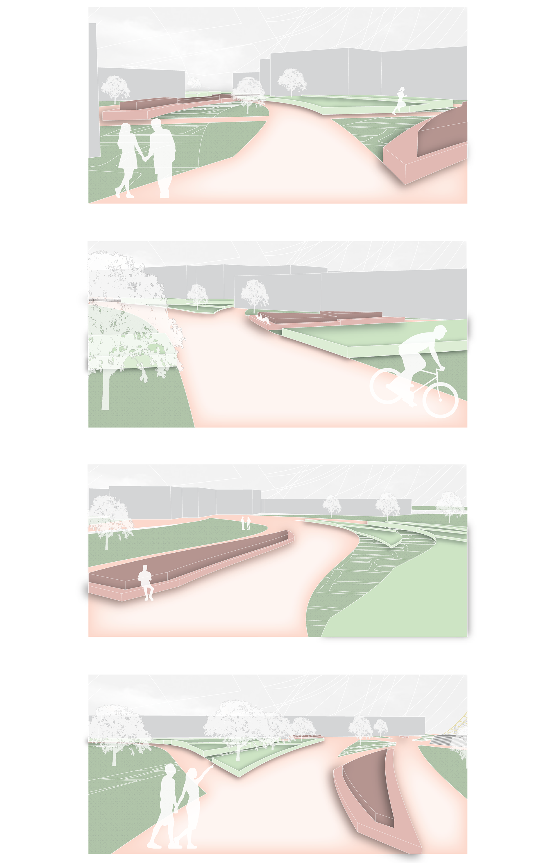
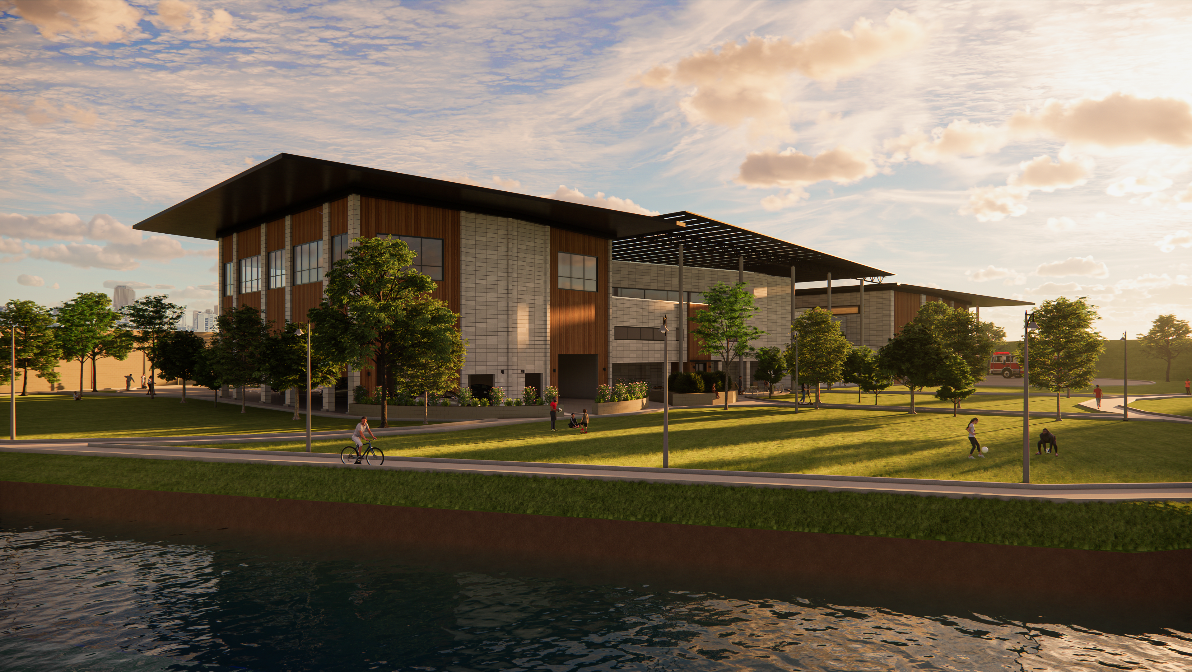
SITE RENDERS | BY GRAESEN
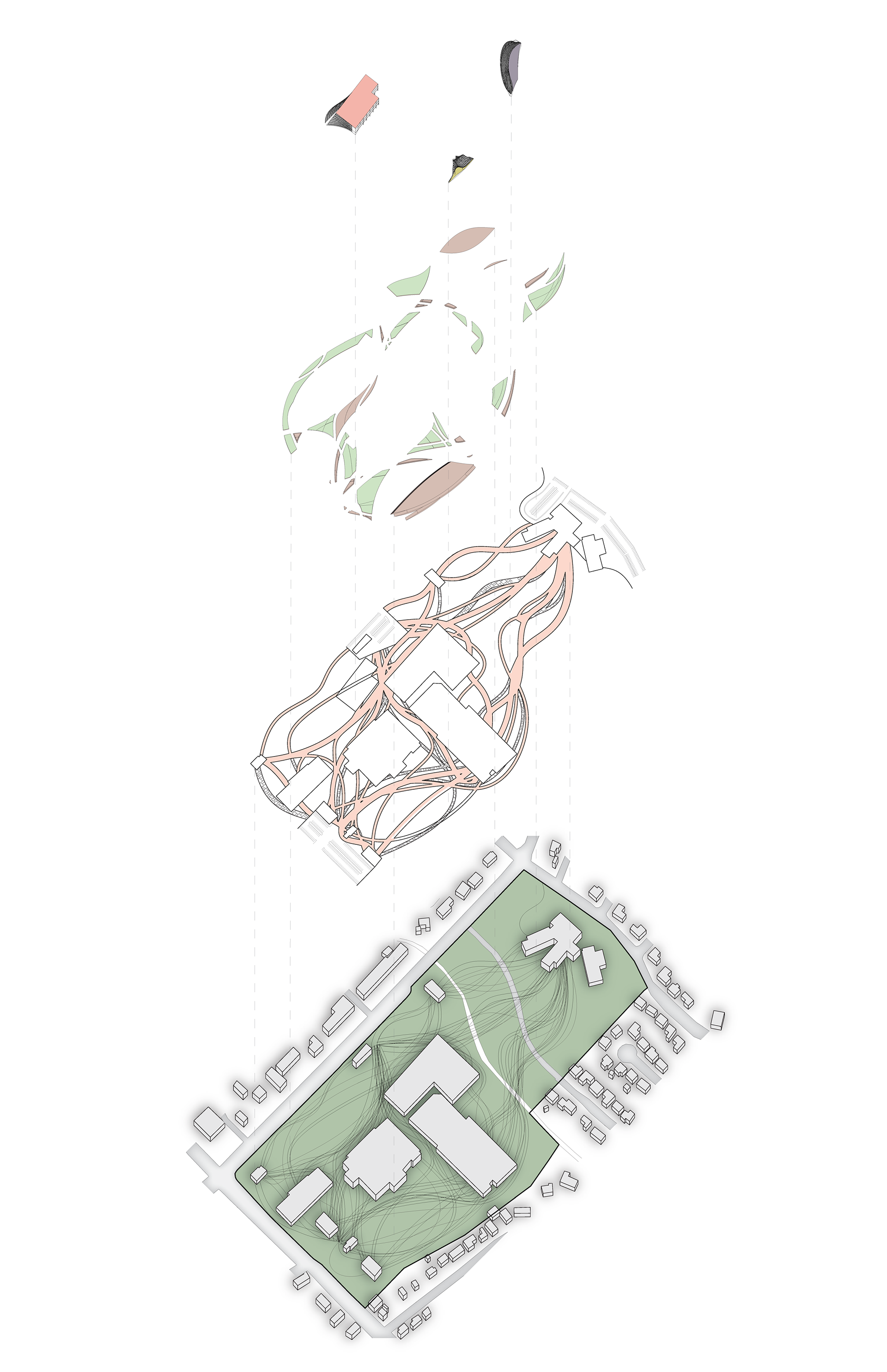
SITE EXPLODED AXONOMETRIC | BY GRAESEN
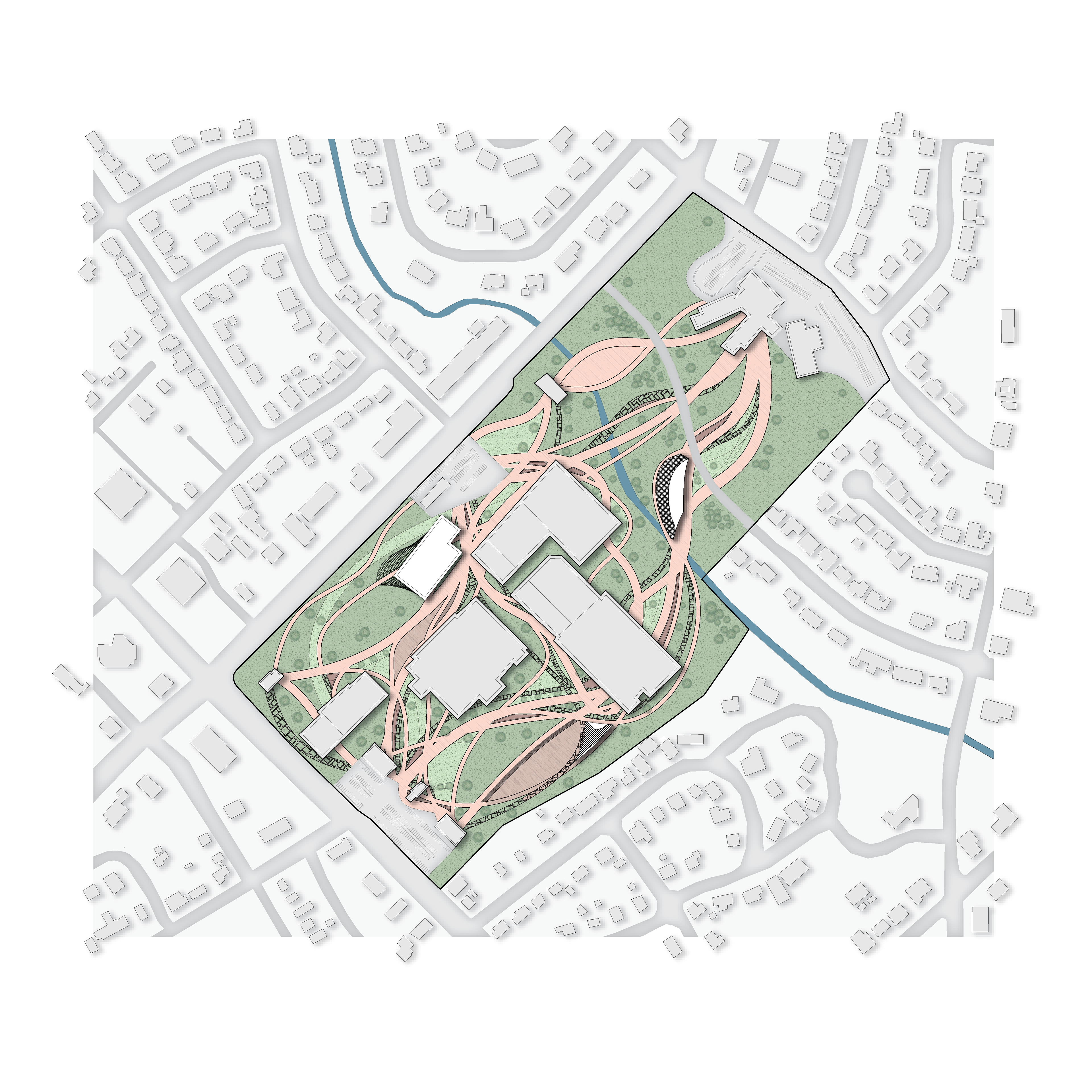
SITE | BY GRAESEN
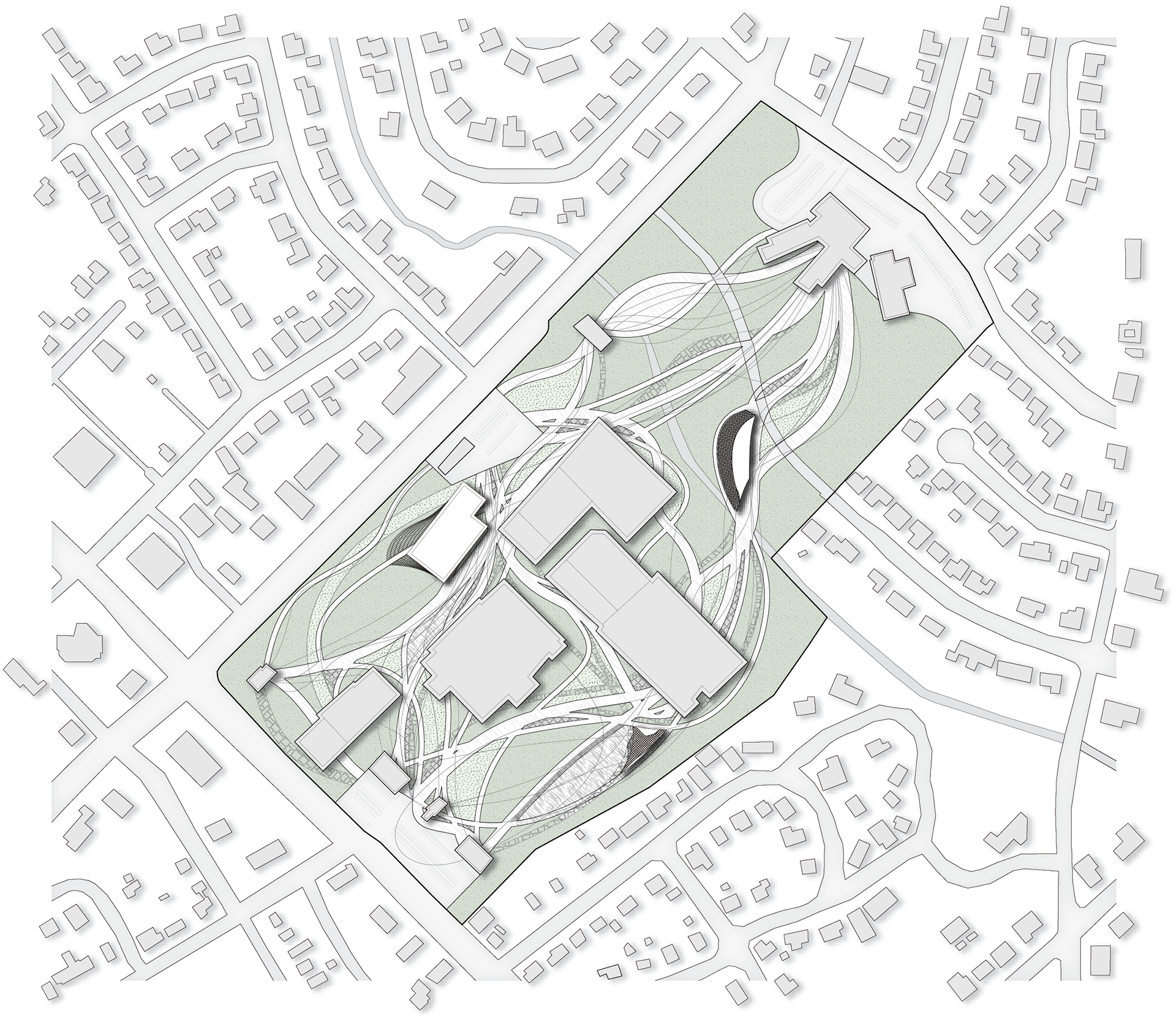
SITE GRAYSCALE | BY GRAESEN

SITE SECTION | BY GRAESEN

SITE SECTION | BY GRAESEN
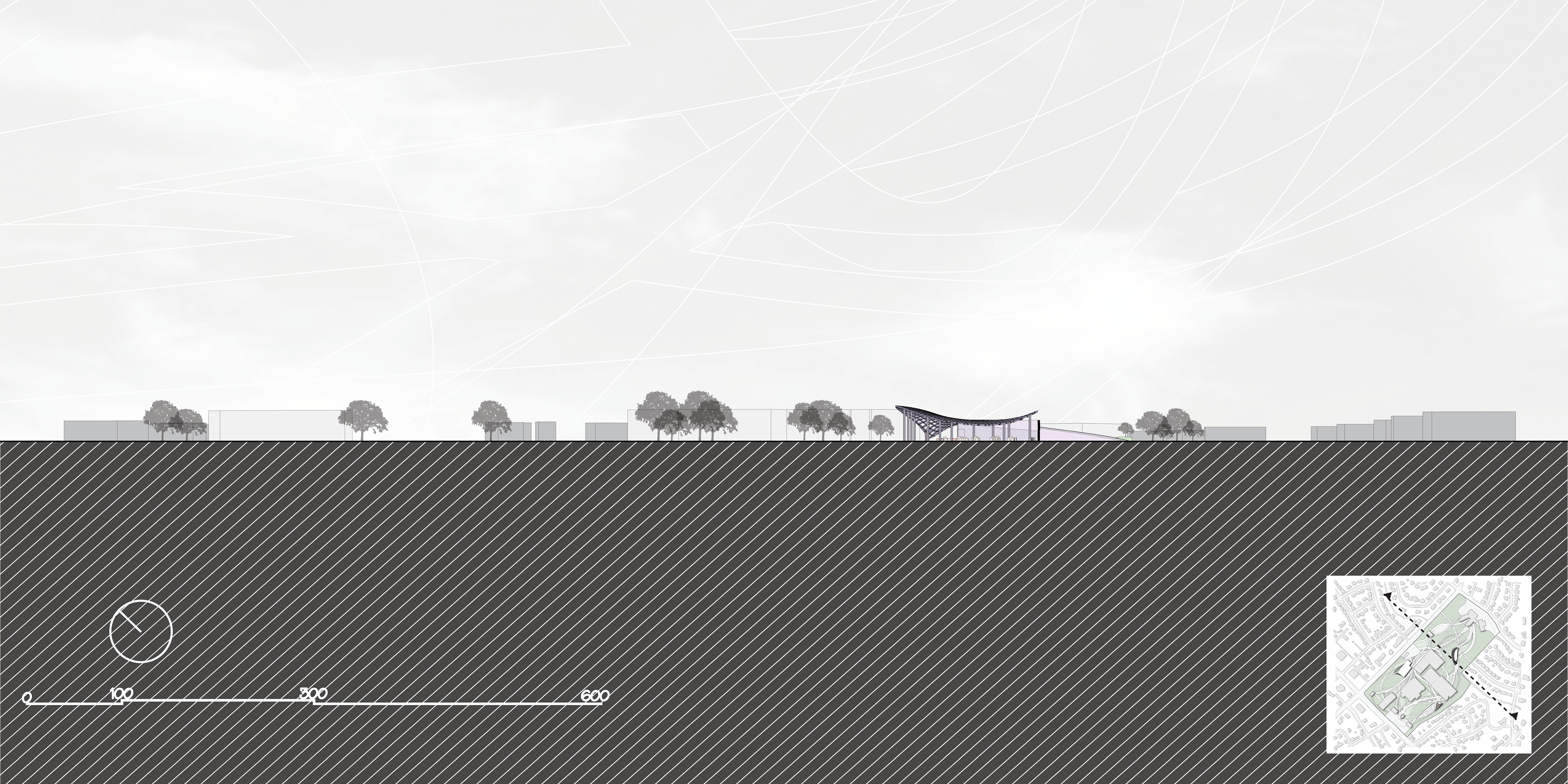
SITE SECTION | BY GRAESEN
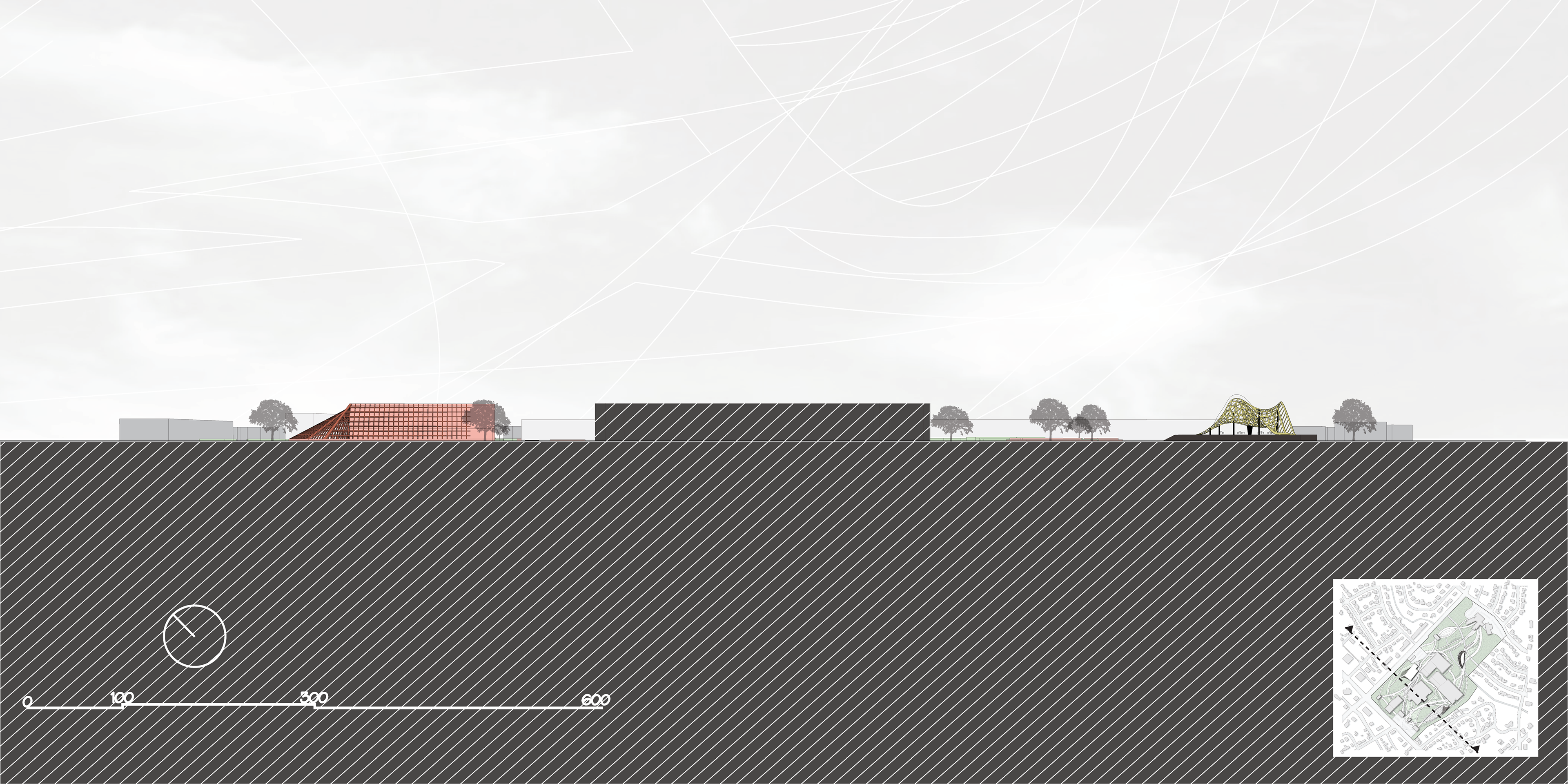
SITE SECTION | BY GRAESEN

LIBRARY PLAN FLOOR 1 | BY COMMERCE
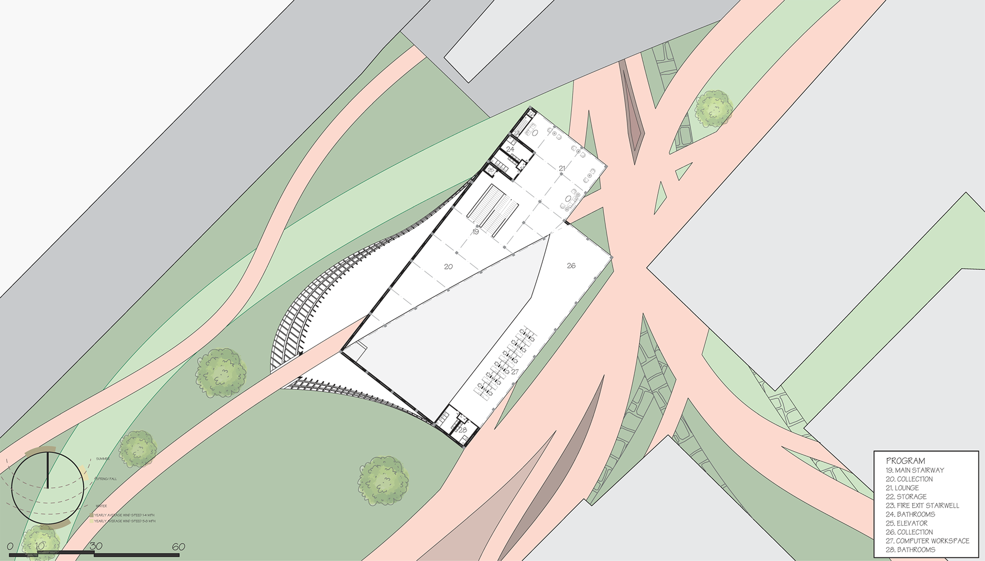
LIBRARY PLAN FLOOR 2 | BY COMMERCE
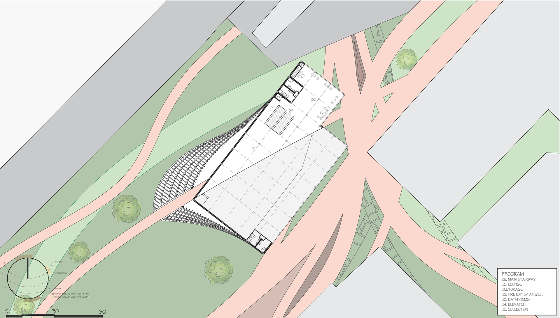
LIBRARY PLAN FLOOR 3 | BY COMMERCE
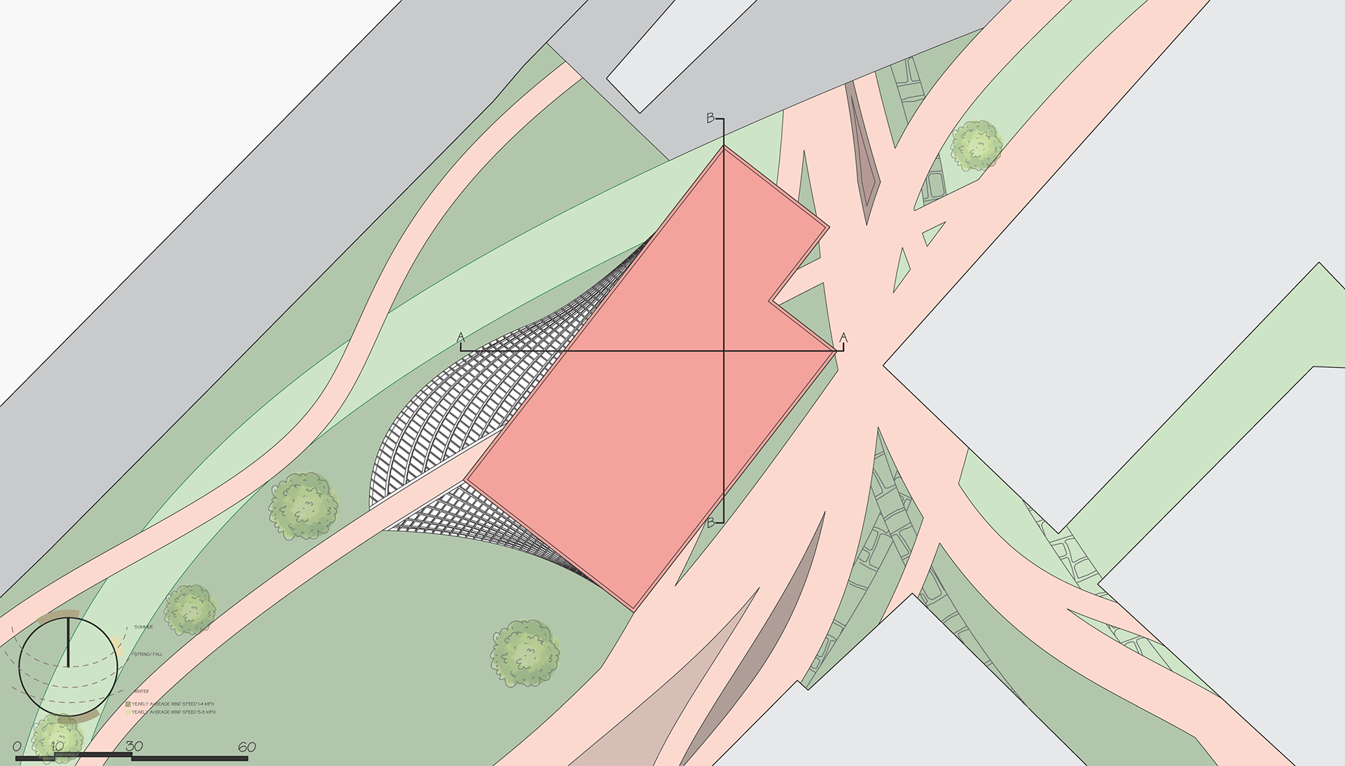
LIBRARY ROOF PLAN | BY COMMERCE
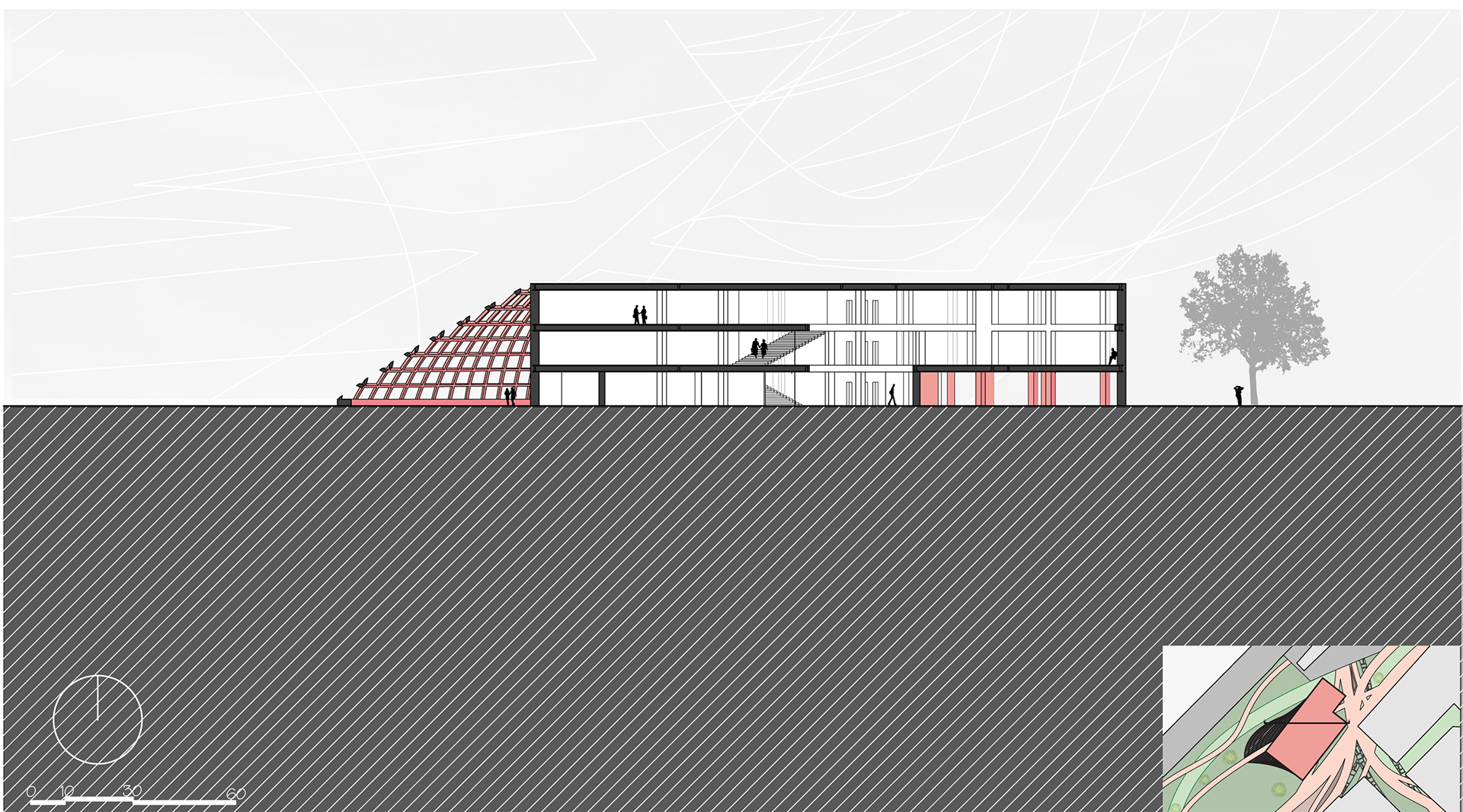
LIBRARY SECTION | BY COMMERCE
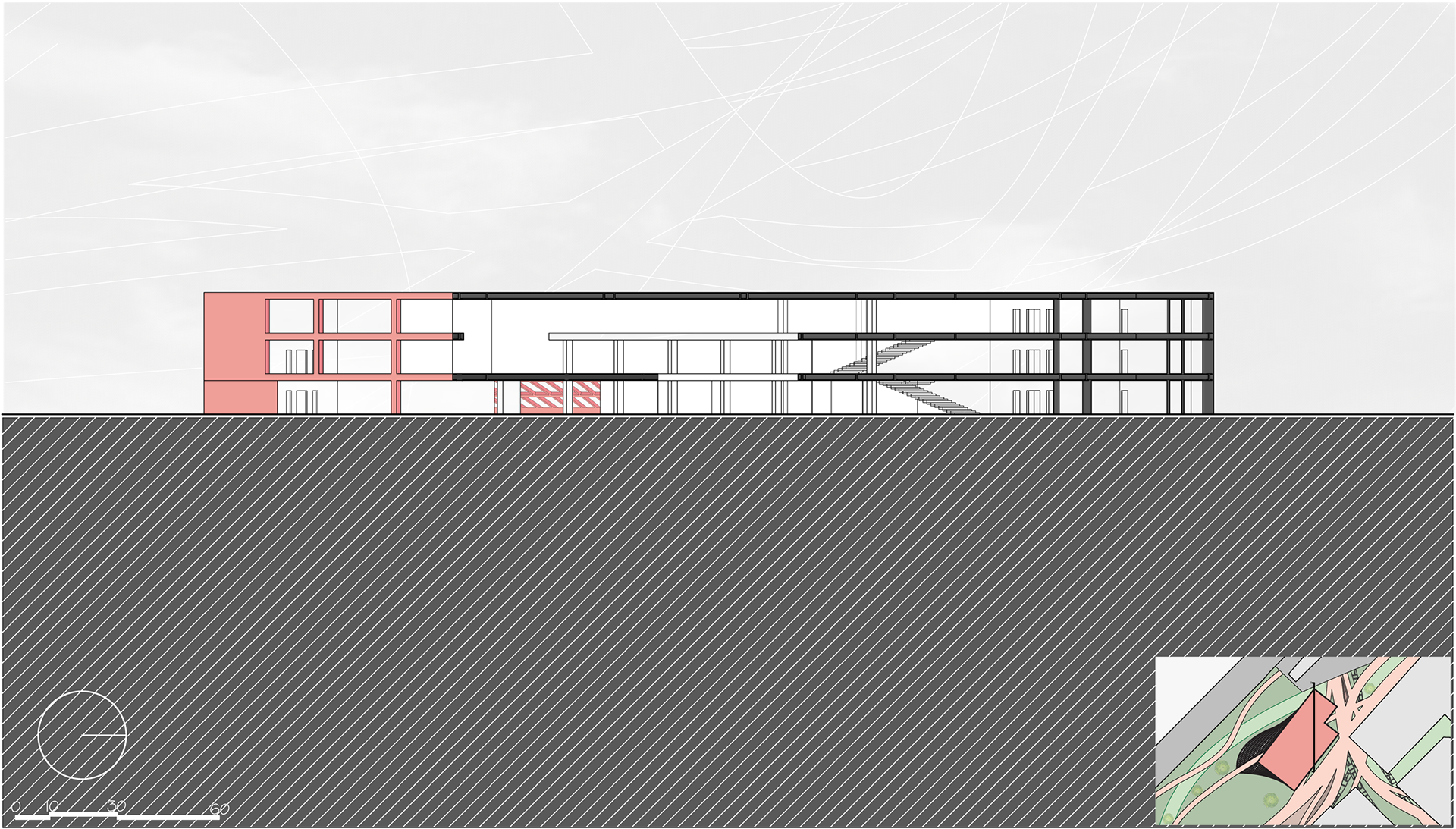
LIBRARY SECTION | BY COMMERCE
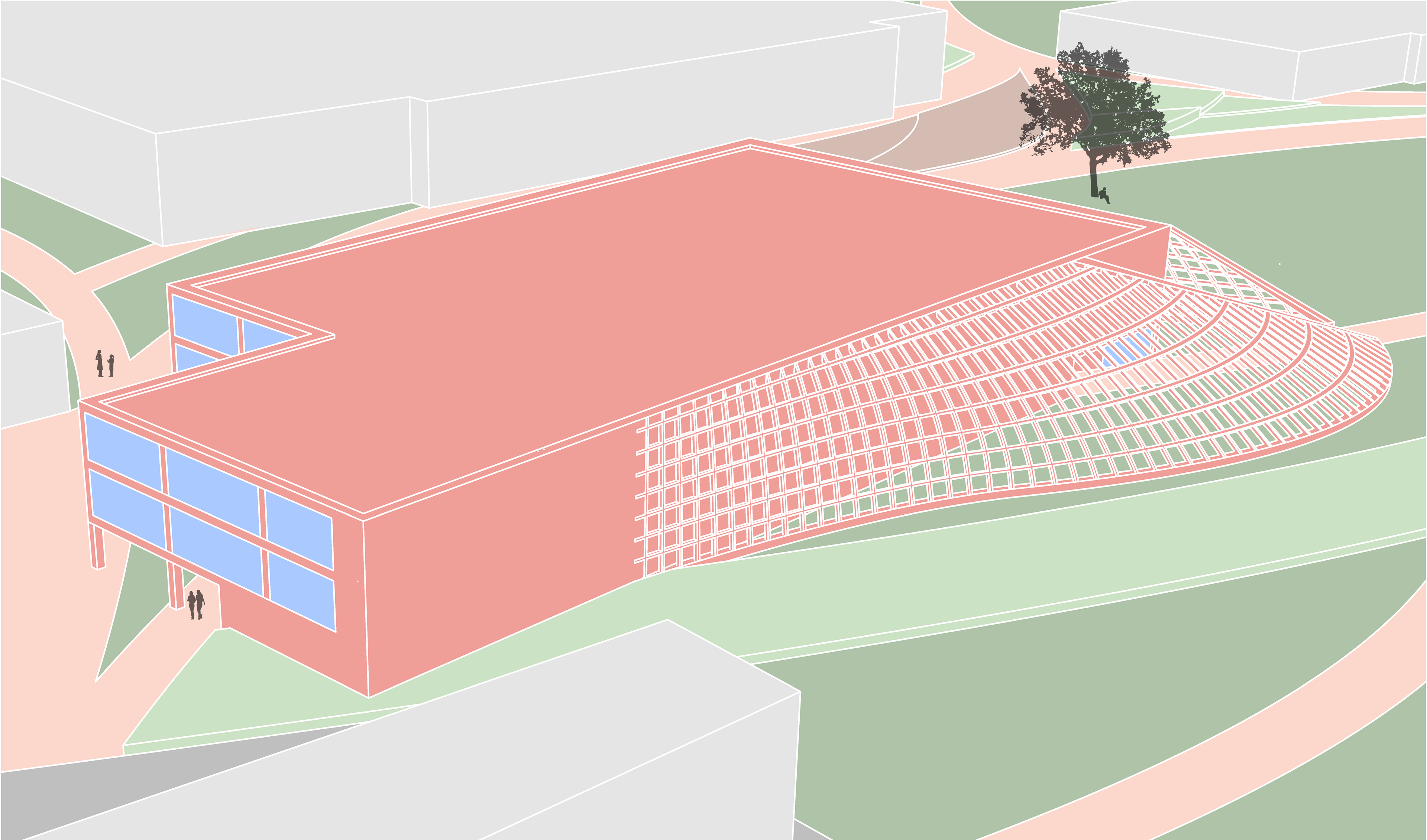
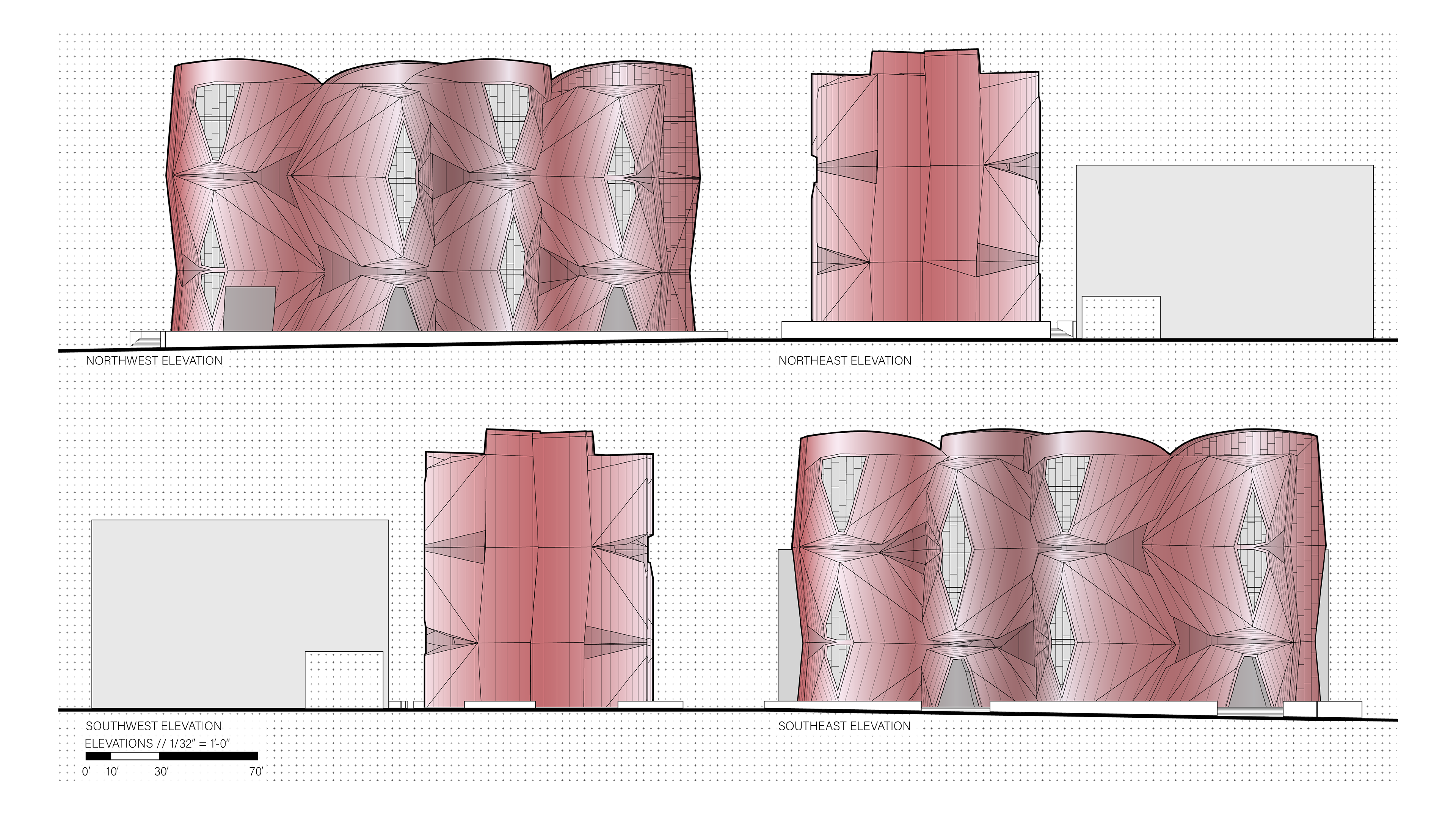
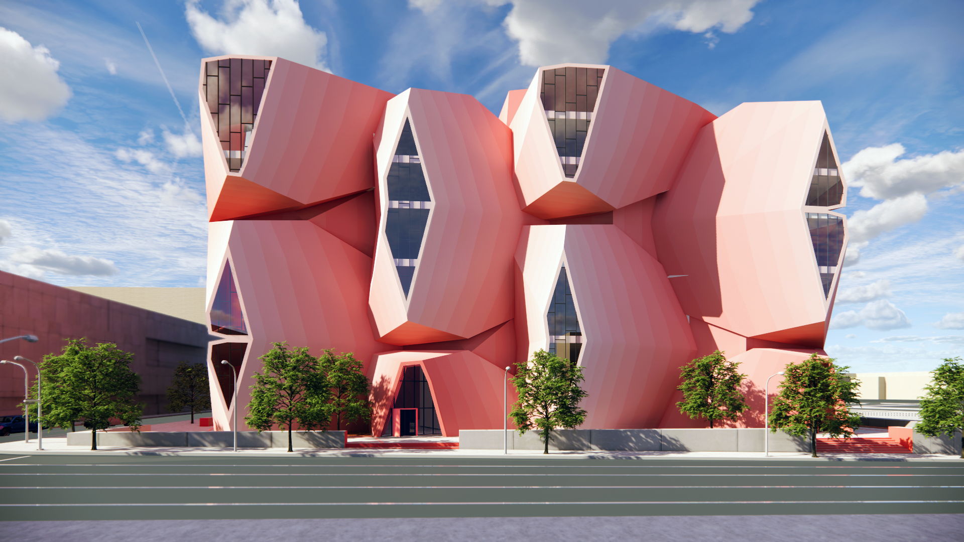
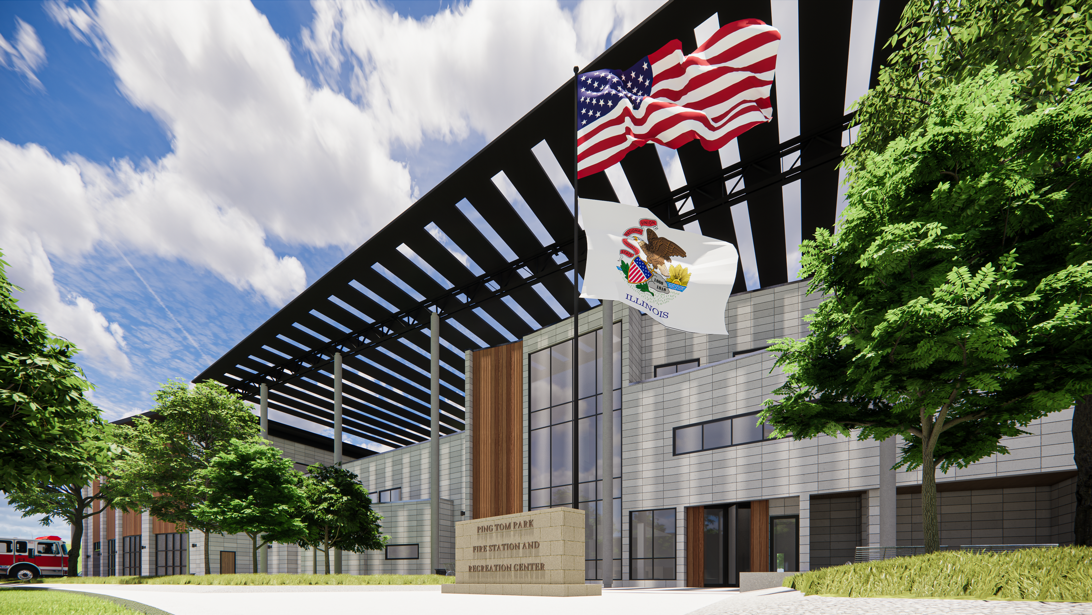
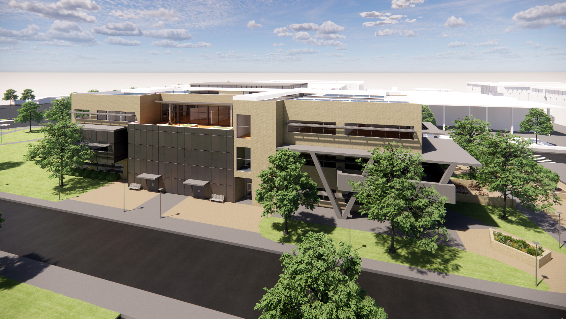
LIBRARY RENDER | BY COMMERCE
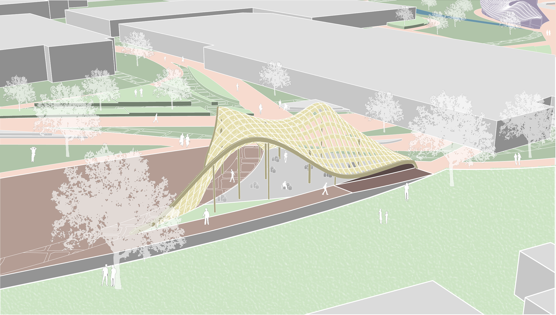
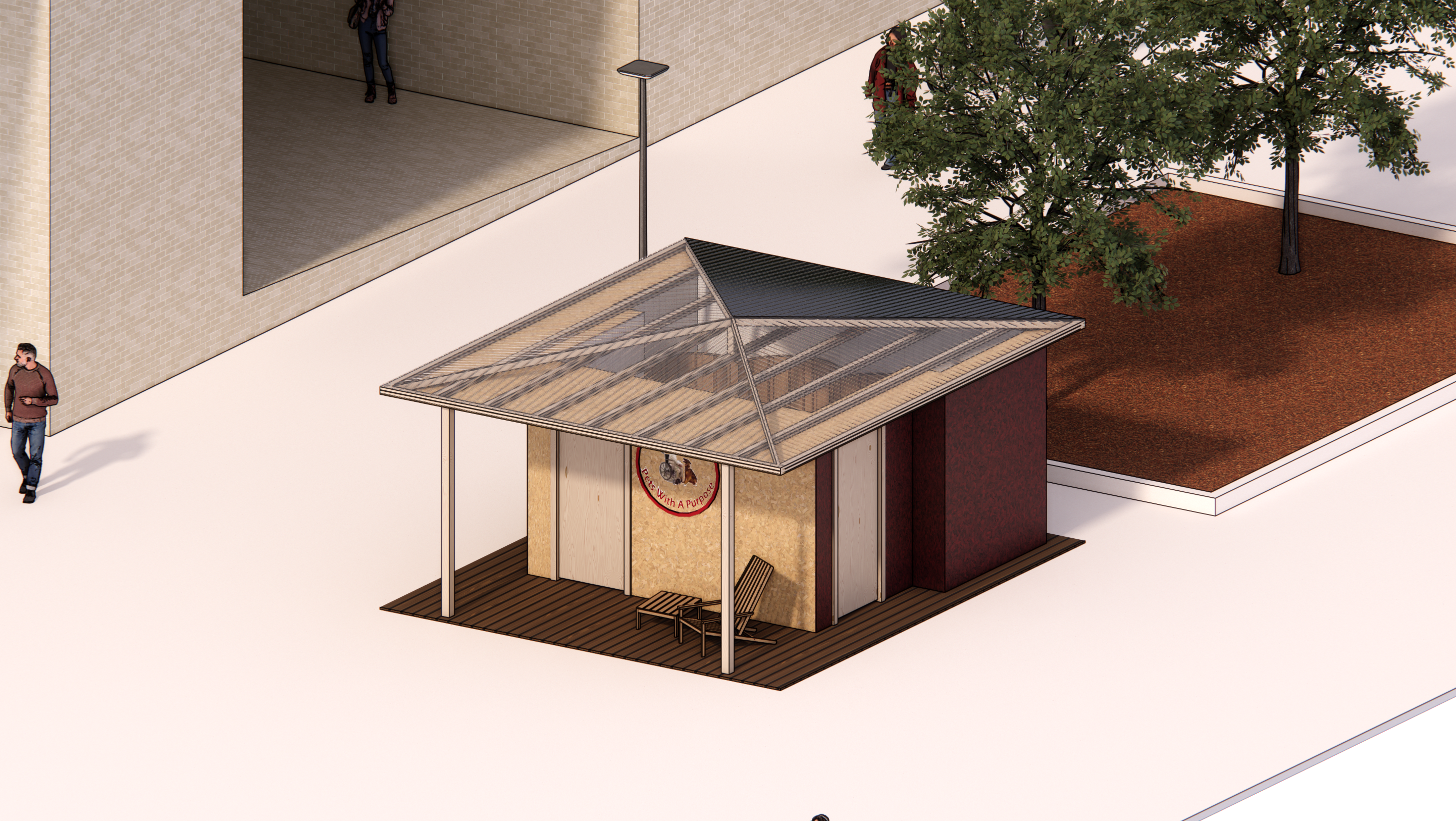
SOUTH PAVILION RENDER
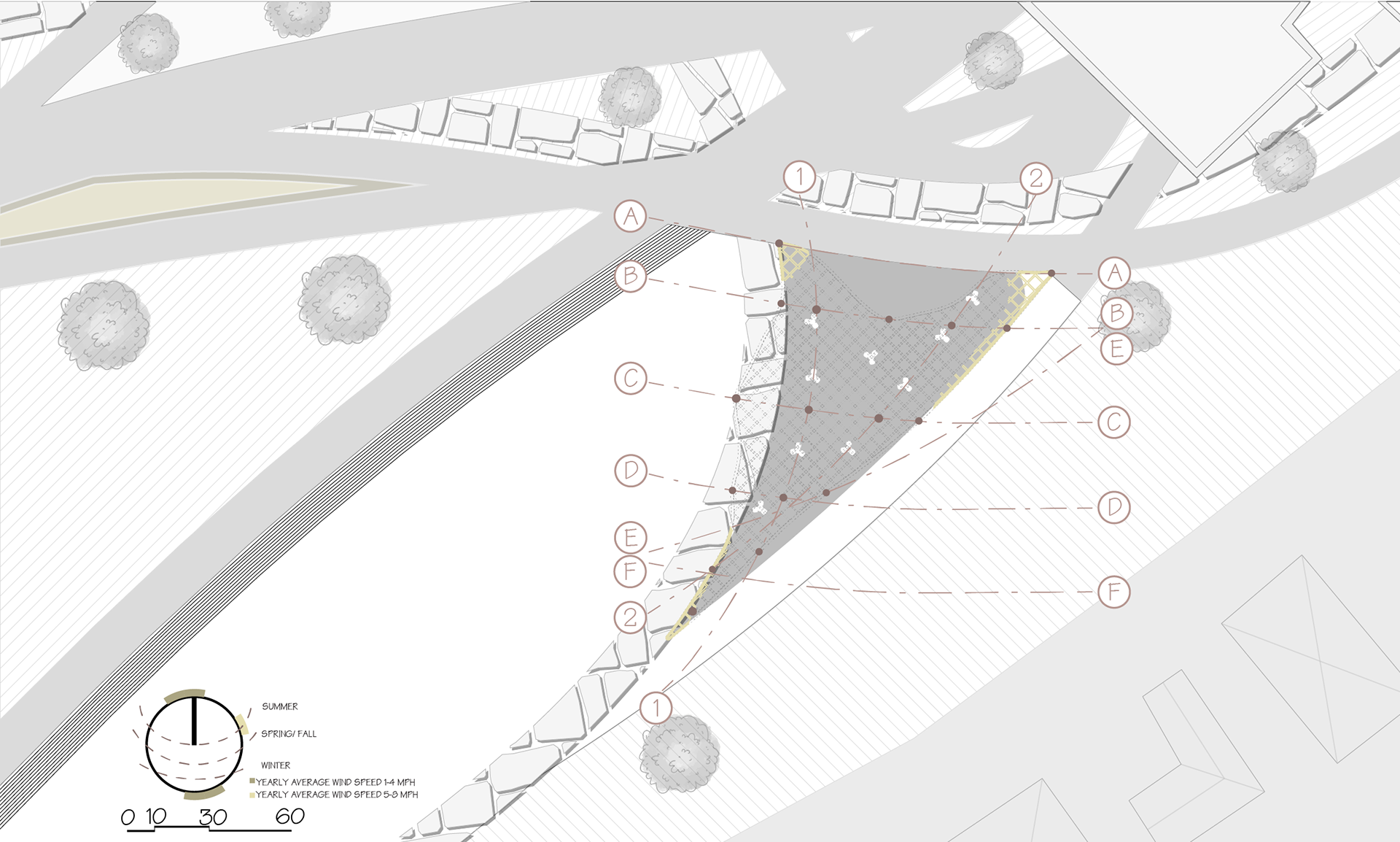
SOUTH PAVILION STRUCTURE PLAN
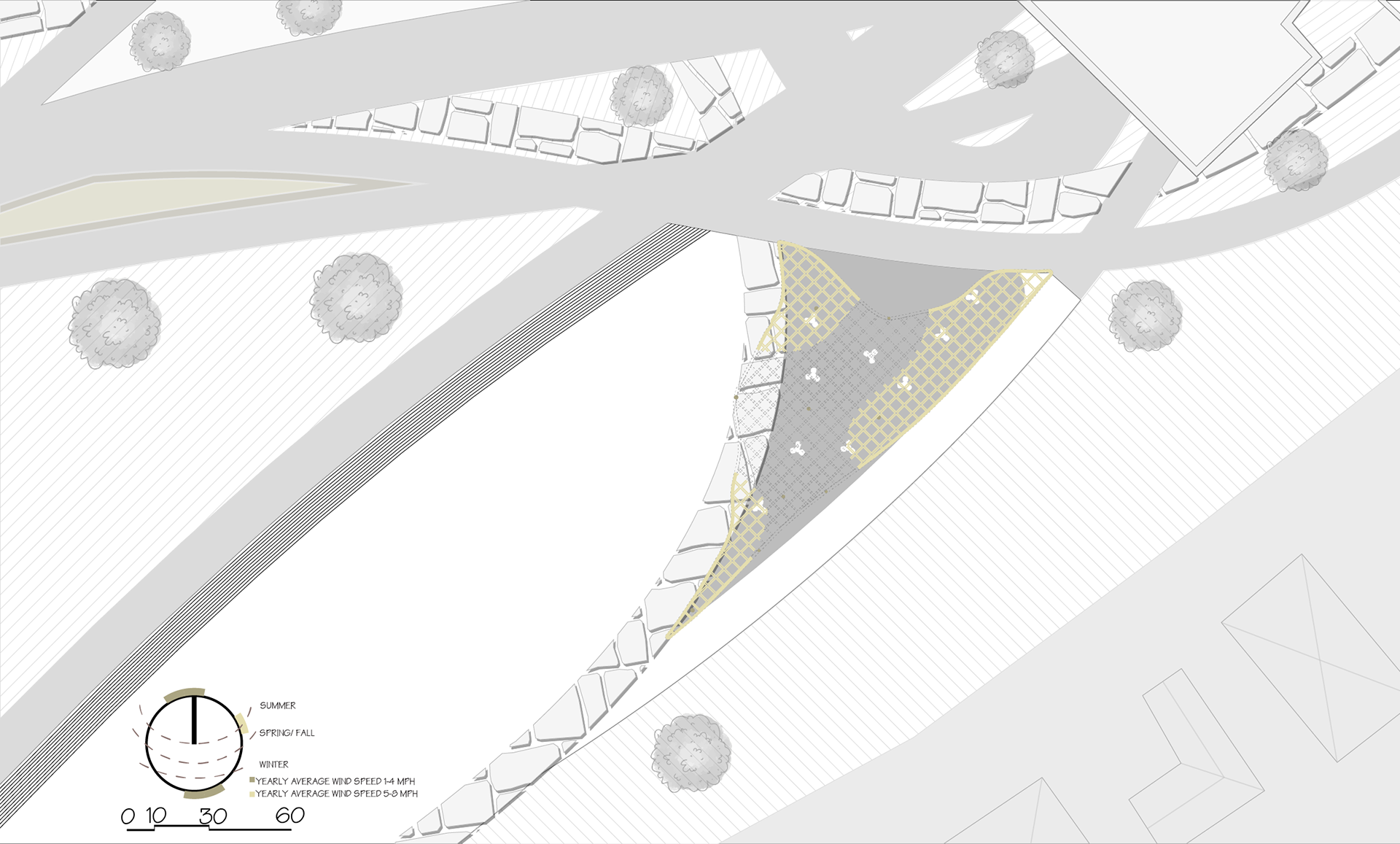
SOUTH PAVILION PLAN
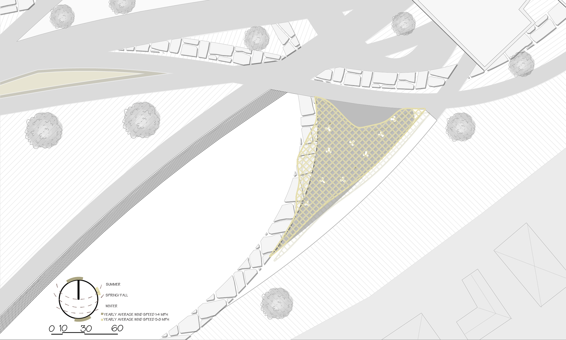
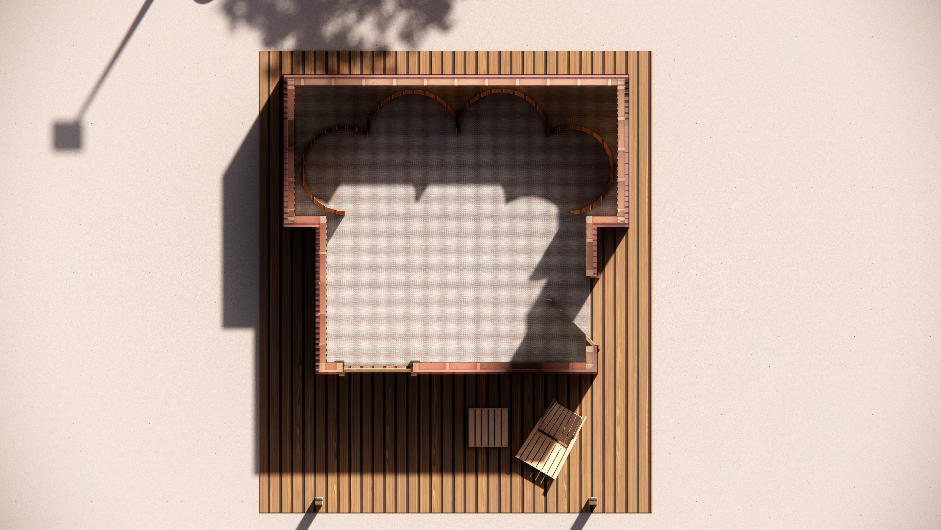
SOUTH PAVILION TOP VIEW
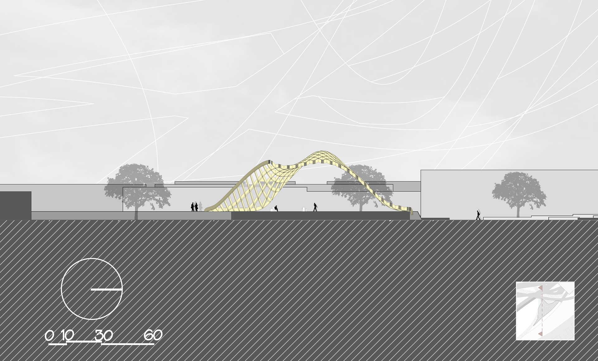
SOUTH PAVILION SECTION
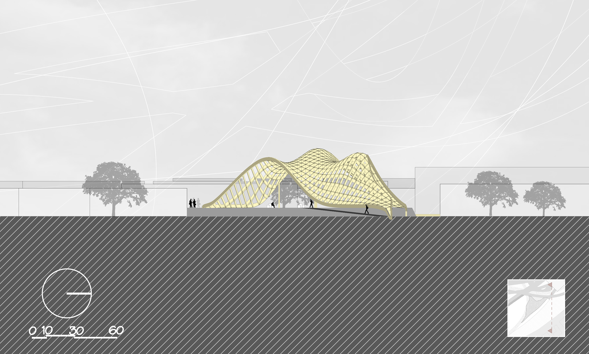
SOUTH PAVILION ELEVATION
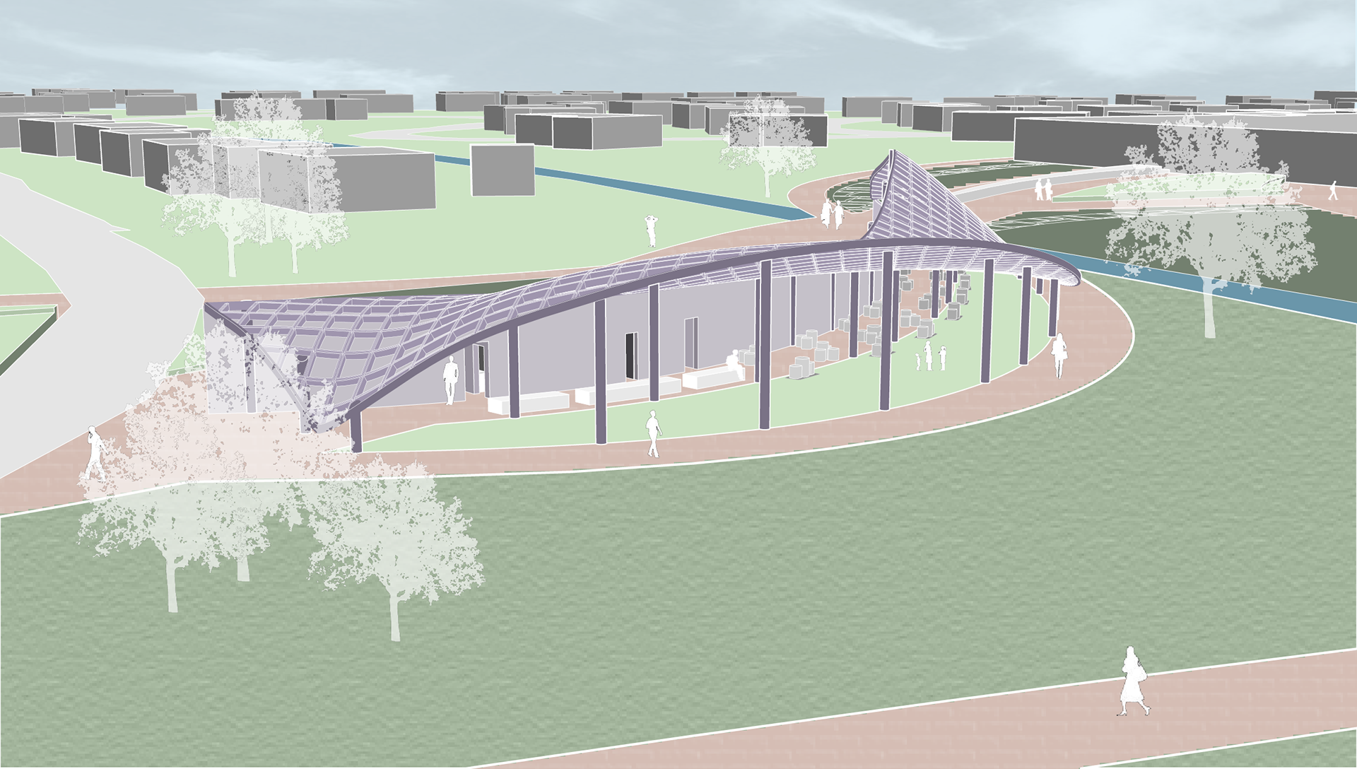
NORTH PAVILION RENDER
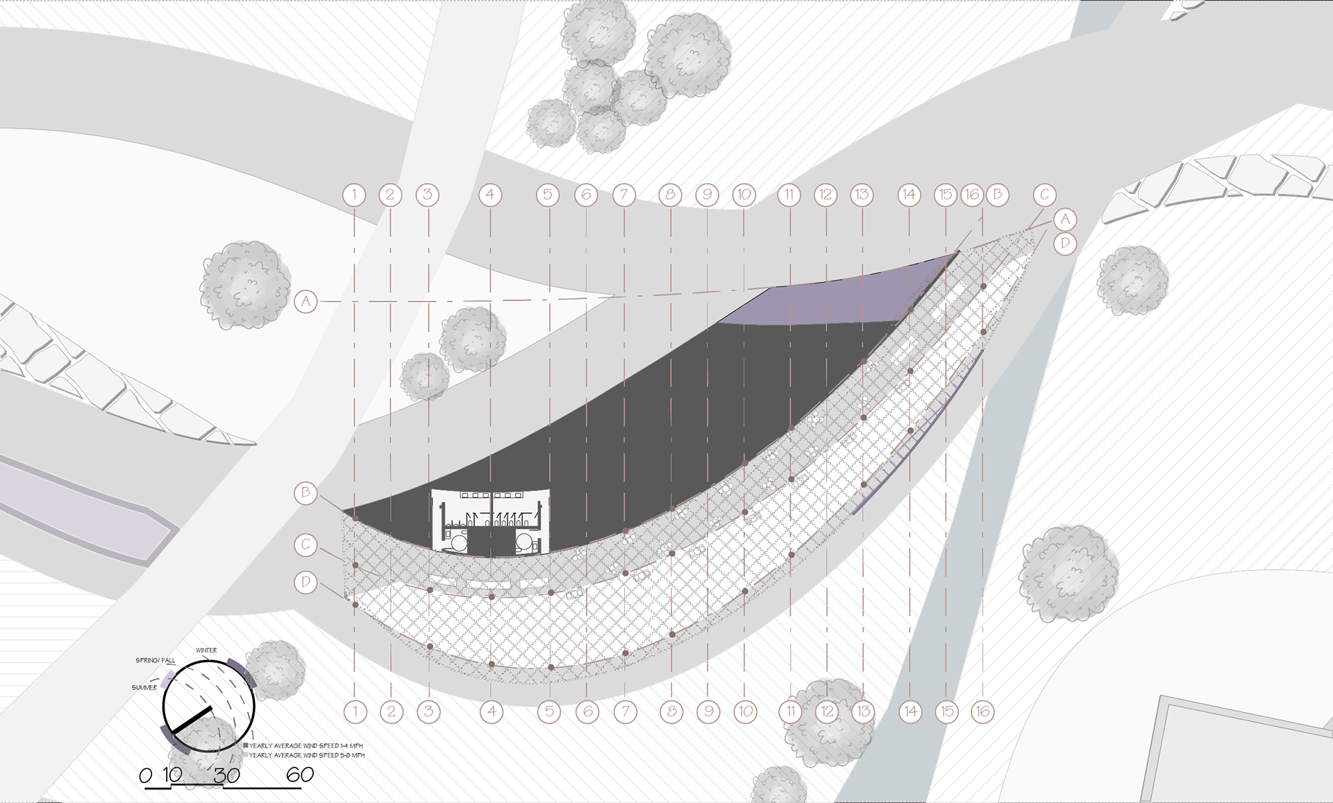
NORTH PAVILION STRUCTURE PLAN
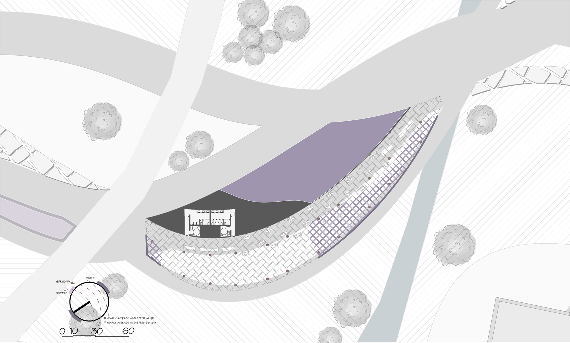
NORTH PAVILION PLAN

NORTH PAVILION TOP VIEW

NORTH PAVILION SECTION

NORTH PAVILION ELEVATION
The site currently consists of a shopping center with open parking lots as well as a strip of land for a park and an elementary school that is separated by a creek. It is located on the corner of Villa Maria and Texas Avenue, one of the two busiest roads in Bryan. Because of this, the shopping center is a full and busy area with thousands of vehicles that visit and use these facilities per day. We analyzed the basic current circulation that includes cars driving throughout the site, pedestrians walking from their car to their specific needed facility, and bus routes that include one stop on site. We also compared the site to the 20 Minute City and realized that the site itself, from Starbucks to the elementary school, included everything a community needed within walking distance, it was just missing the connection of a community and with this, specific areas to have this community come together.
Taking the current facilities, we analyzed an approach that focused on what circulation would exist if there were more pathways from one building to another. Within this circulation and site analysis, we focused on the urban space syntax and took into consideration what buildings and spaces are used more than others. We concentrated on three different entrances to the site and realized that from these three specific areas, there were paths that could be created to each main building and use on the site. This created path-connections between every aspect of the 20 Minute City and therefore connected the site as a whole. From these general analysis paths, we determined which paths were more useful and which paths could continue to be used for later purposes as a grid. With this approach, we created both the path form as well as the shapes and location of the pavilions and library. Between these paths, we wanted to expand the landscape of the park to the entire site by intervening green areas as well as raised landscape areas. These raised areas are strategically scattered throughout the site as well as raised at different levels with cuts from the grid. Similarly, there are some raised parts of the site that are benches instead of landscape and other areas that are raised and create concentrated plaza areas. Both of these spaces emphasize a community space in more areas than just the pavilions and library. We also located the trees based off the overall grid lines with many of the original trees on the current park staying intact. Overall, the community is encouraged to gather at any location and transition through many different pathway options that connect not only the site but connect the community as well. Our site has many established open areas that have the opportunity for activities such as playground, sculptures, and food trucks to be placed upon them and transform those spaces into activity areas.
We decided that our primary built intervention on the site would be a public library, as that was a service that is currently sparse in Bryan and fit well with the general goal of turning the site into a proper community center. The library also completed the triangulation between programs with the two pavilions.
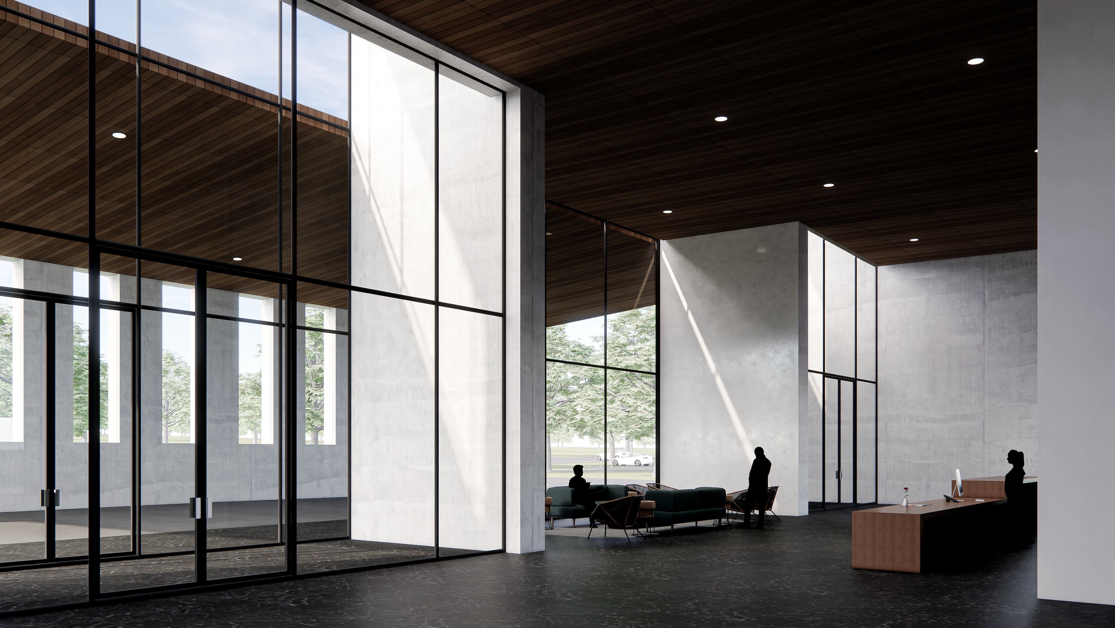
The form of the library was designed to fit the general geometry of the buildings already on the site, but at the ground level it was cut into by the paths we made, allowing them to dictate the form on the ground floor as well as the interior layout of the building on higher levels. A major design element of the library is the steel lattice that emerges from the northwest and southwest facades. This is primarily there to establish a visual connection between the library and the pavilions on the site, which employ a similar lattice. It also creates an outdoor area for use outside the library. On the interior of the library, the design places emphasis on open space and connection. There are very few walls in the building, and the circulation is designed to be very free-flowing. The program is meant to provide the essential services of a library while also being flexible with its space and not too rigidly separated. The main element of circulation between the different levels is the large stairway, which provides said circulation while also being a visual focal point. As for materiality, the library’s internal structure is a lightweight steel frame, chosen for its affordability and effectiveness. The external facades as well as the interior walls are stonework, chosen largely for aesthetic purposes. The floors would be hardwood for the same reasons. There are large windows on the northeast and southeast facade for the purpose of providing natural daylighting during the daytime, as well as generally promoting a feel of connection to the site as a whole. The lattice is made with the same kind of steel as the lattice on the pavilions.
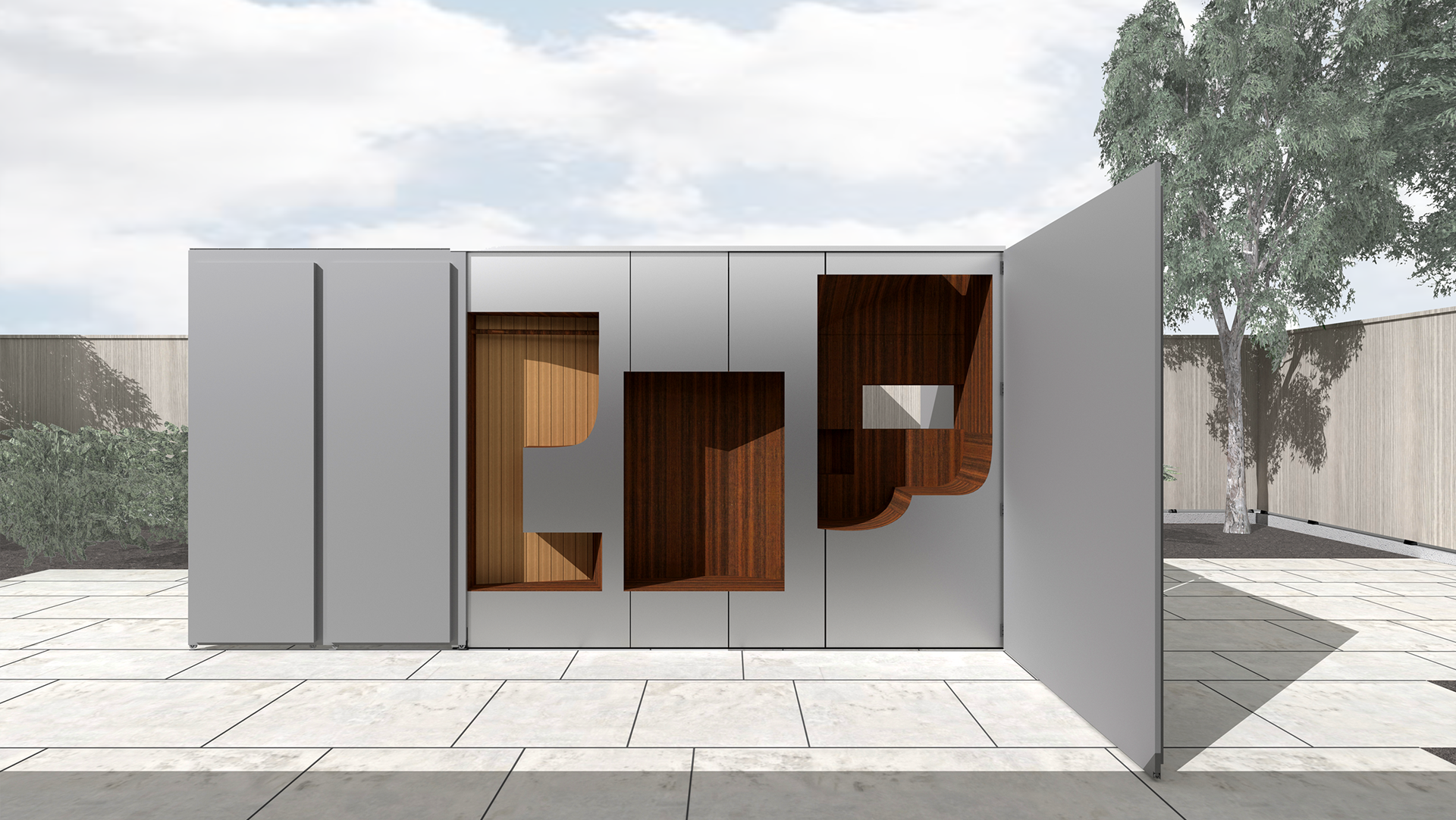
We determined early on we would like to have pavilions as part of our community center. Two were created as part of the triangulation between our architectural programs. Both pavilions are made of steel in lattice forms and provide seating. Both are formed based on the established path lines that were then modified on all three planes to create their curvy shapes. The north pavilion is made from steel in the lattice, which has a more subtle lattice distortion. The wall structure is made from the same material as the library, stonework, and the ground is the pathway cutting through as well as a grass strip. It is across the street from the school in the original location of Sul Ross park and is surrounded by paths. It is right next to the creek, giving users easy access to the bridge and the original Tejas center. This pavilion also includes a public restroom as well as a grass hill attached to the east side. The south pavilion has a more original distortion and has steel for the lattice and the ground is concrete that matches with the site materiality. The south pavilion is located on an elevated area behind most of the remaining retail buildings on what was originally a parking lot.
