ARCH 405
FALL 2021
PROF. ANDREW HAWKINS
ARCHITECTURAL DESIGN IV
FALL 2021
PROF. ANDREW HAWKINS
ARCHITECTURAL DESIGN IV
SITE LOCATION: College Station, Texas
SITE ASPECTS: Texas A&M Campus
PROGRAM: Educational
TYPE: Partner Project | Alanna Burnett
SEMESTER: Fall 2021 | 8th
FROM THE PROFESSOR:
"The design of educational facilities is a large market within the field of architecture. The world of education
and learning continues to evolve based on newly developing technologies and we should be preparing for
future technologies. Creative and Design education is special in its programmatic elements and the needs
for space. This project is meant to be an addition to the current Texas A&M Campus as a educational
facility that may be used for a variety of instruction offerings. As you have been a student in college for a
few years now, you should have a multitude of ideas for improving your learning environment.
How do we create an environment that supports various types of learning and also is adaptable for the
future? How can design foster learning, problem solving and creativity? How can facility design provide
confidence, security, and integration into the “outside” world? How can educational design create a
positive and lasting impact on students and the community? How can you plan for technologies that are
not yet in existence?
The educational facility will be based on “creative” education facility with a community environment.
The site location is on the main campus of Texas A&M University near the Commons Residence Halls And
the Central Campus Parking Garage. The site is currently empty with a small “park” on the northeast end.
The full site is approximately 73,000 square feet with a more usable area of approximately 45,500 square
feet. The existing park area is to remain or may be modified to similar use."
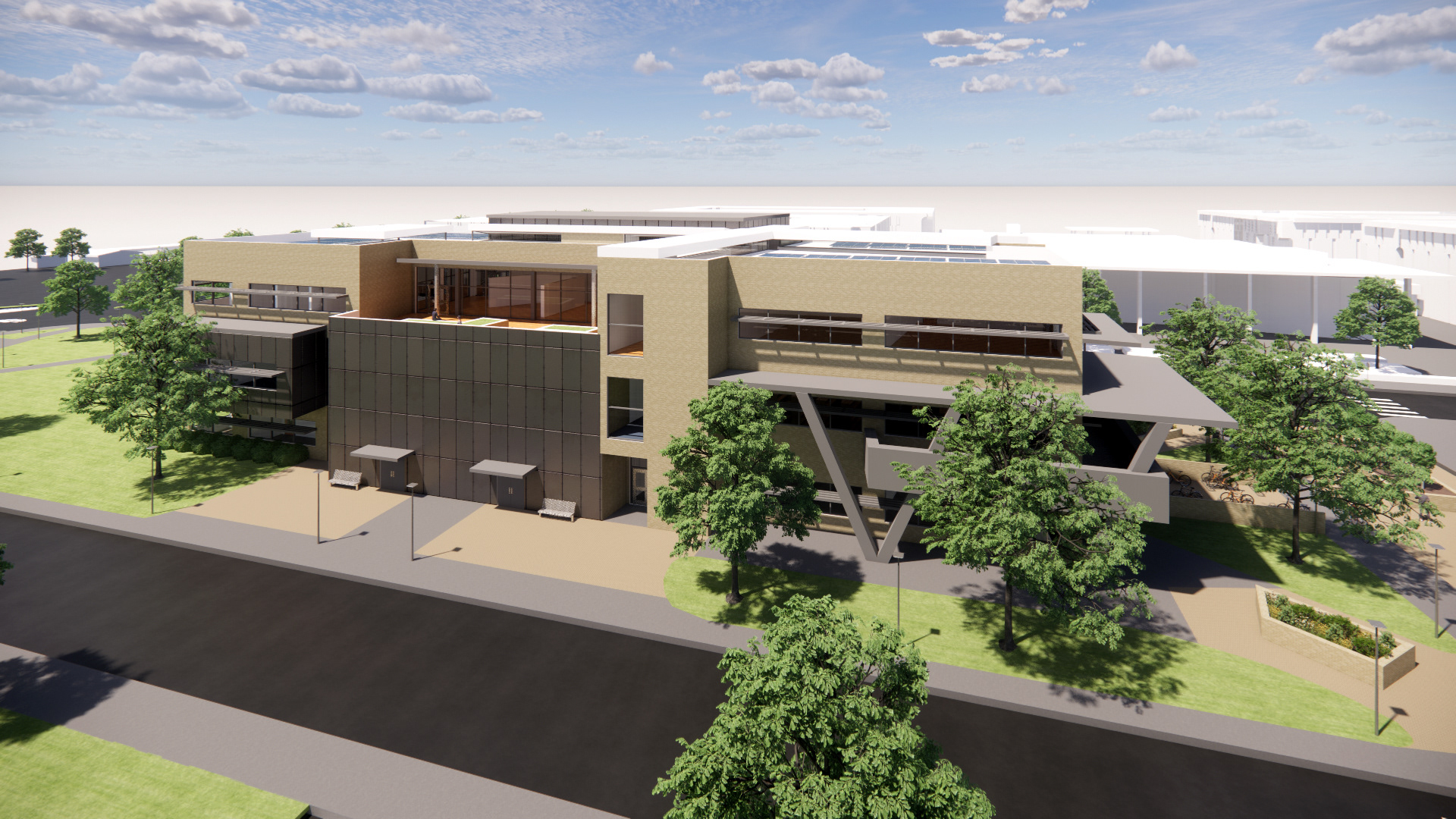
RENDER | NORTH
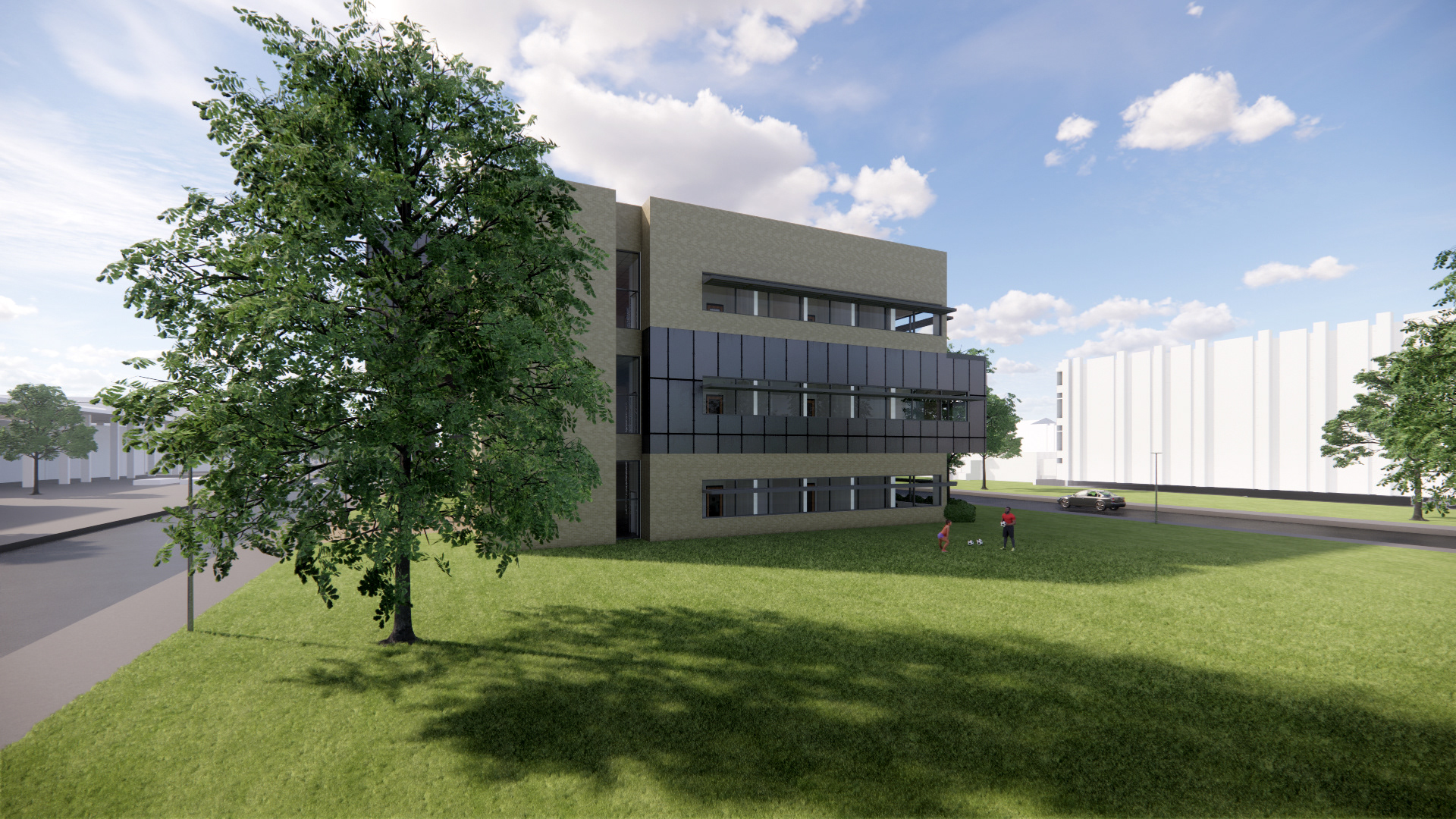
RENDER | EAST

RENDER | SOUTH
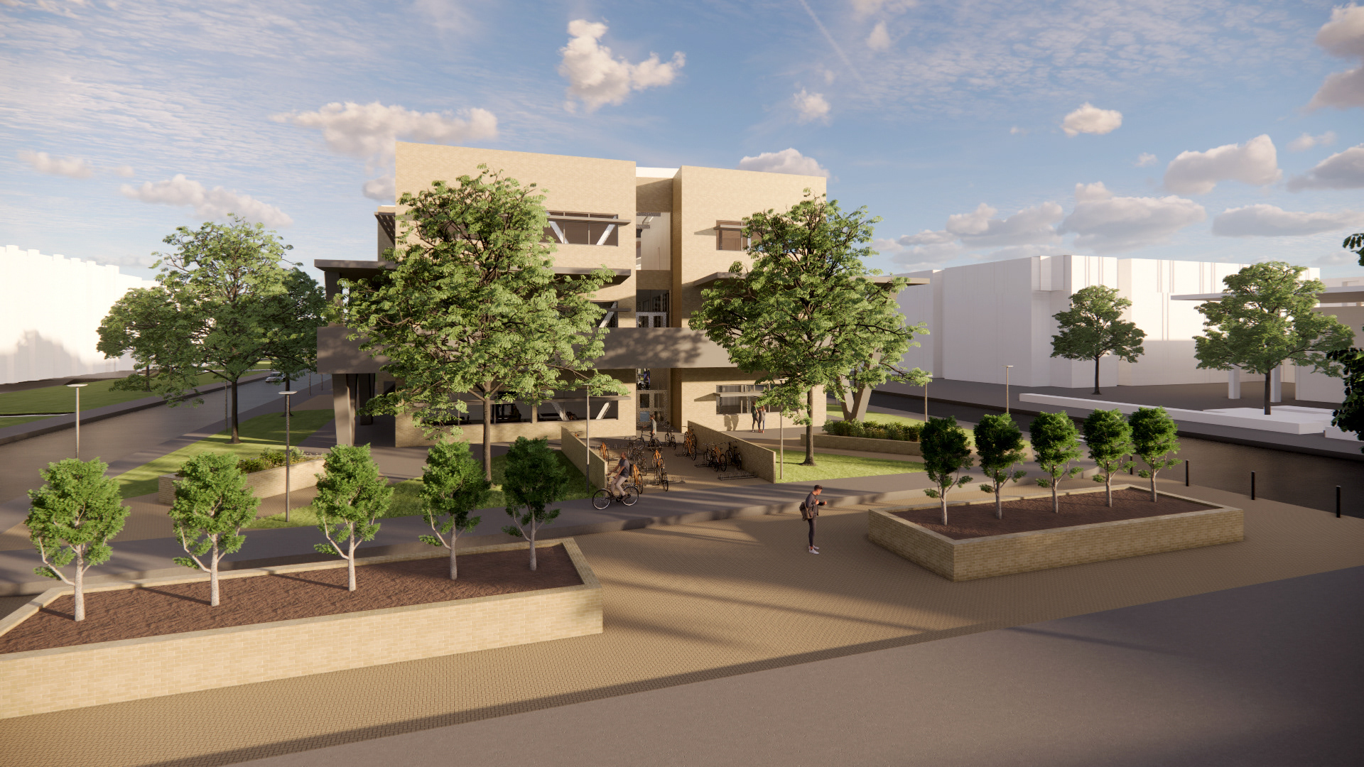
RENDER | WEST
SITE CONTEXT
SITE ANALYSIS

MIDTERM TO FINAL FORM CHANGE
FORM GENERATION

PROGRAM DIAGRAM

SITE PLAN
FLOOR PLAN | FLOOR 1
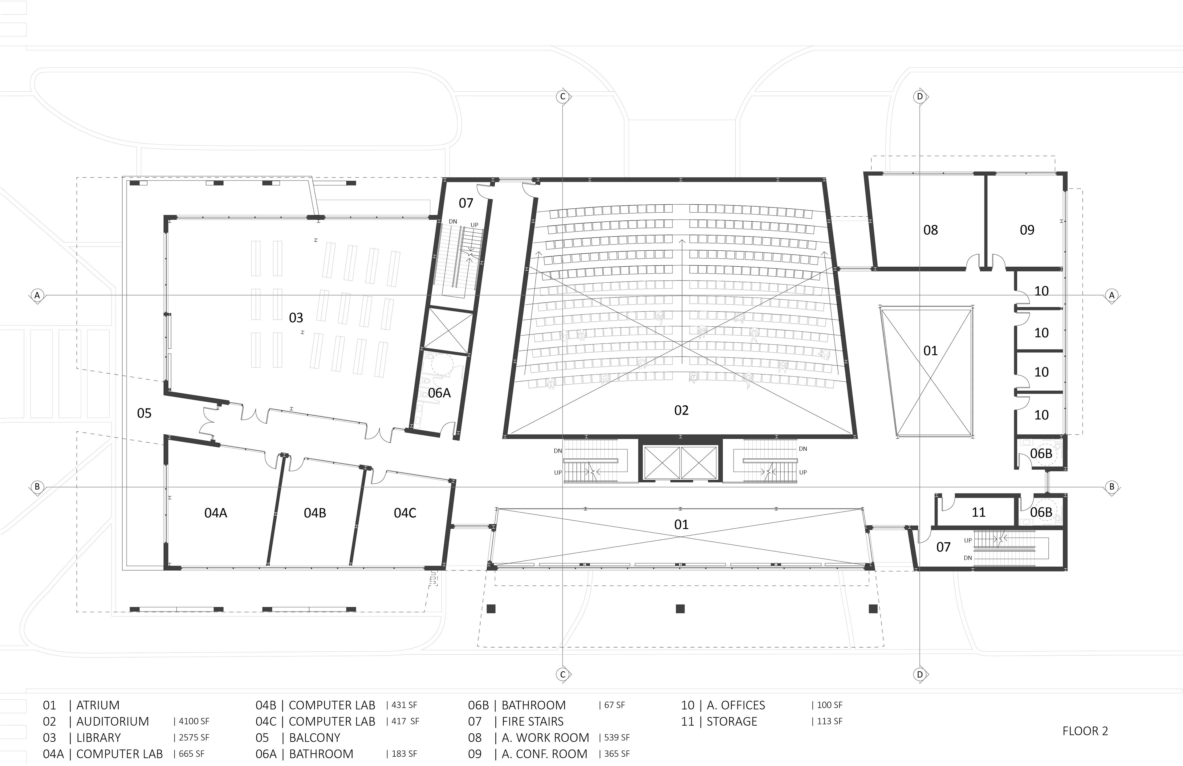
FLOOR PLAN | FLOOR 2

FLOOR PLAN | FLOOR 3

ELEVATIONS
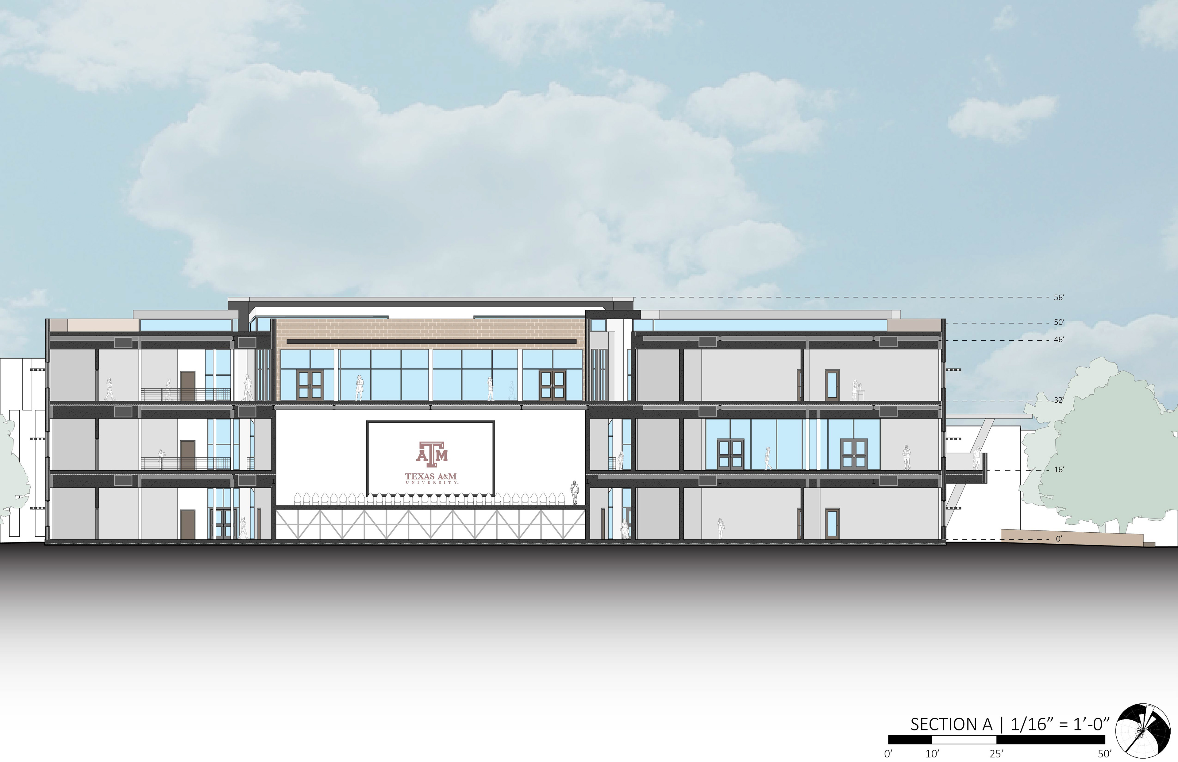
SECTION A

SECTION B
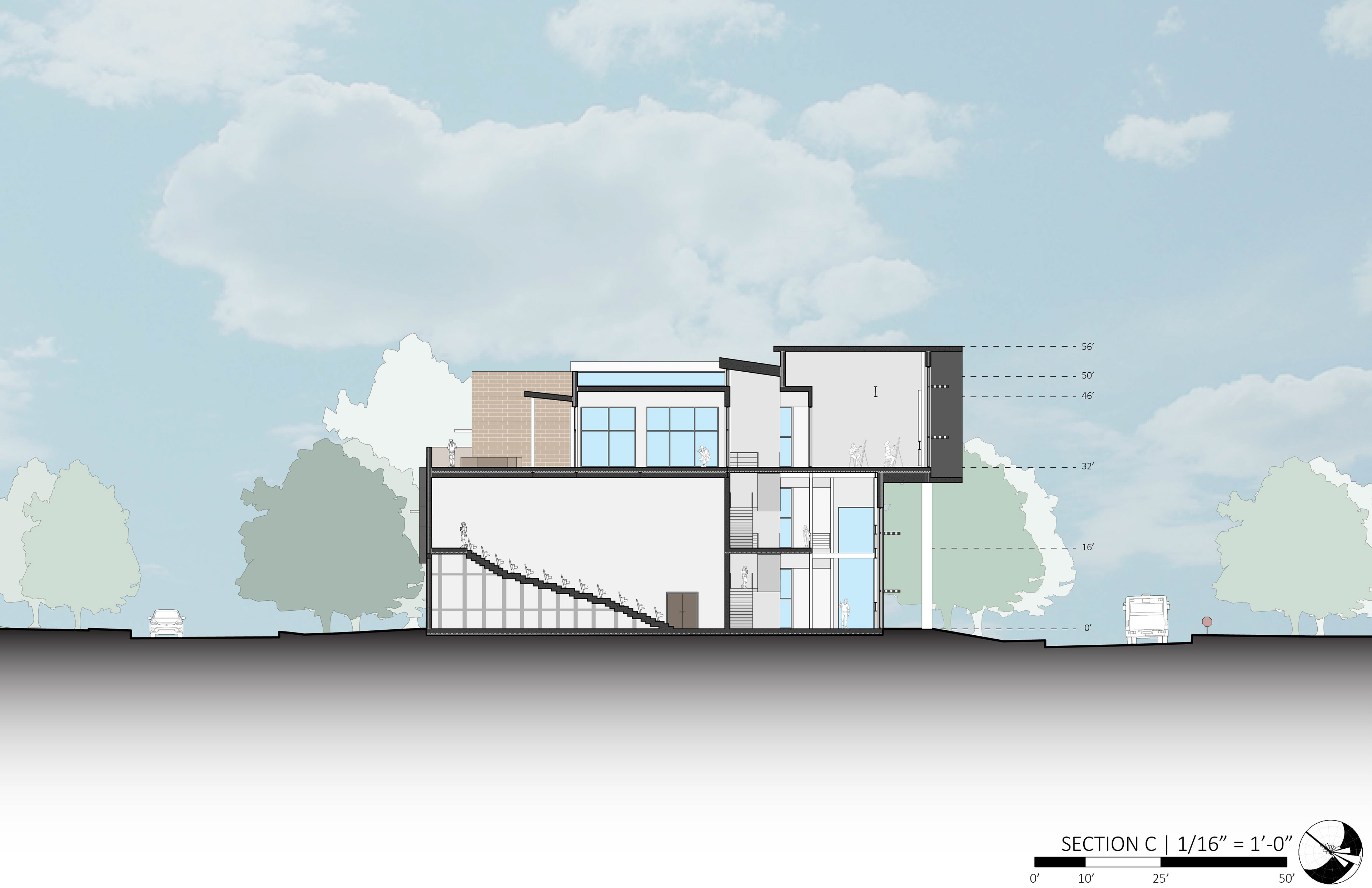
SECTION C

SECTION D

SITE SECTION WITH SECTION D

FRAMING KEY
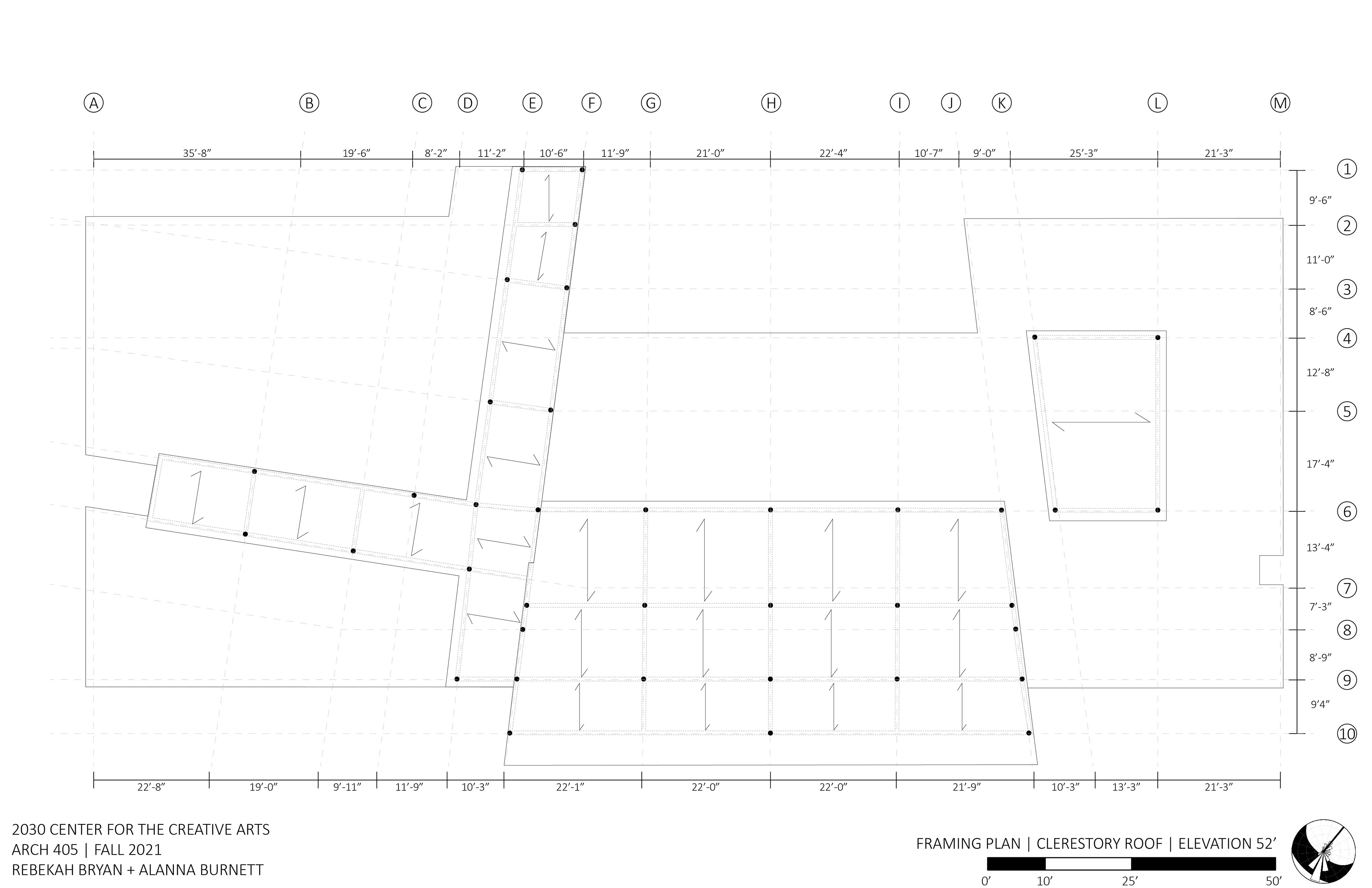
FRAMING PLAN | CLERESTORY ROOF
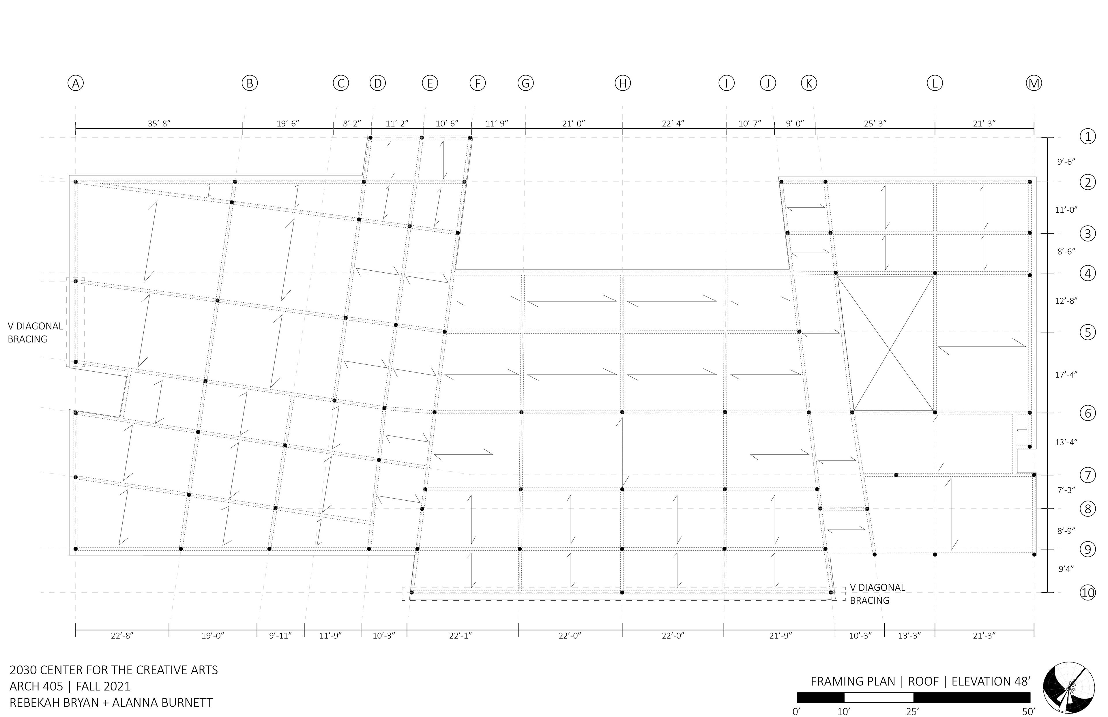
FRAMING PLAN | ROOF
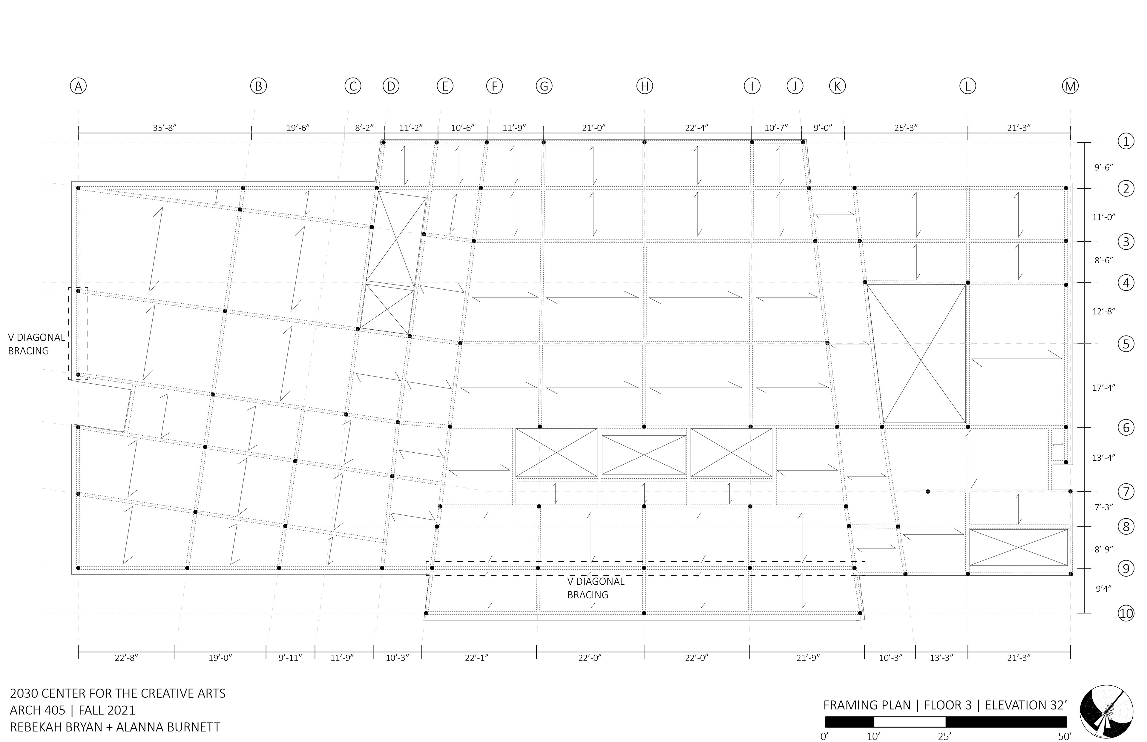
FRAMING PLAN | FLOOR 3
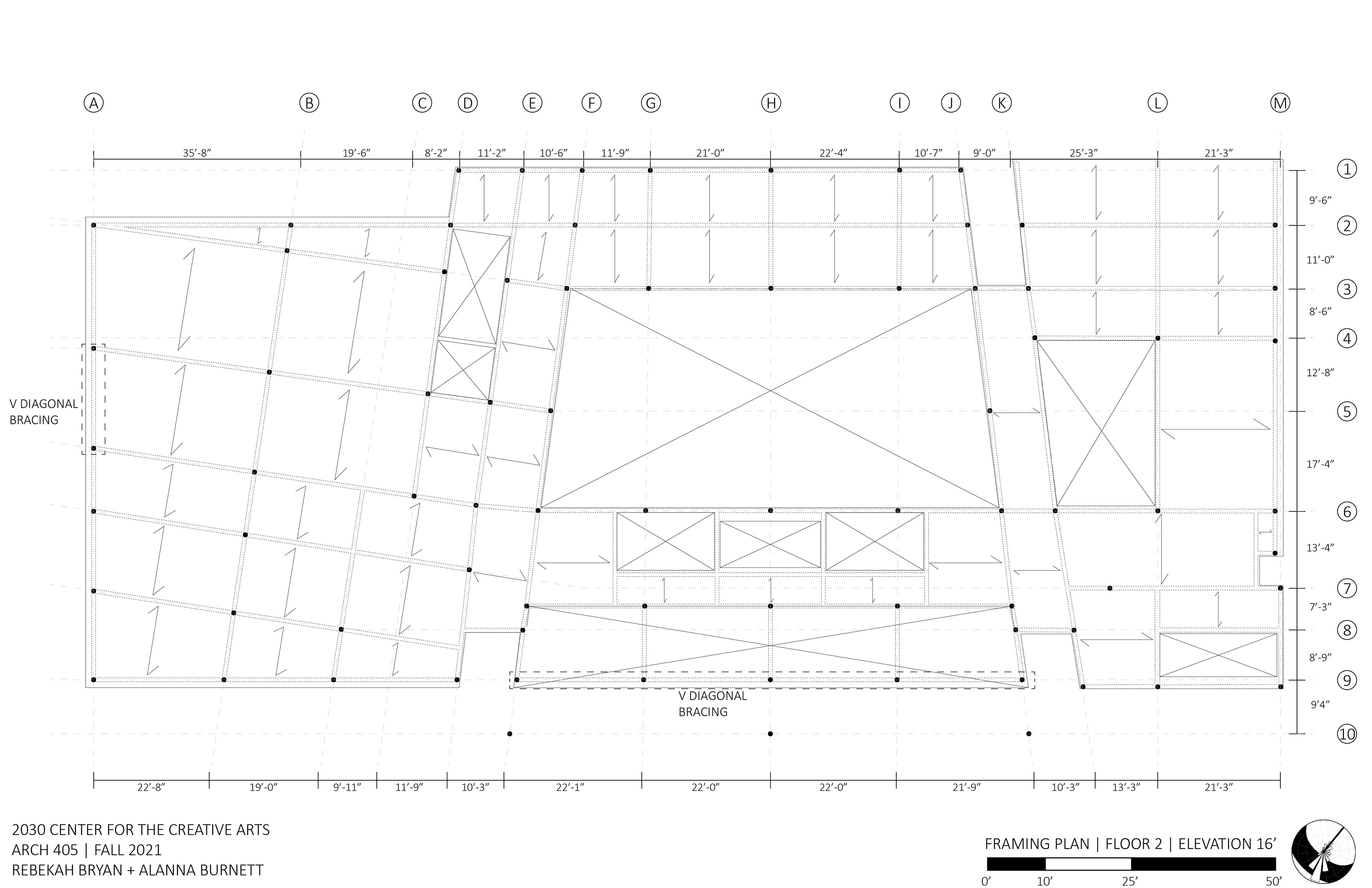
FRAMING PLAN | FLOOR 2
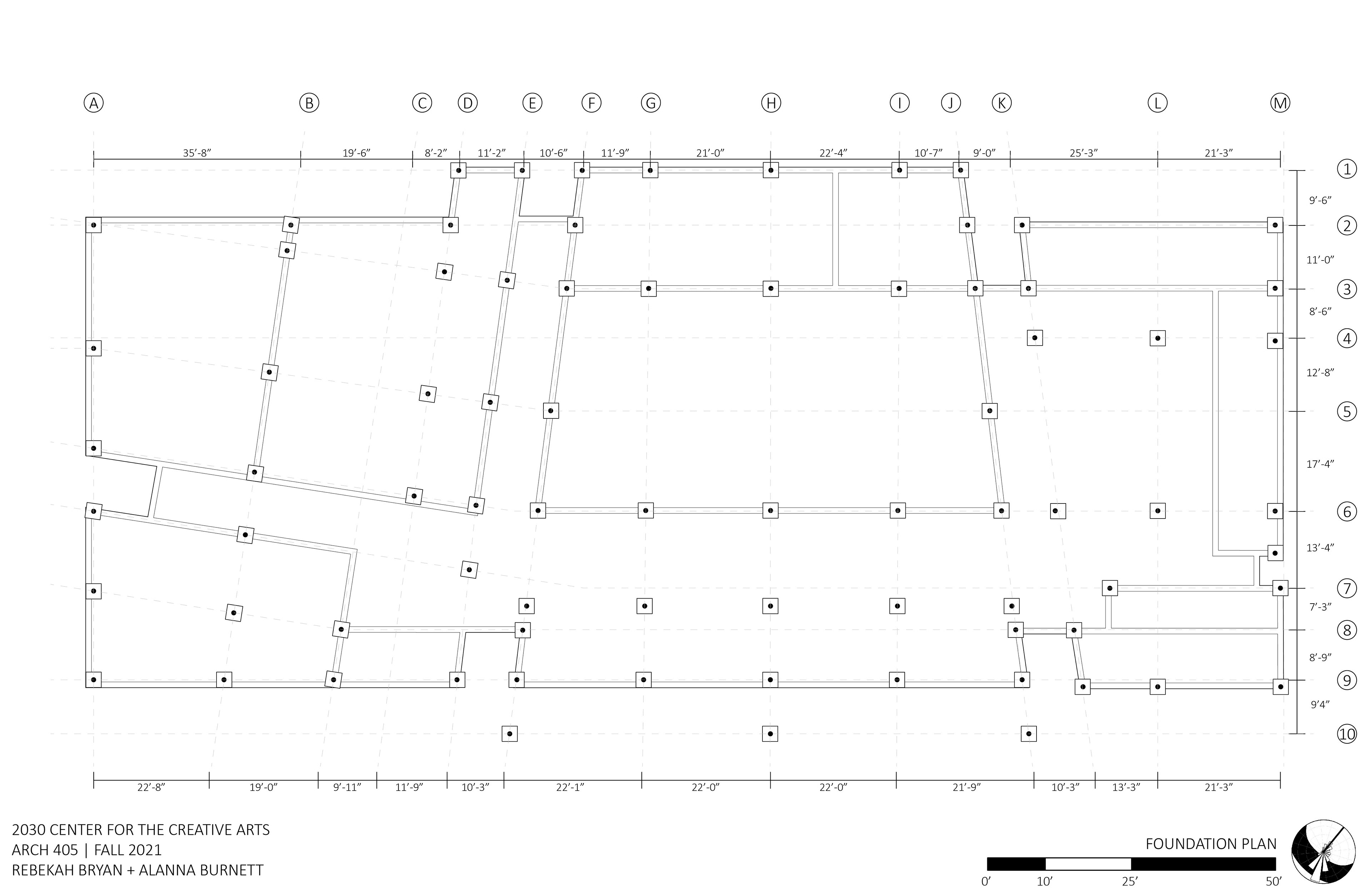
FOUNDATION PLAN
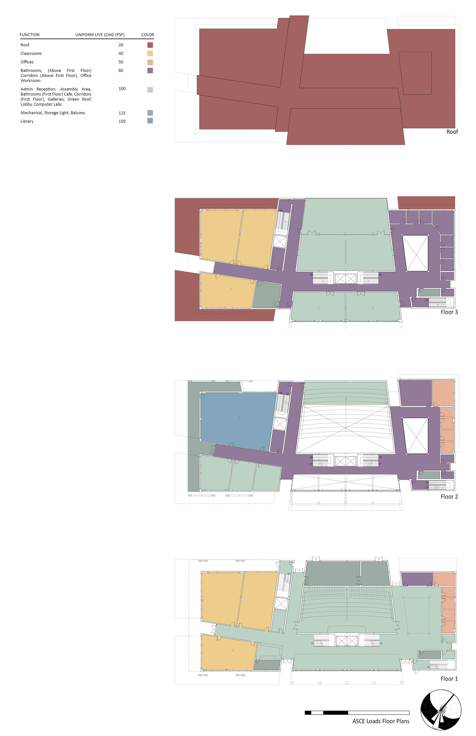
ASCE LOAD DIAGRAM
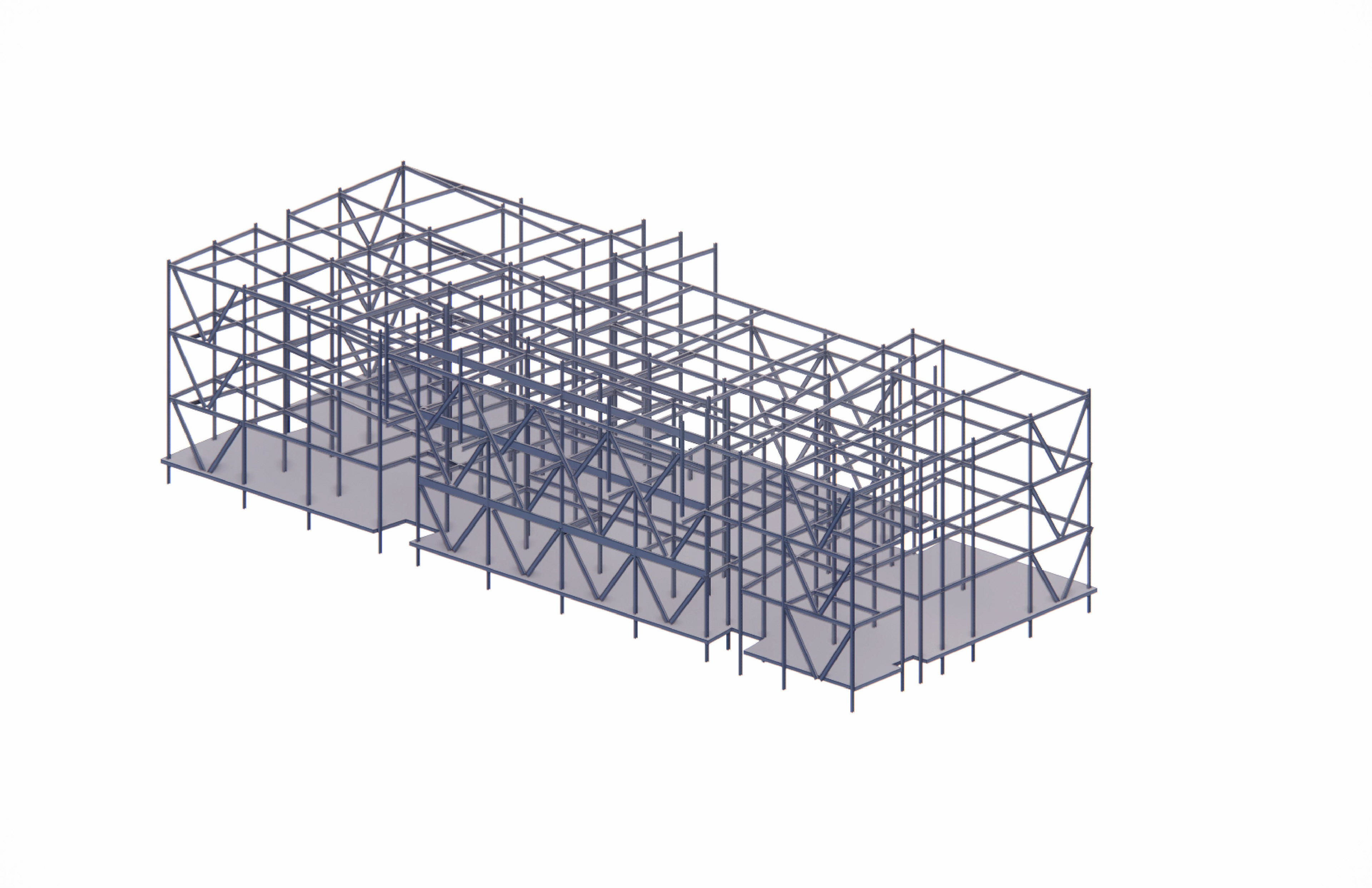
BONES MODEL

BONES MODEL

LARGE SCALE SECTION

LARGE SCALE SECTION

SYSTEMS INTEGRATION
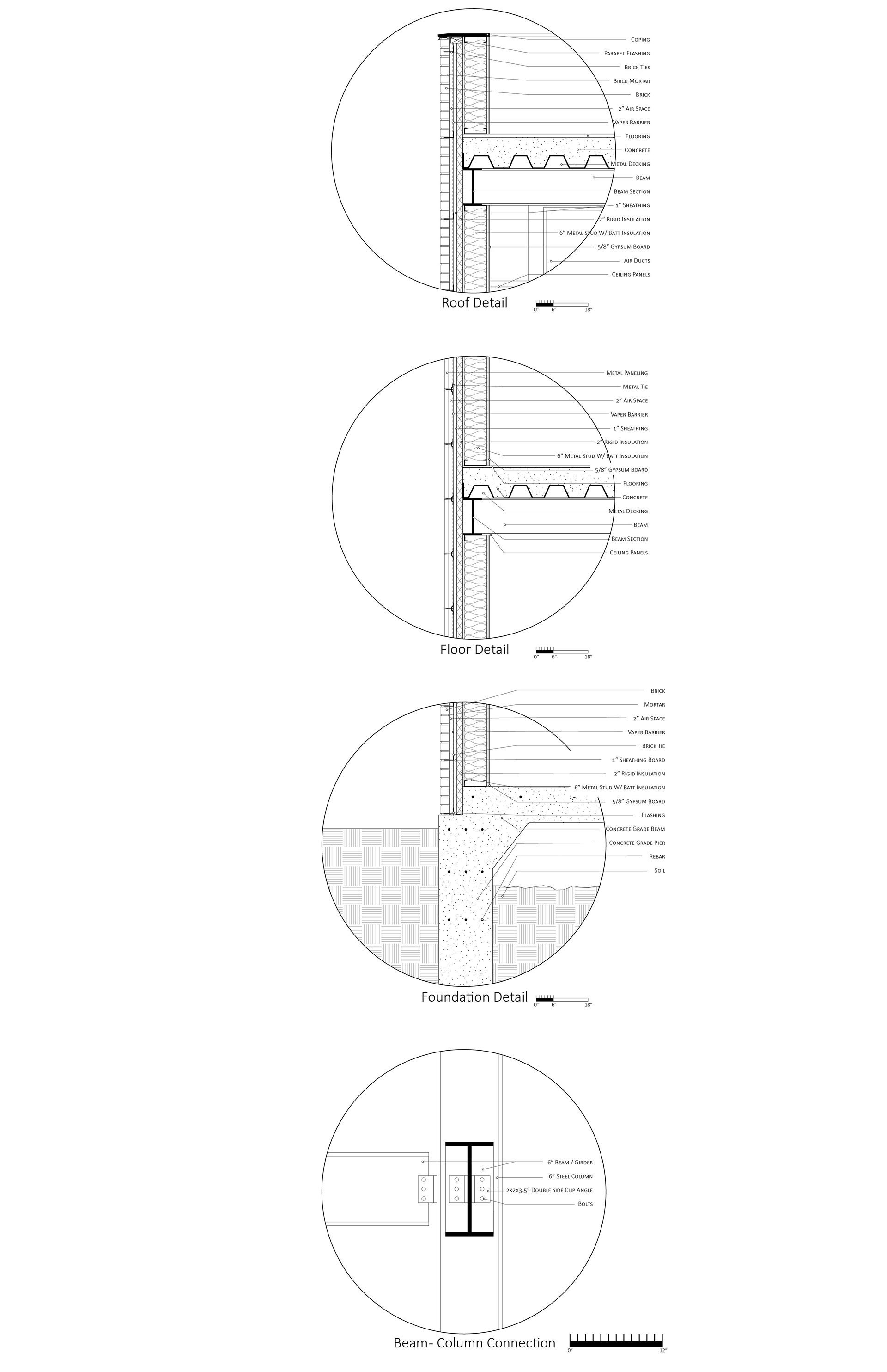
STRUCTURAL DETAILS
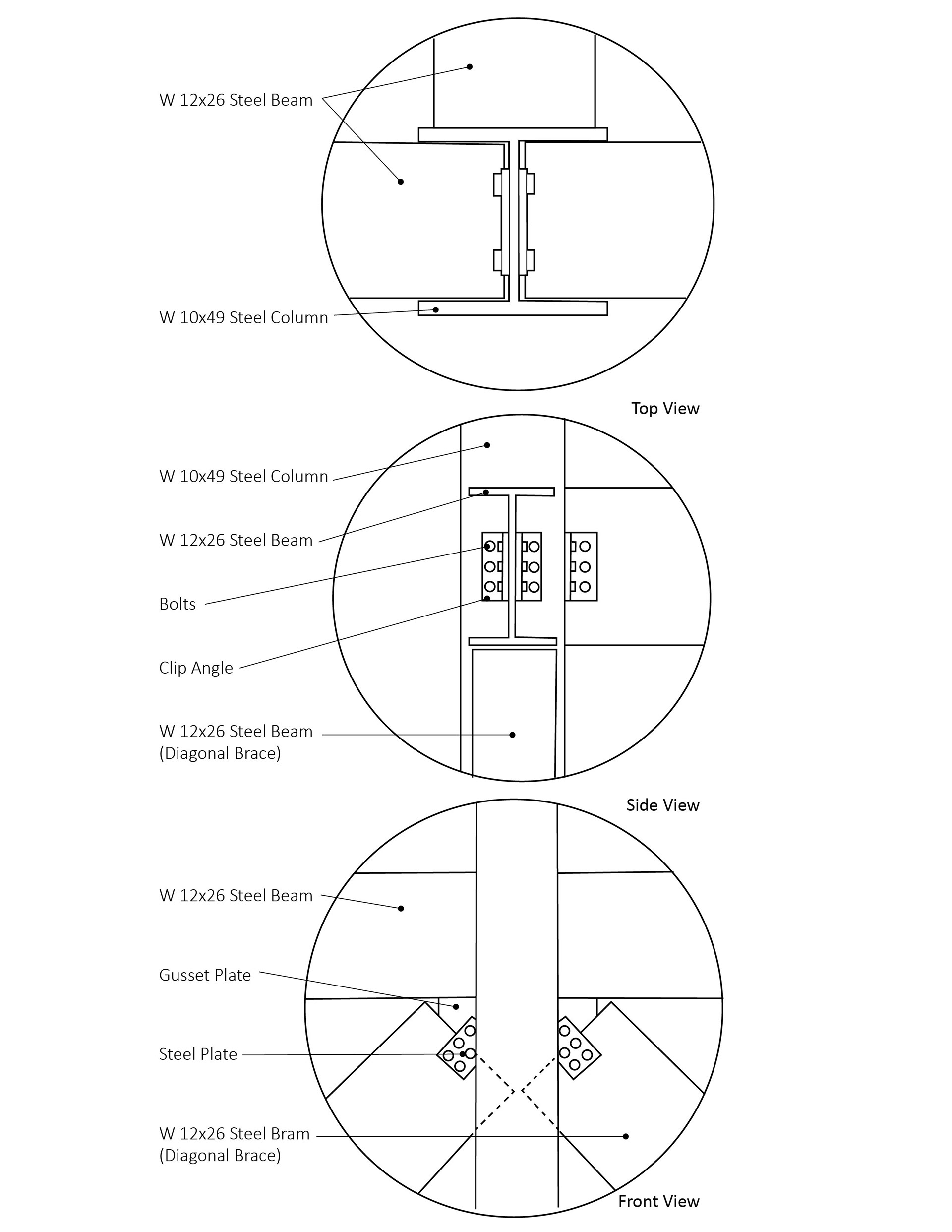
BEAM COLUMN CONNECTION DETAIL
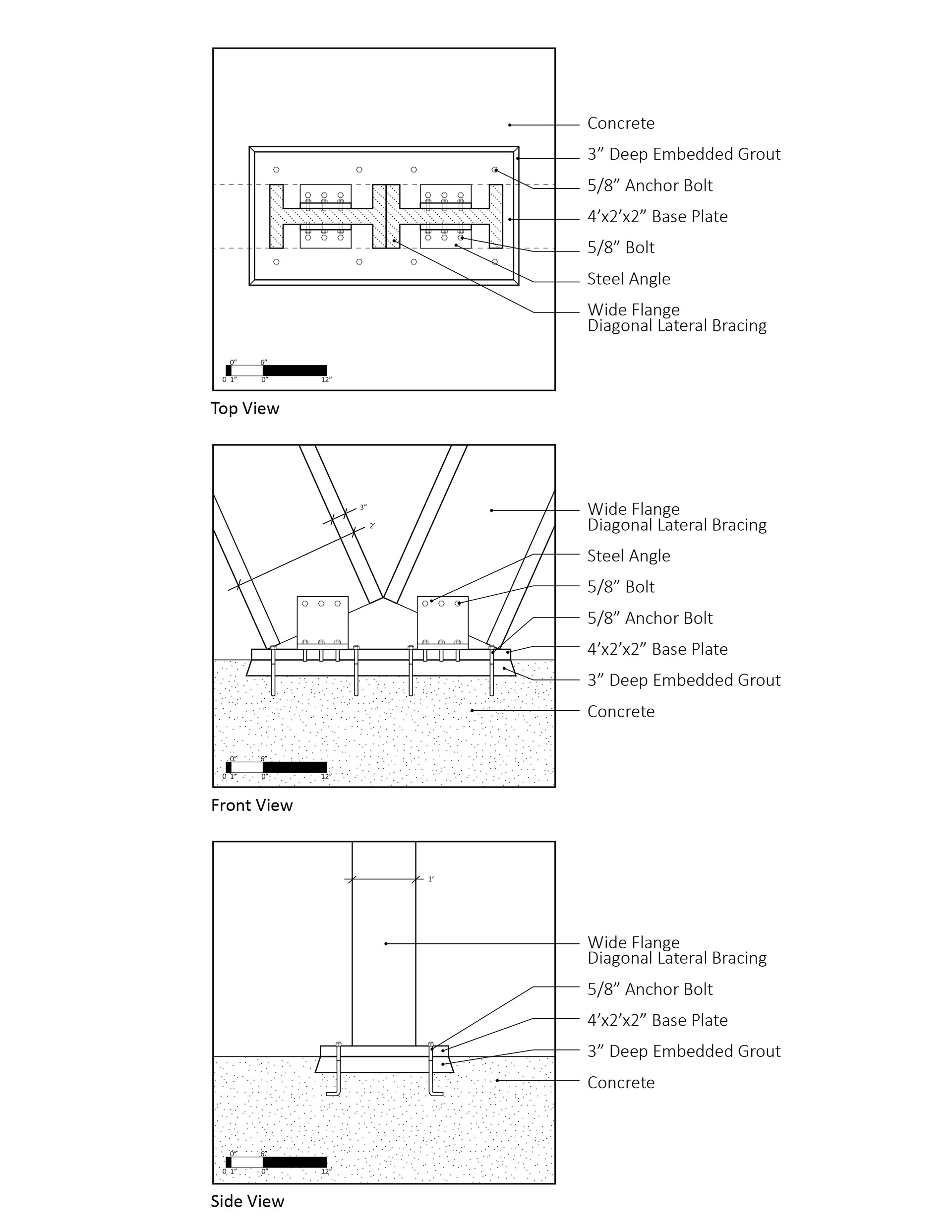
FOUNDATION BRACING CONNECTION DETAIL
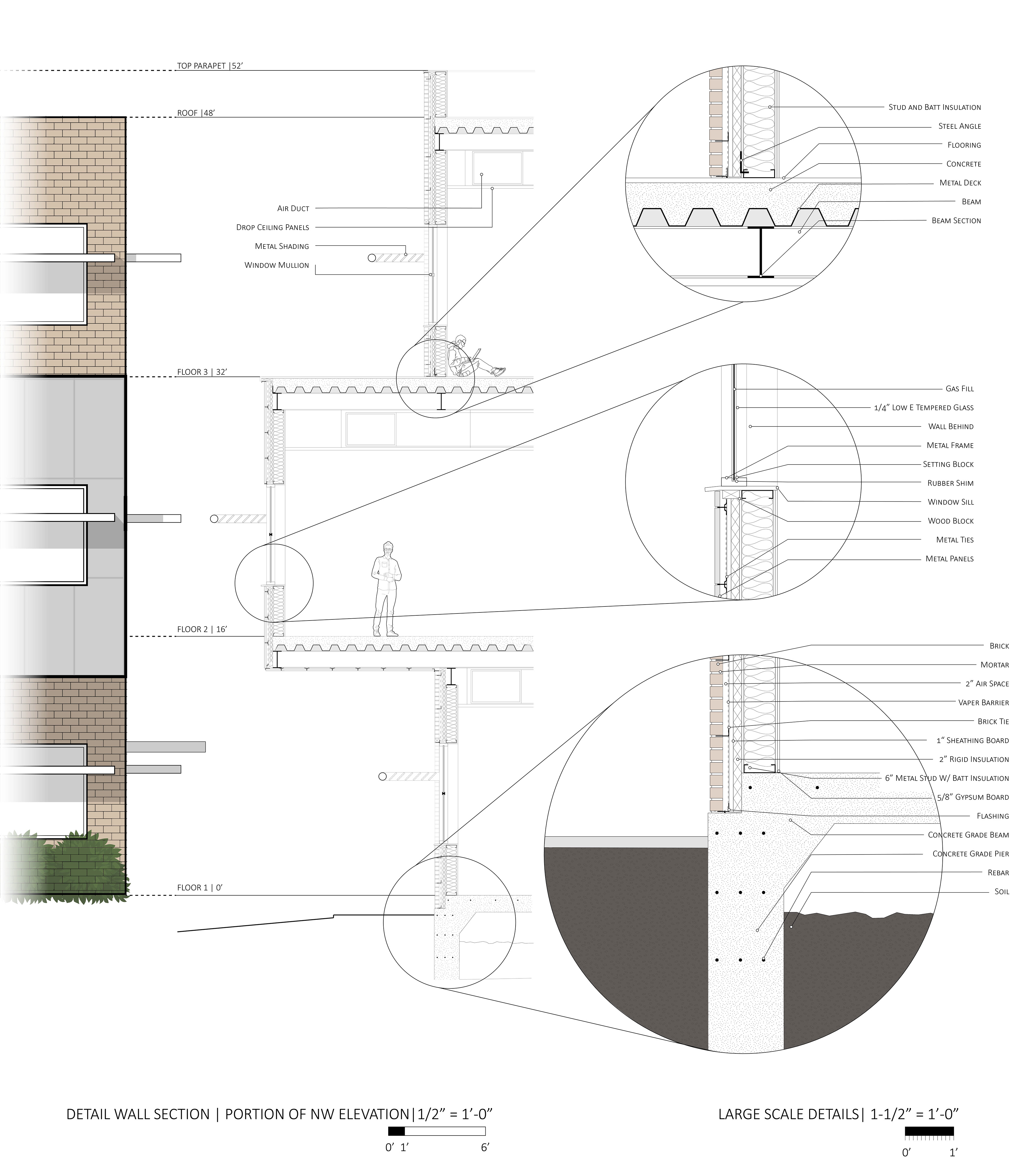
WALL DETAIL SECTION
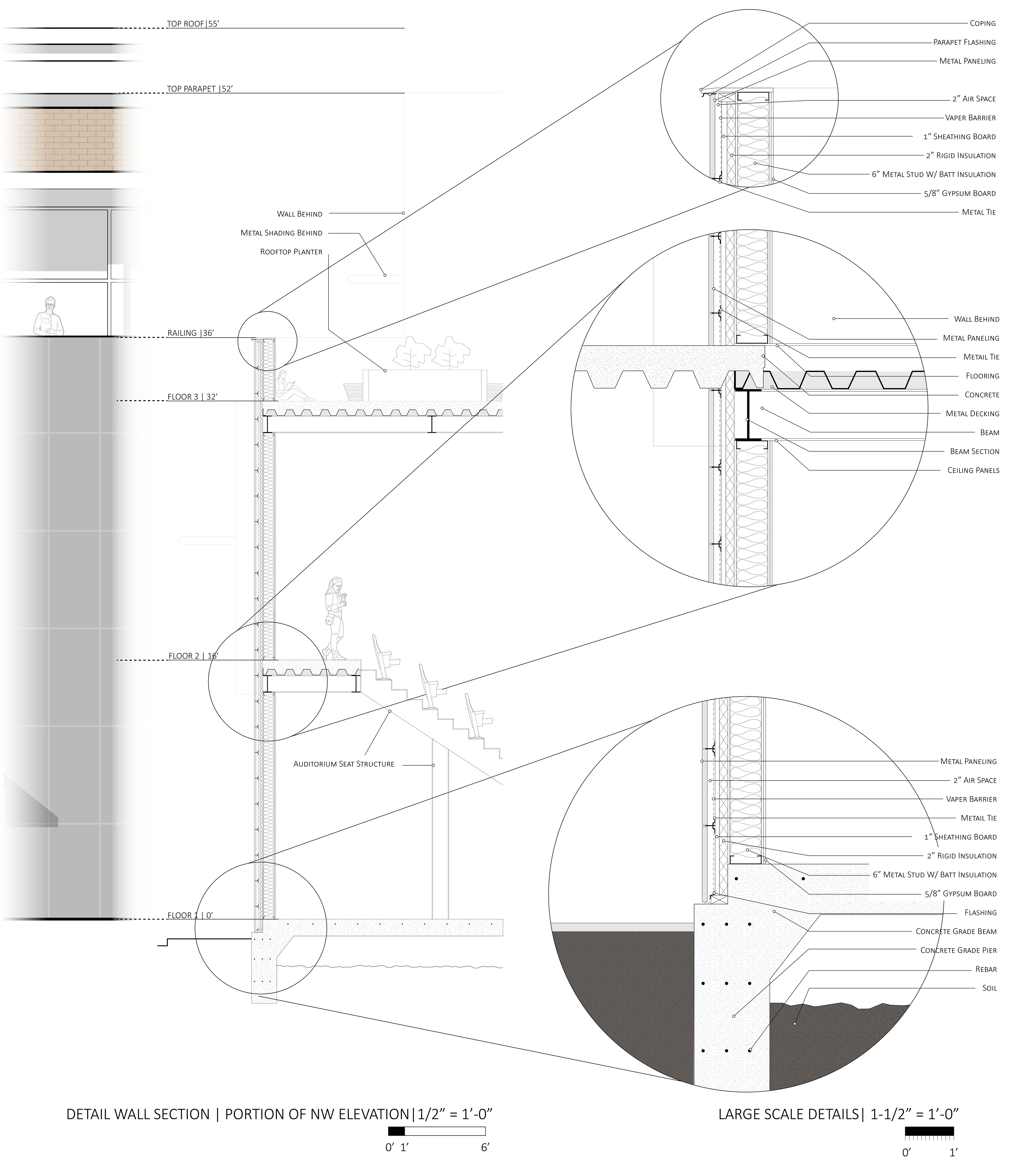
WALL DETAIL SECTION
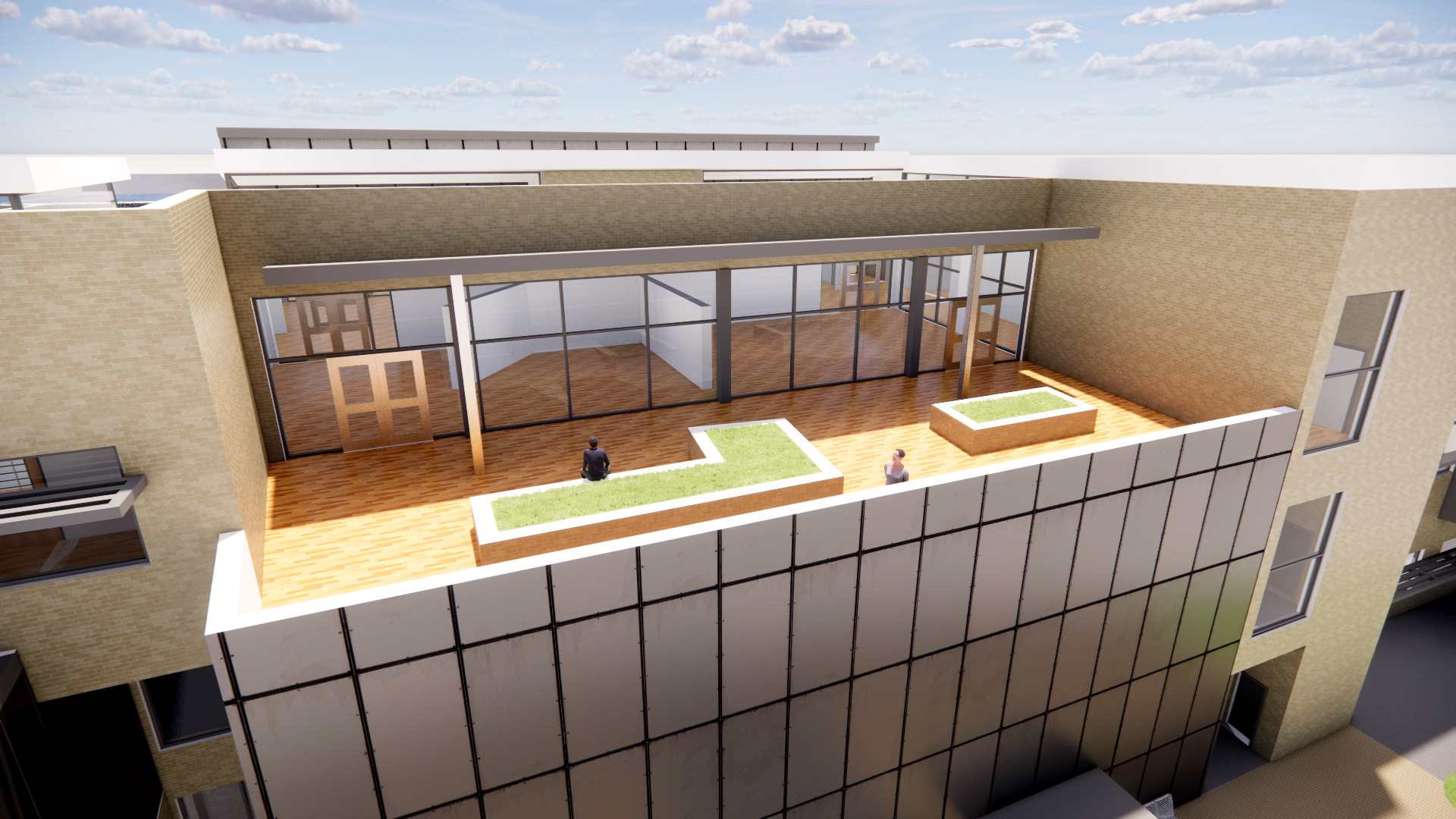
RENDER | GREEN ROOF
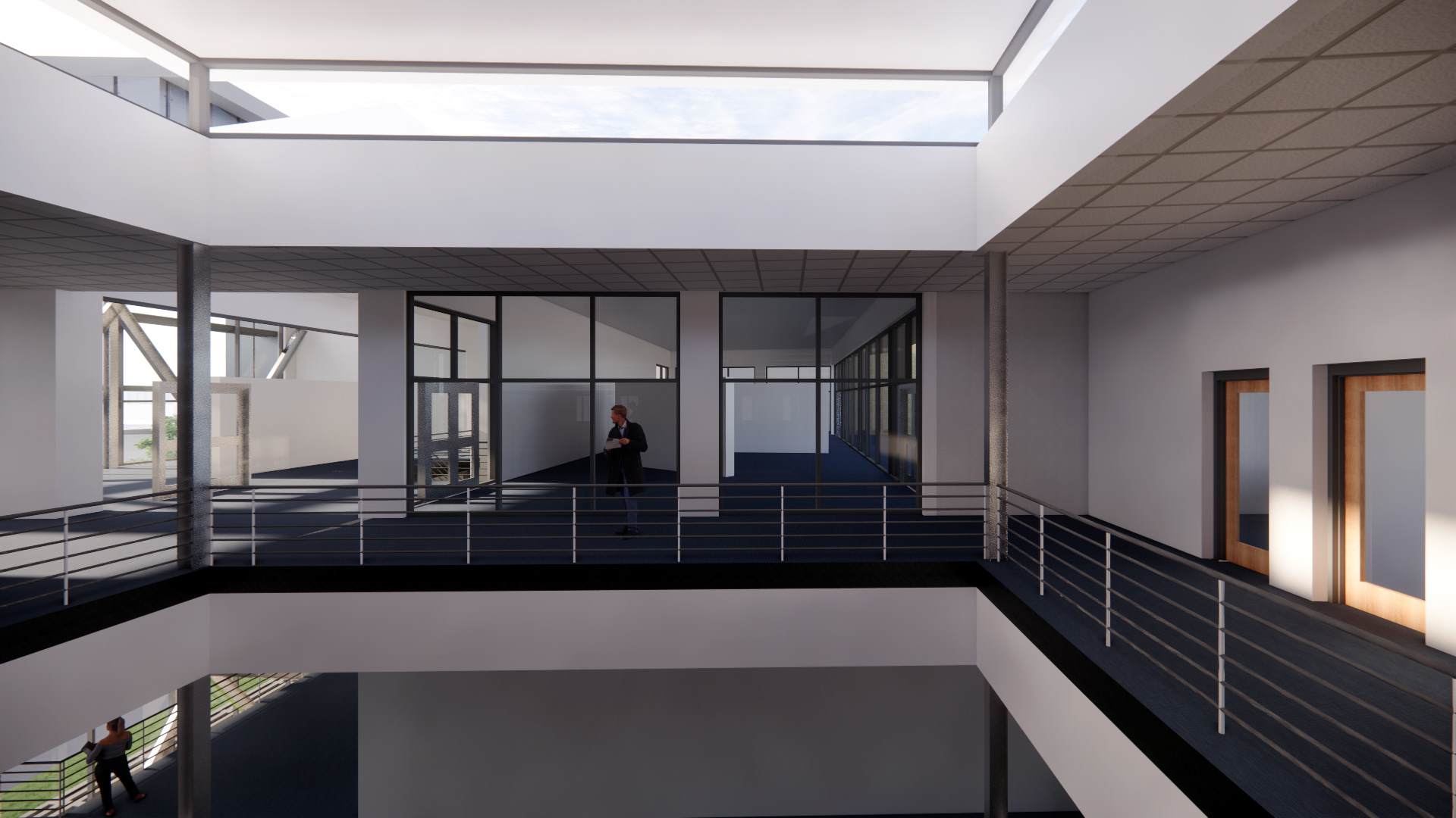
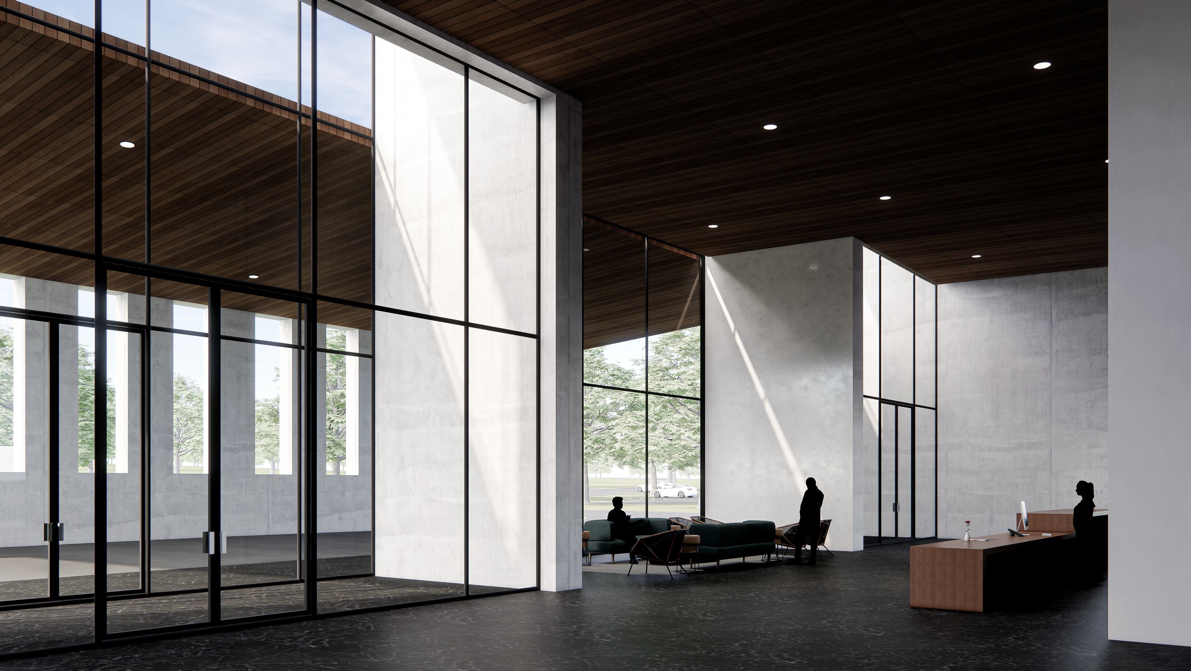
RENDER | FLOOR 3 | ADMIN ATRIUM
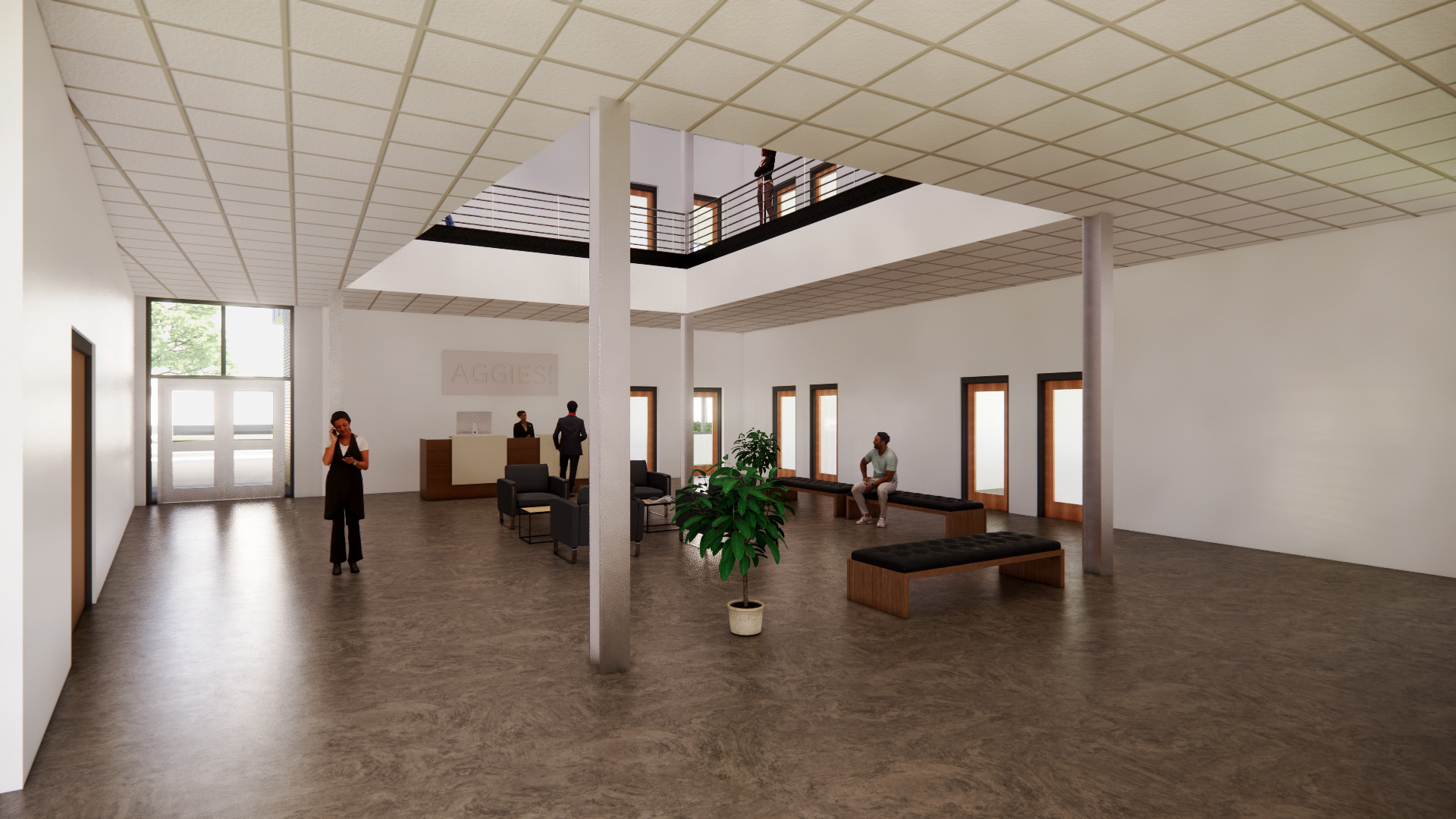
RENDER | FLOOR 1 | ADMIN RECEPTION
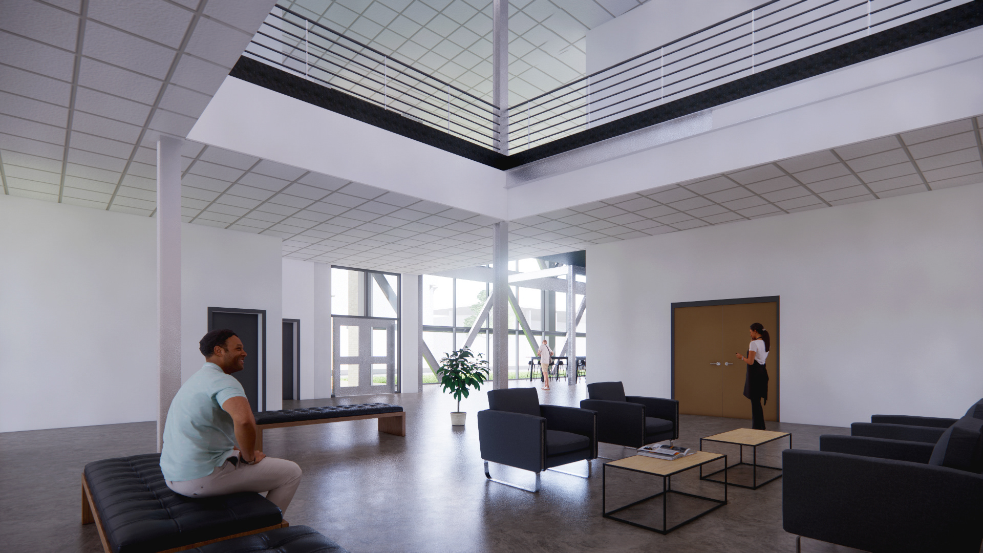
RENDER | FLOOR 1 | ADMIN RECEPTION
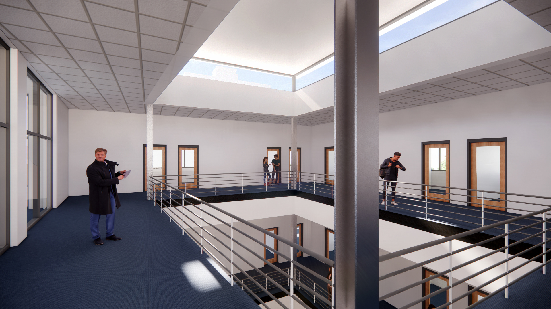
RENDER | FLOOR 3 | ADMIN ATRIUM

RENDER | FLOOR 1 | ATRIUM

RENDER | FLOOR 1 | ATRIUM
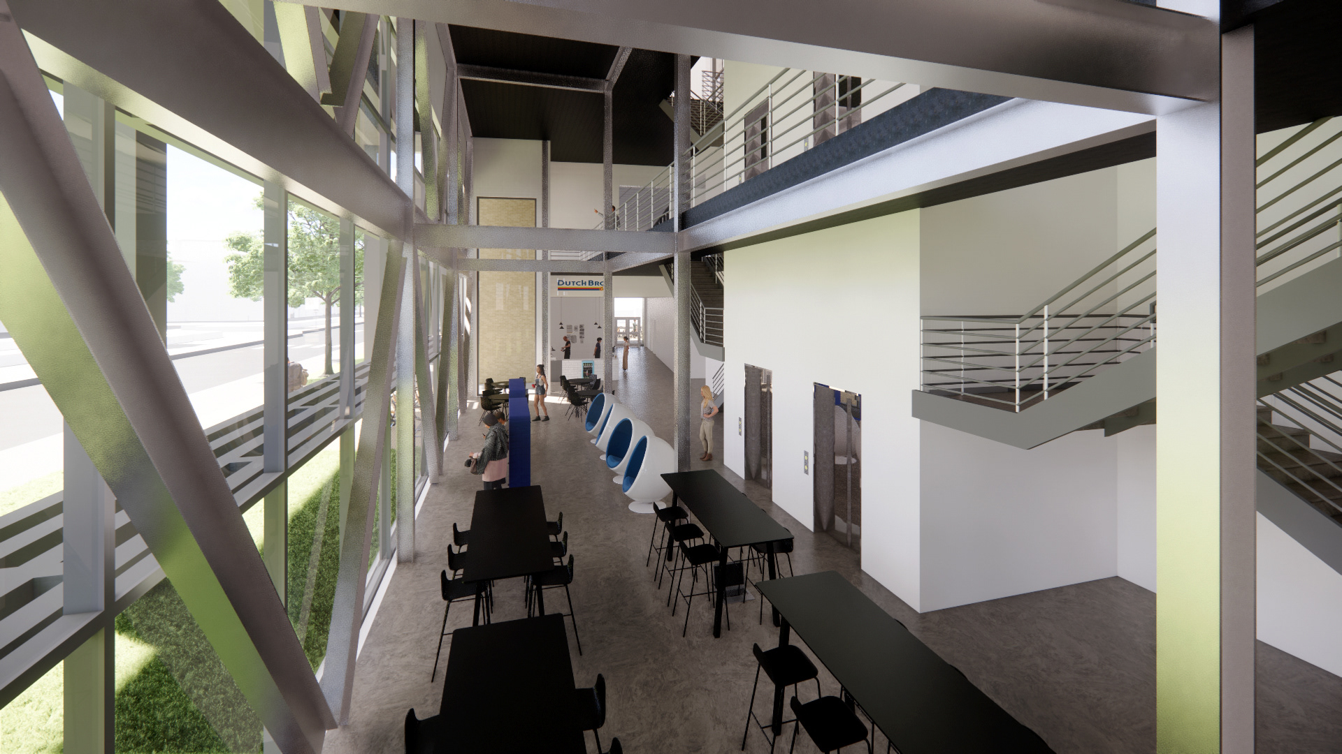
RENDER | FLOOR 1 | ATRIUM

RENDER | FLOOR 1 | CLASSROOM
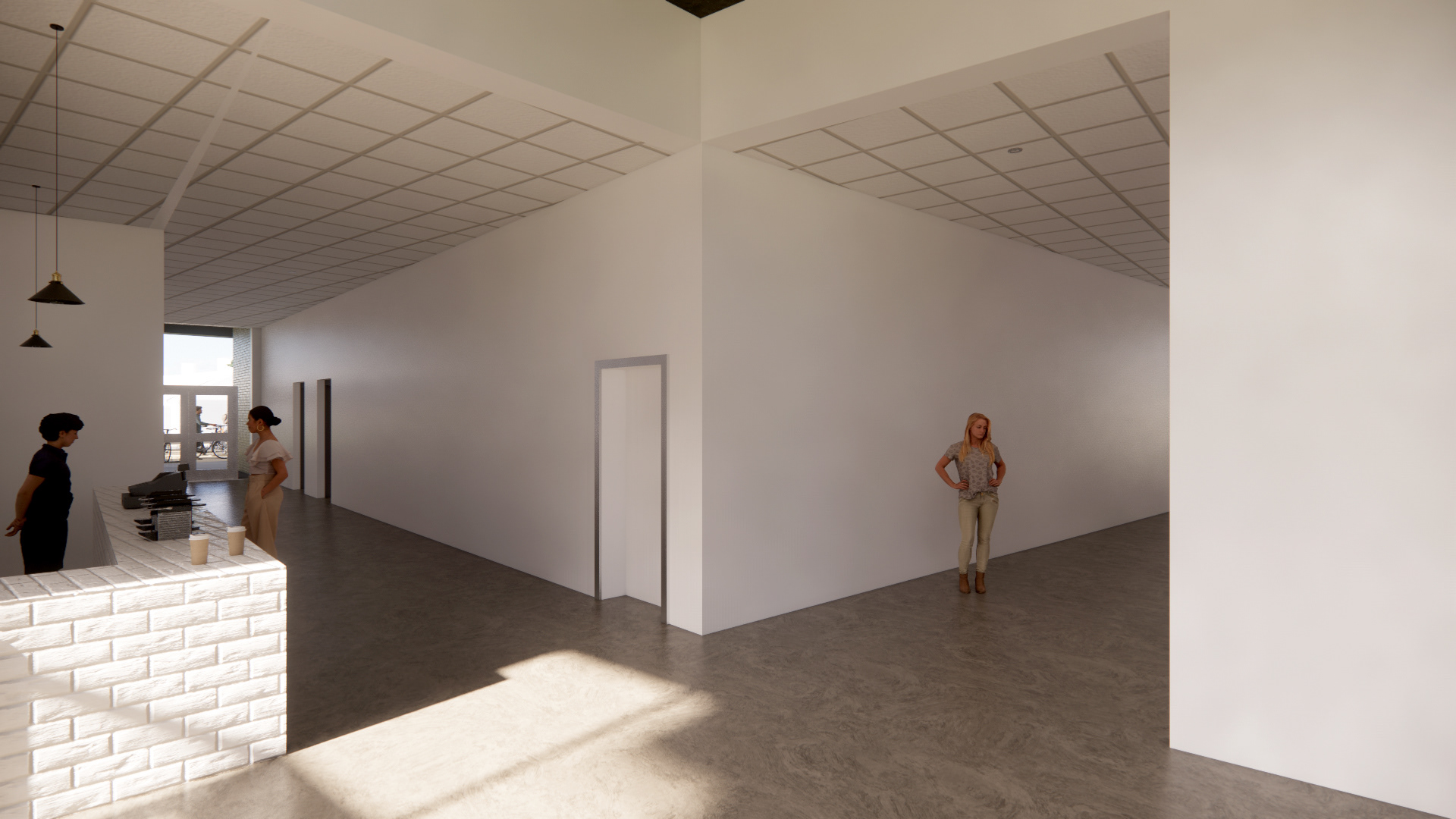
RENDER | FLOOR 1

RENDER | FLOOR 1 | CAFE

RENDER | FLOOR 2 | ATRIUM HALLWAY

RENDER | FLOOR 2 | HALLWAY
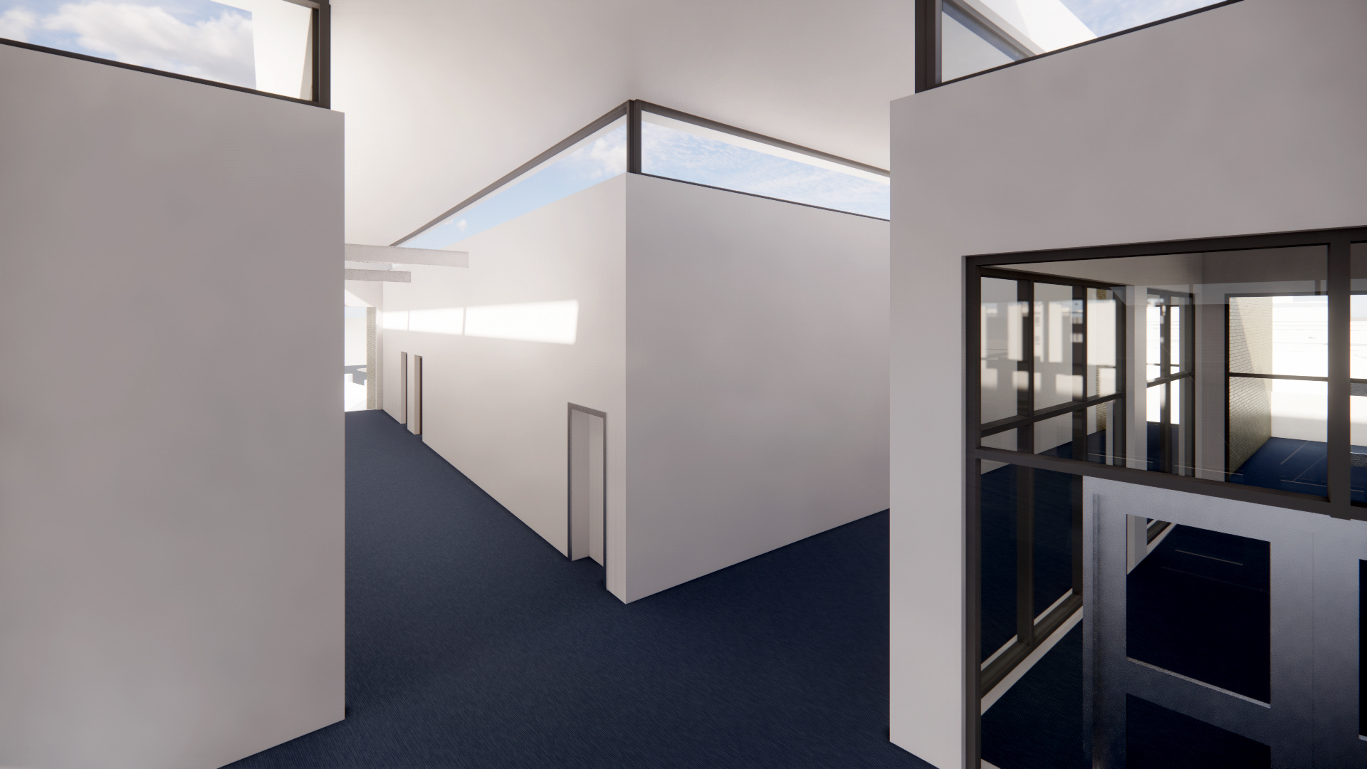
RENDER | FLOOR 3 | CLERESTORY WINDOWS
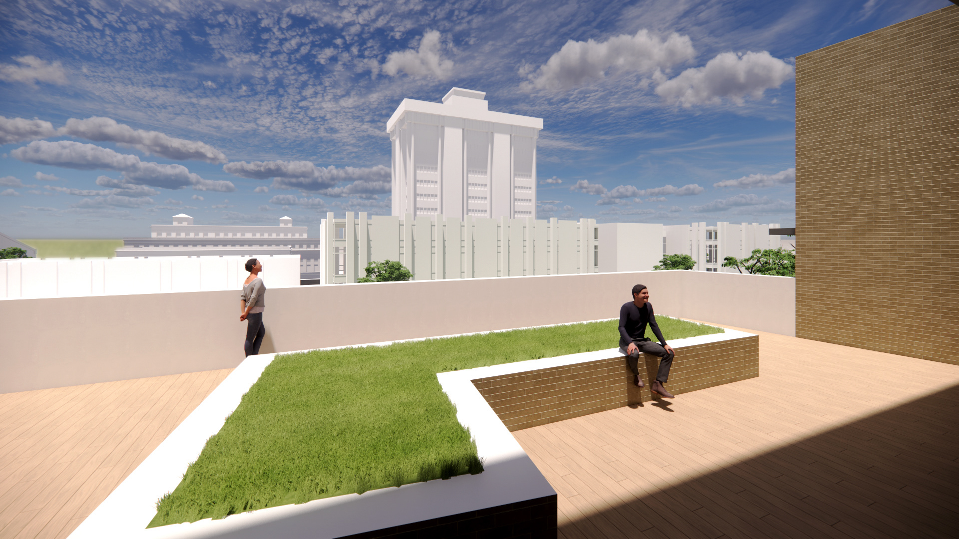
RENDER | GREEN ROOF
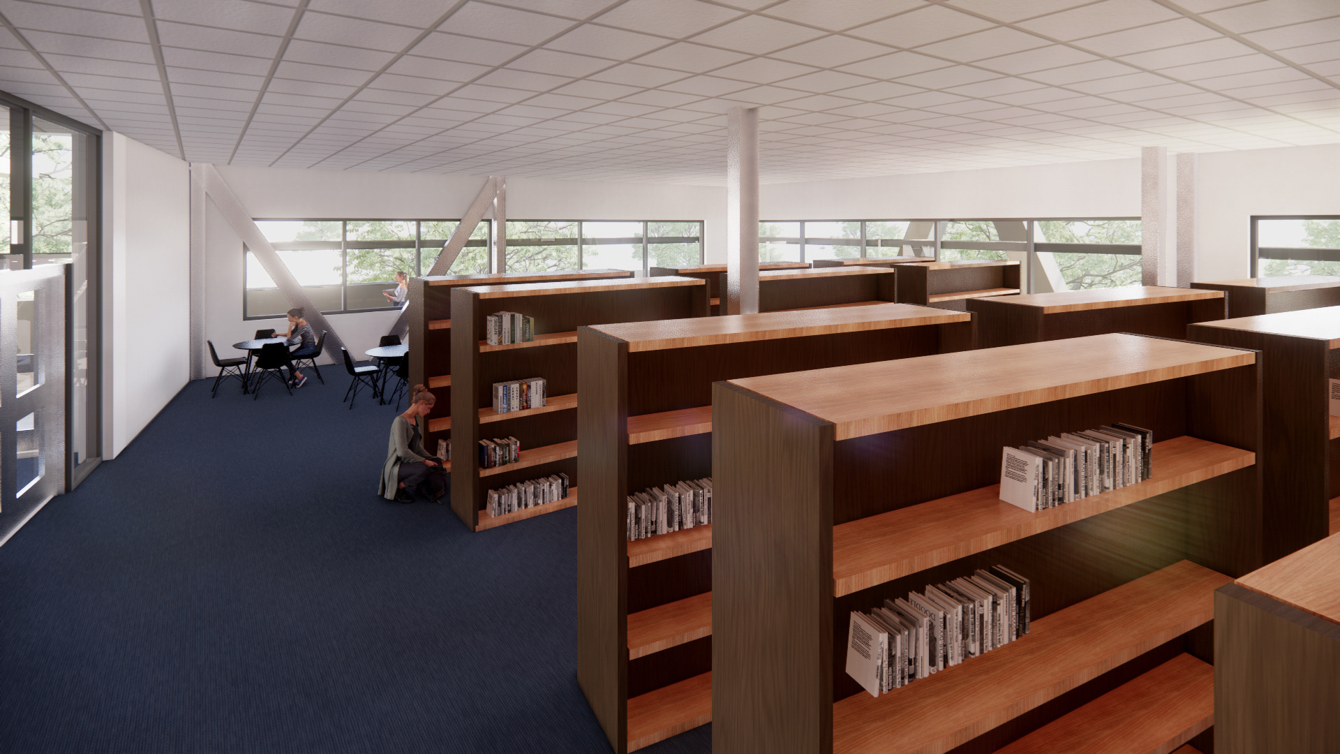
RENDER | FLOOR 2 | LIBRARY
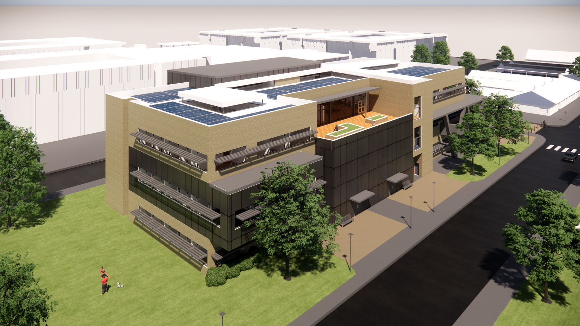
RENDER | NORTHEAST
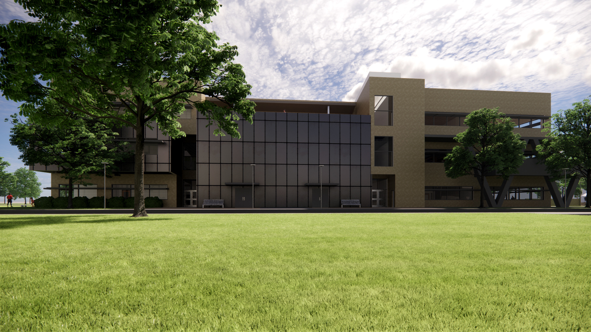
RENDER | NORTH

RENDER | ORTHO

RENDER | ORTHO

RENDER | ORTHO
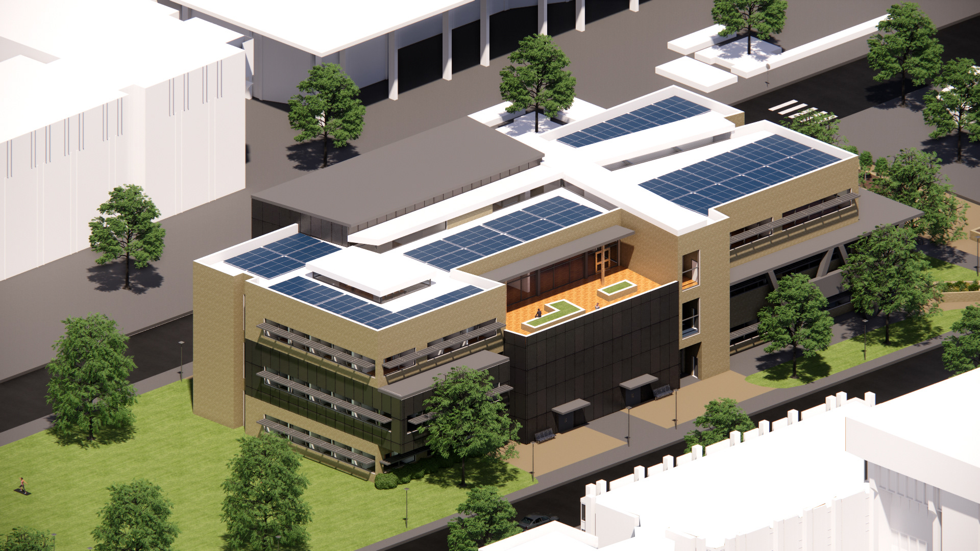
RENDER | ORTHO
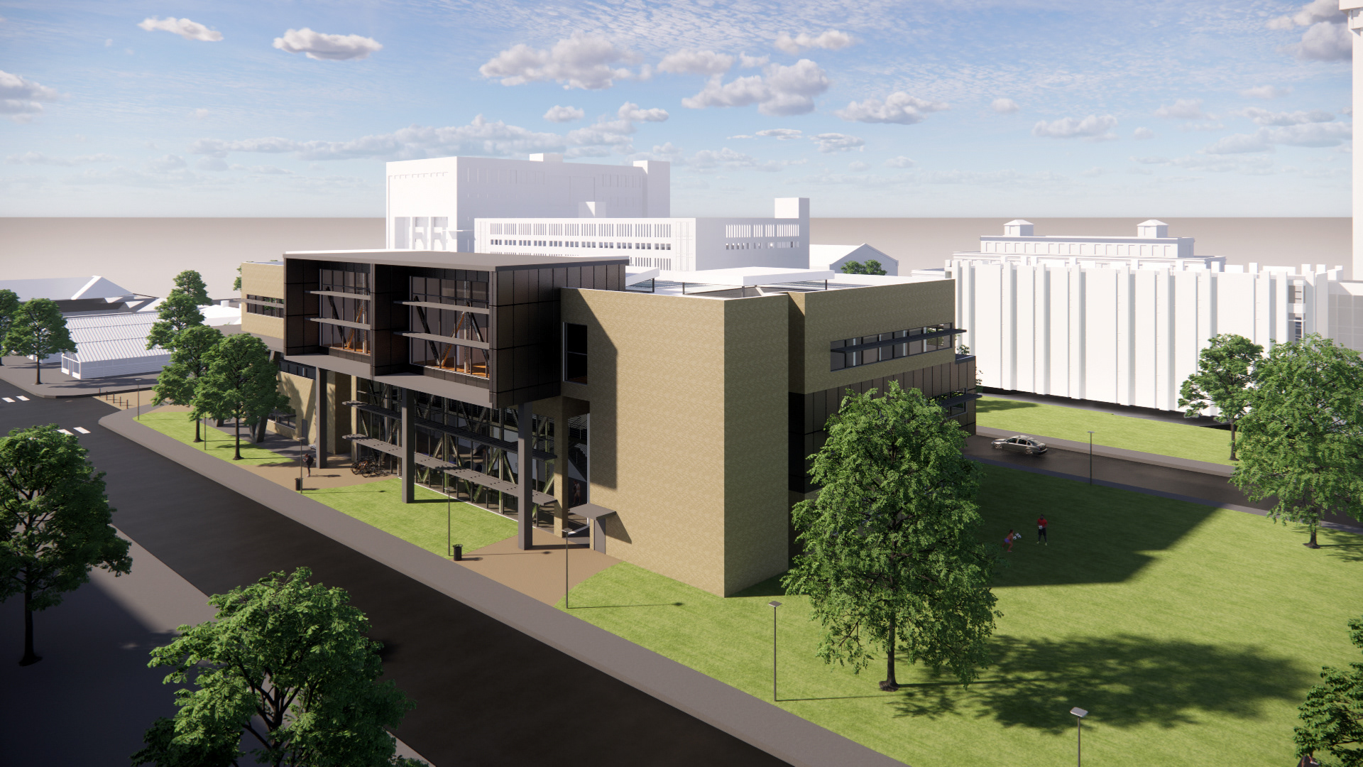
RENDER | SOUTHEAST

RENDER | SOUTH

RENDER | WEST

RENDER | WEST
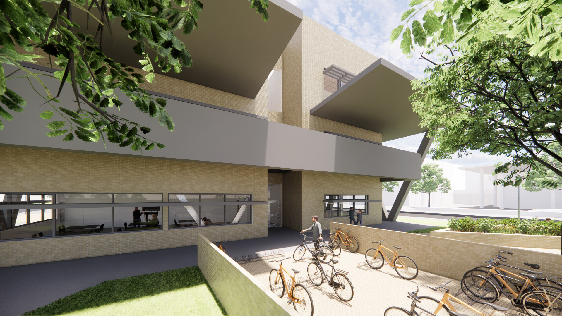
RENDER | WEST

MODEL
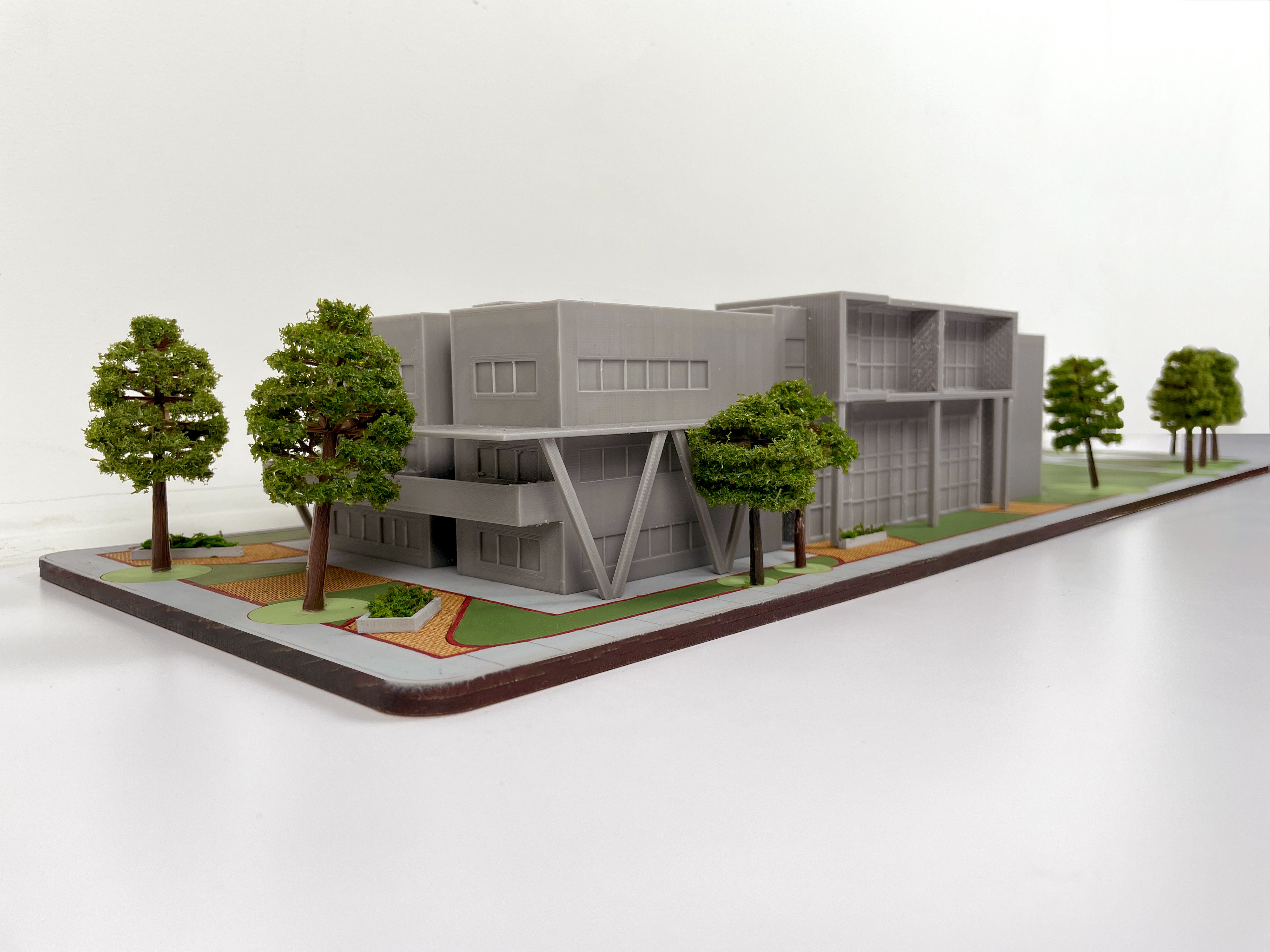
MODEL
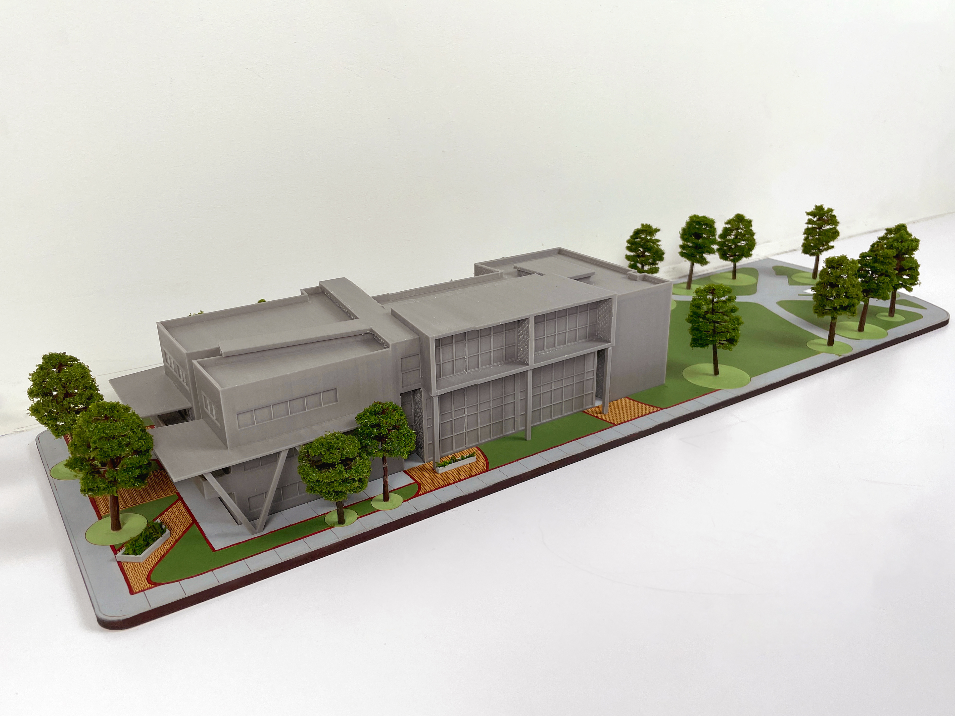
MODEL

MODEL
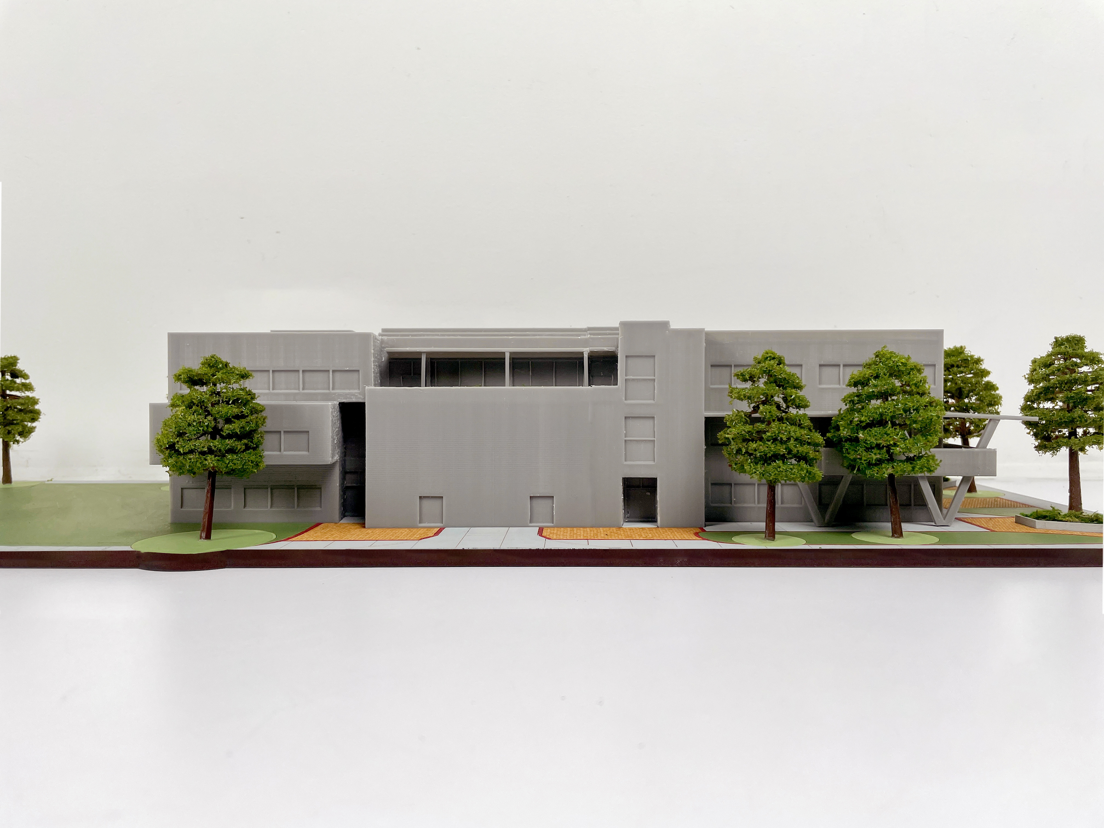
MODEL

MODEL
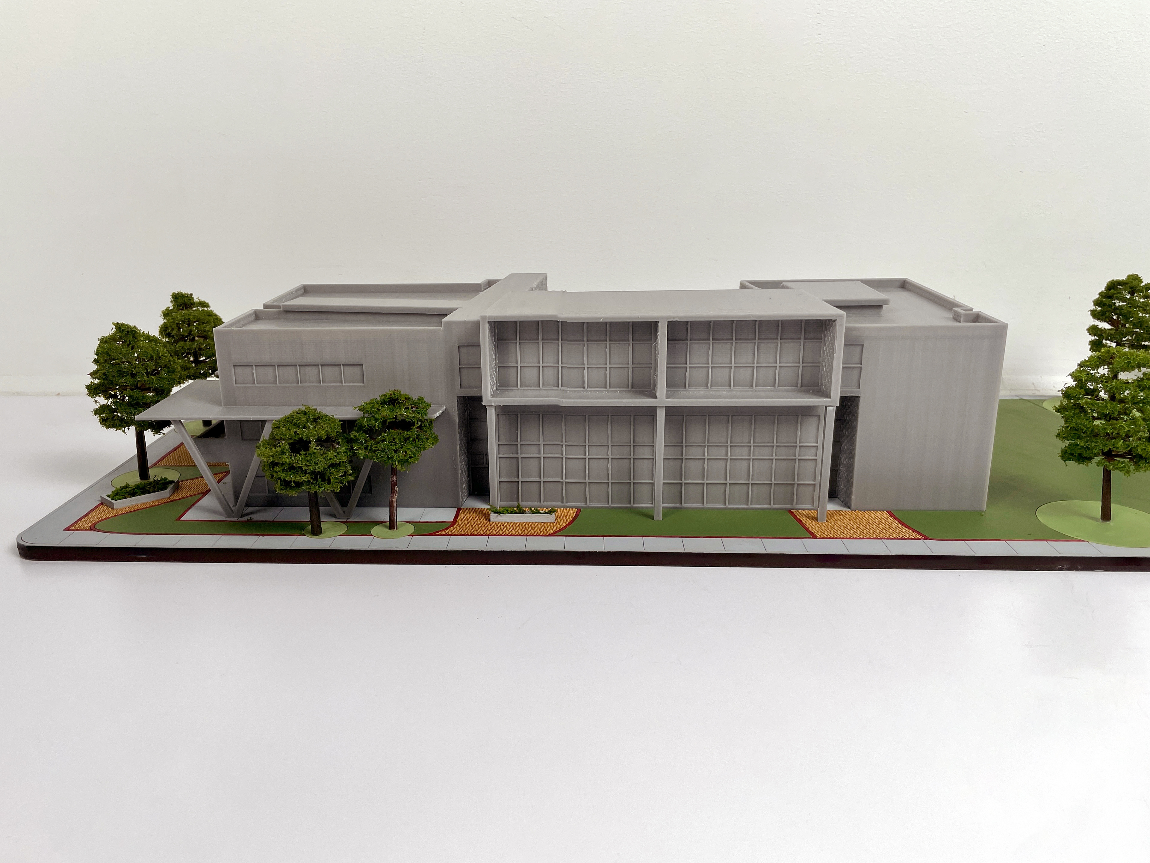
MODEL

MODEL

MODEL
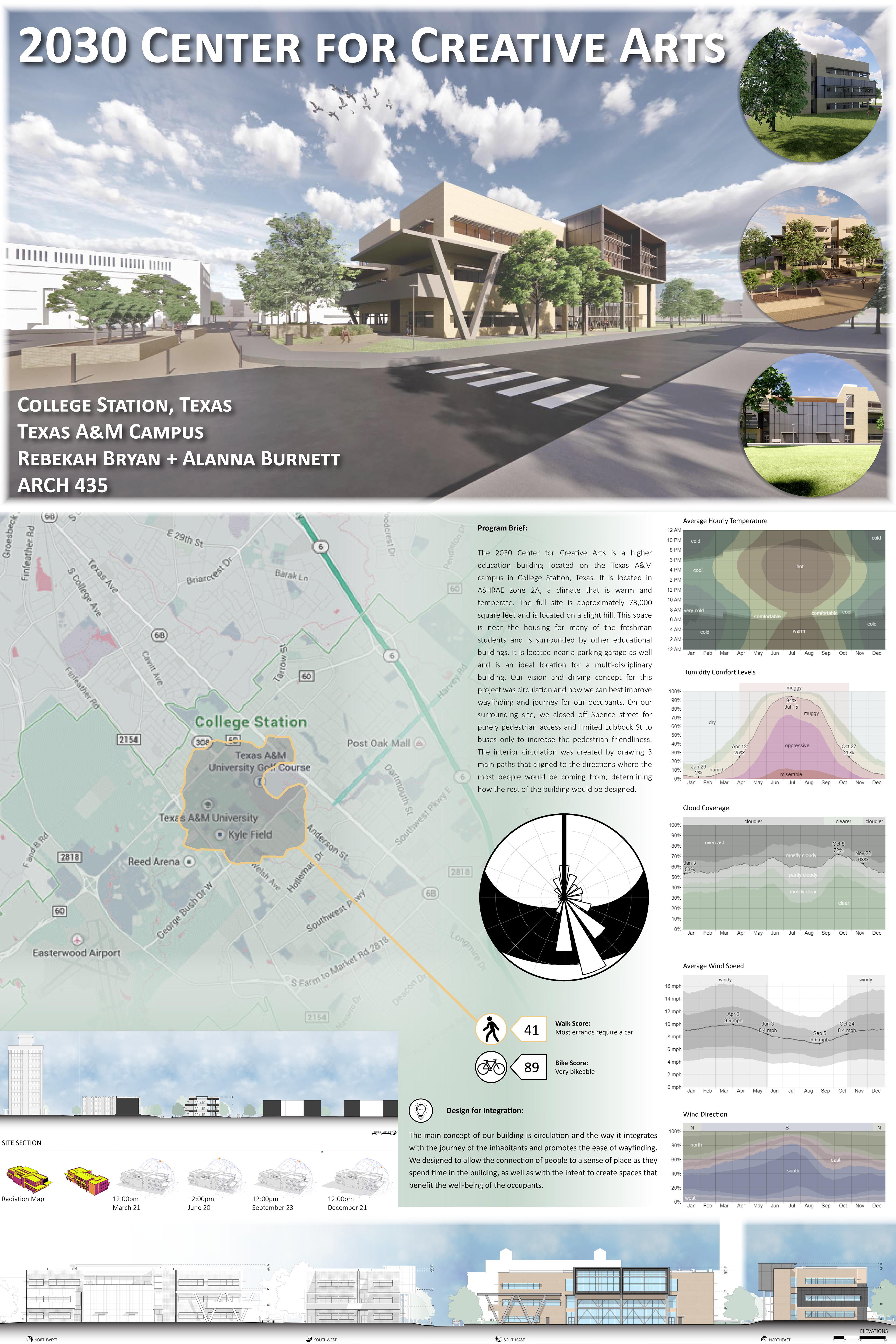
SYSTEMS FINAL REPORT
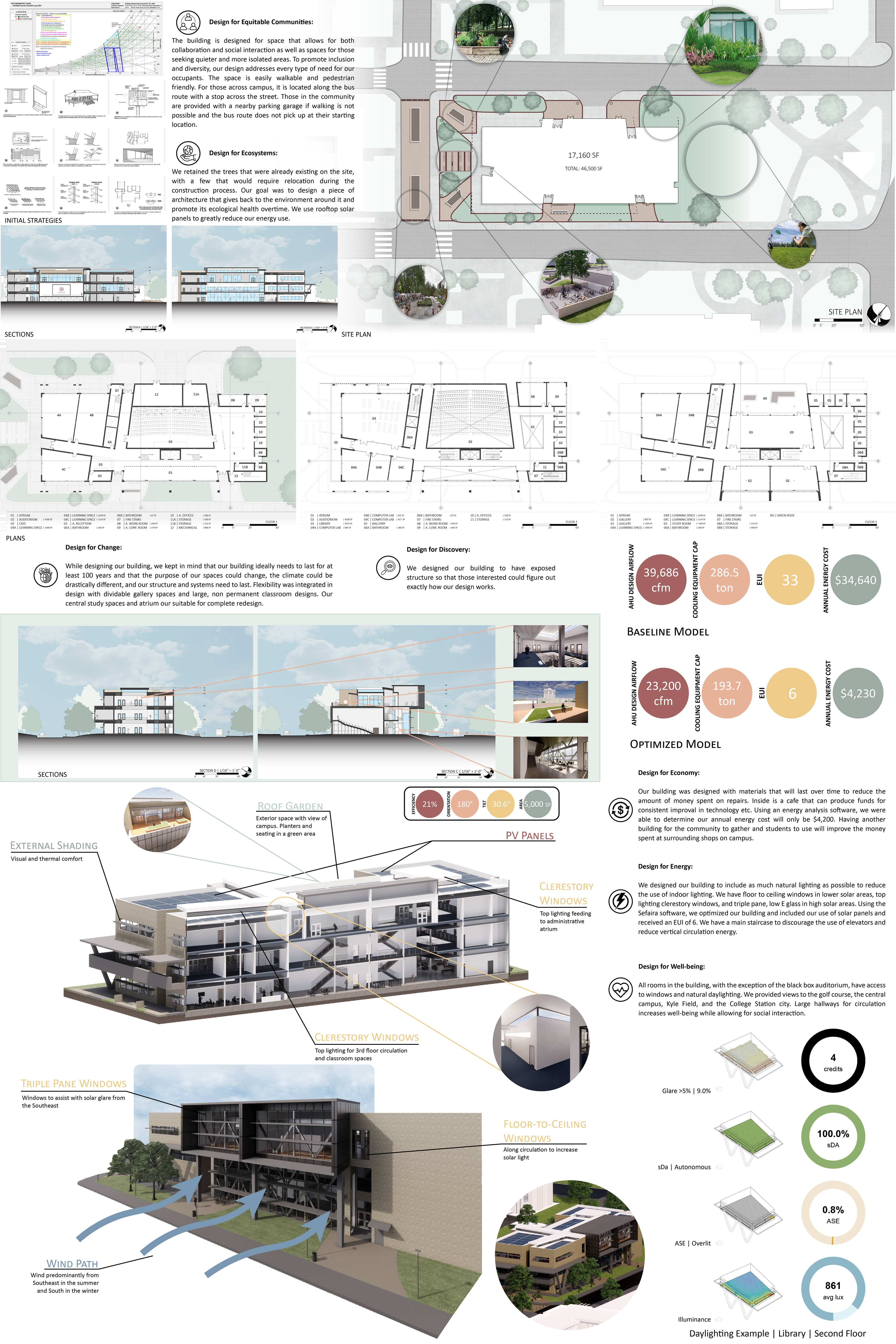
SYSTEMS FINAL REPORT
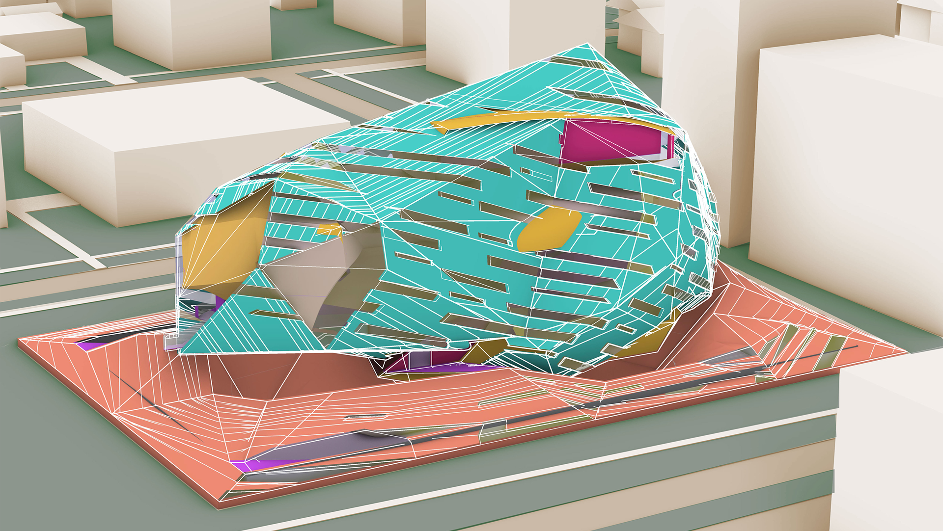
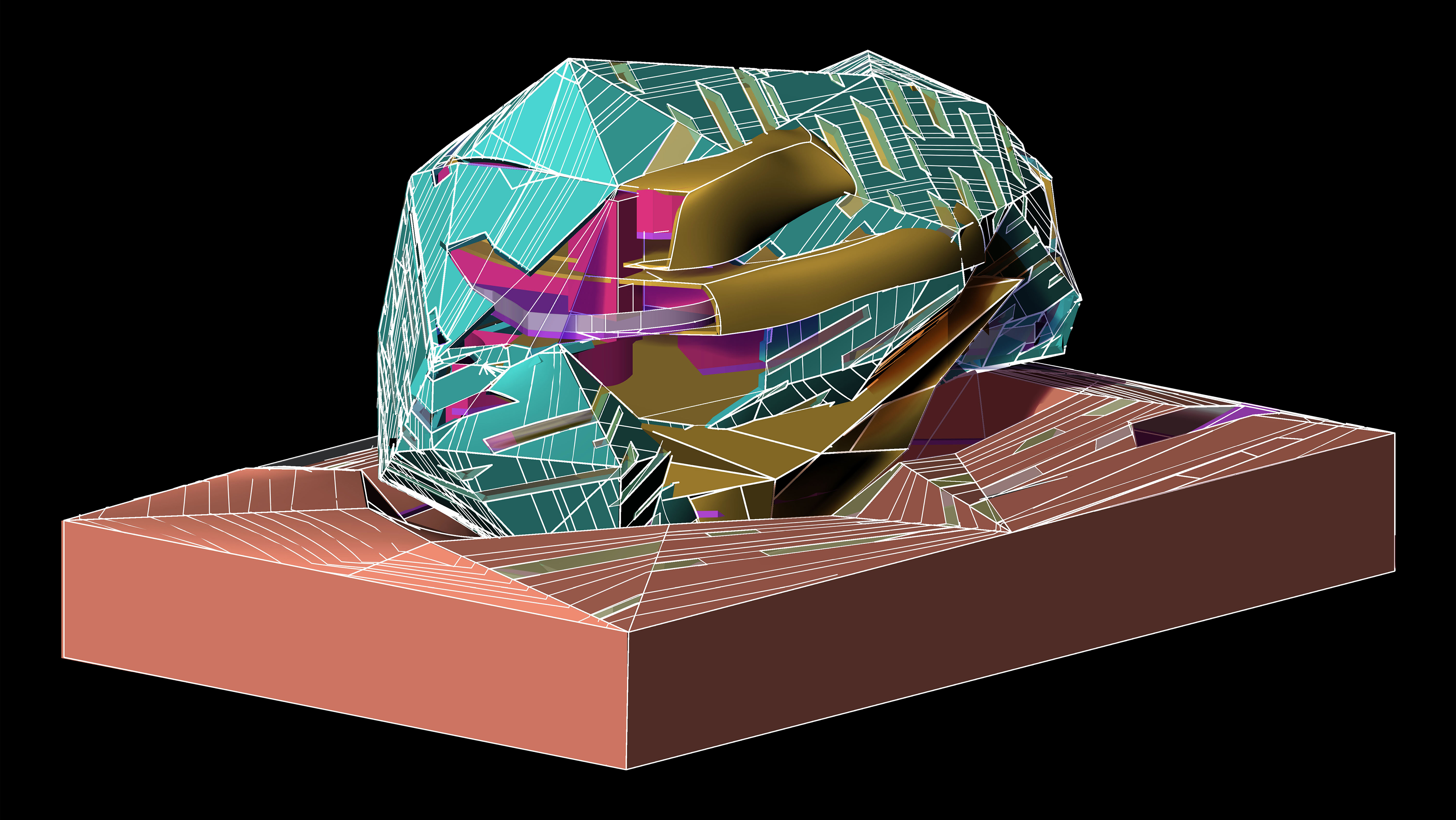
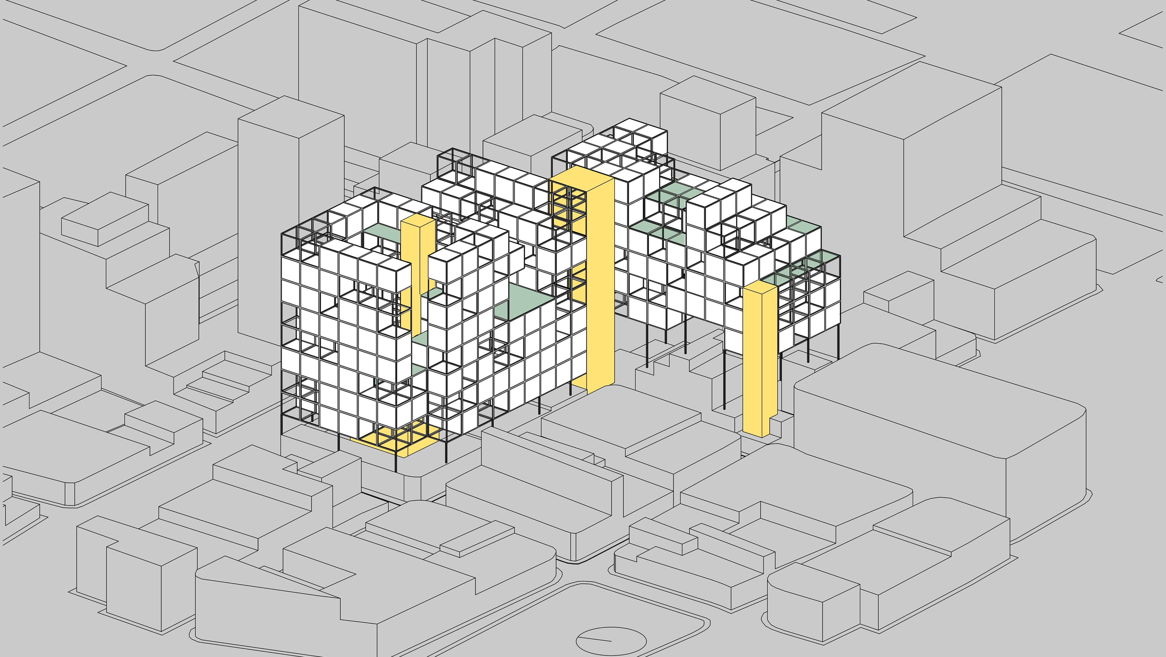
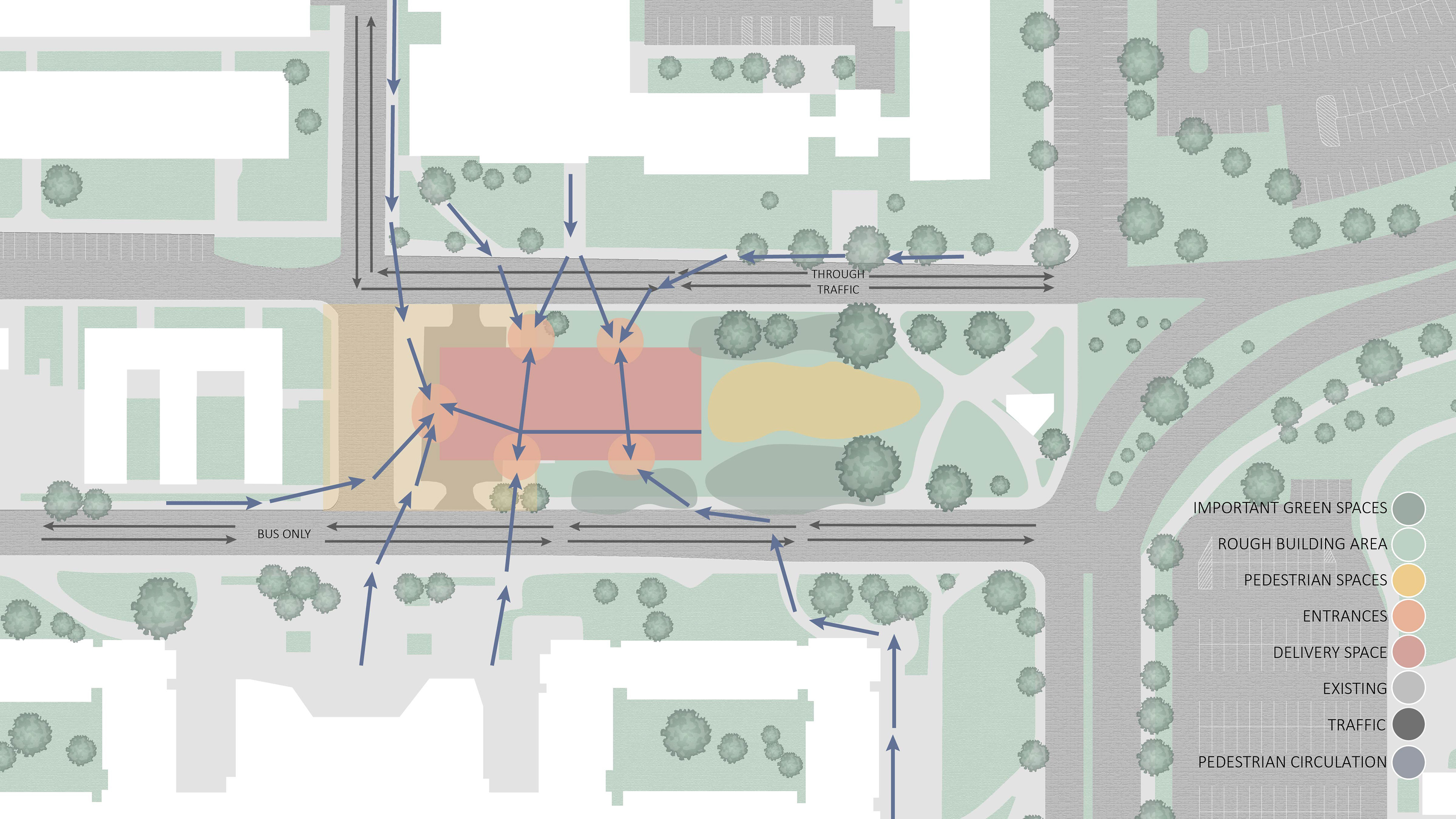
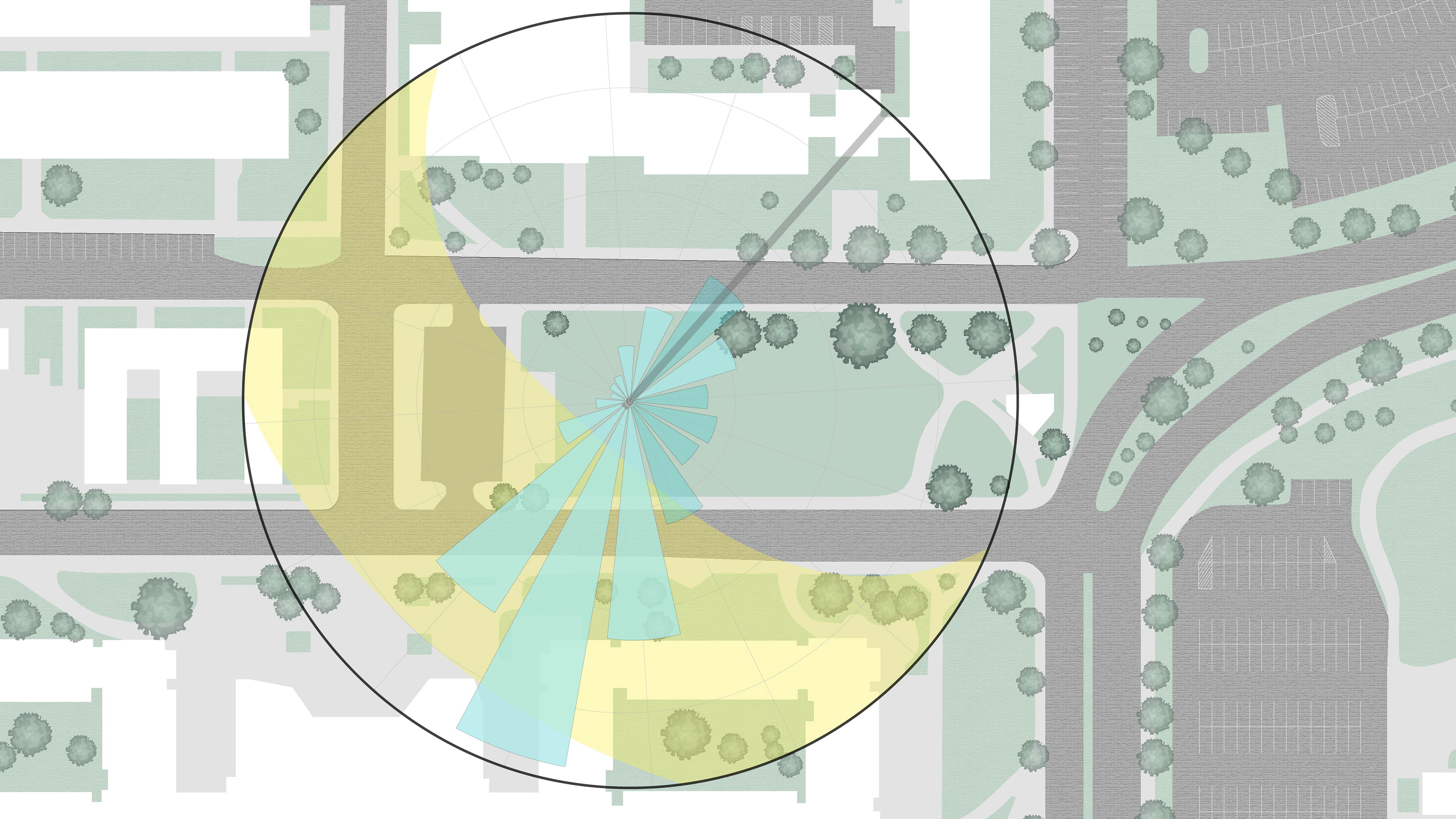
The main concept that guided the design for our project is circulation. When we first began the project, we took a holistic view of the site. We found that there are four main directions that pedestrians will be coming from, two main roads for through traffic, and one primary area that bikes will travel through. Based on this information, we closed the road directly to the left of our site (when looking at the site plan) so that it can be used for bike traffic and pedestrian use only. This is the direction that the majority of people will be coming from however, it is currently used for cars. We felt that it would be more efficient to redirect traffic and allow pedestrians to use this area as an outdoor space and a large walkway. The road directly above our site (when looking at the site plan) will now be designated for cars only because it is the road that leads to the parking garage adjacent to our site. The road directly below our site (when looking at the site plan) will be used for bus traffic only because there is a major bus stop in front of The Commons. The Commons is a large dining hall attached to four dormitories that is also adjacent to our site to the south. We decided to make the road in between The Commons and our site a bus only road because bus traffic won’t be disrupted by cars and students tend to walk across the street without using the crosswalk. Our vision for this road is for there to be less traffic and more outdoor space because in between classes there will be a very large amount of students and faculty walking to their next destination. It was important for us to make this part of their day as enjoyable and easy as possible.
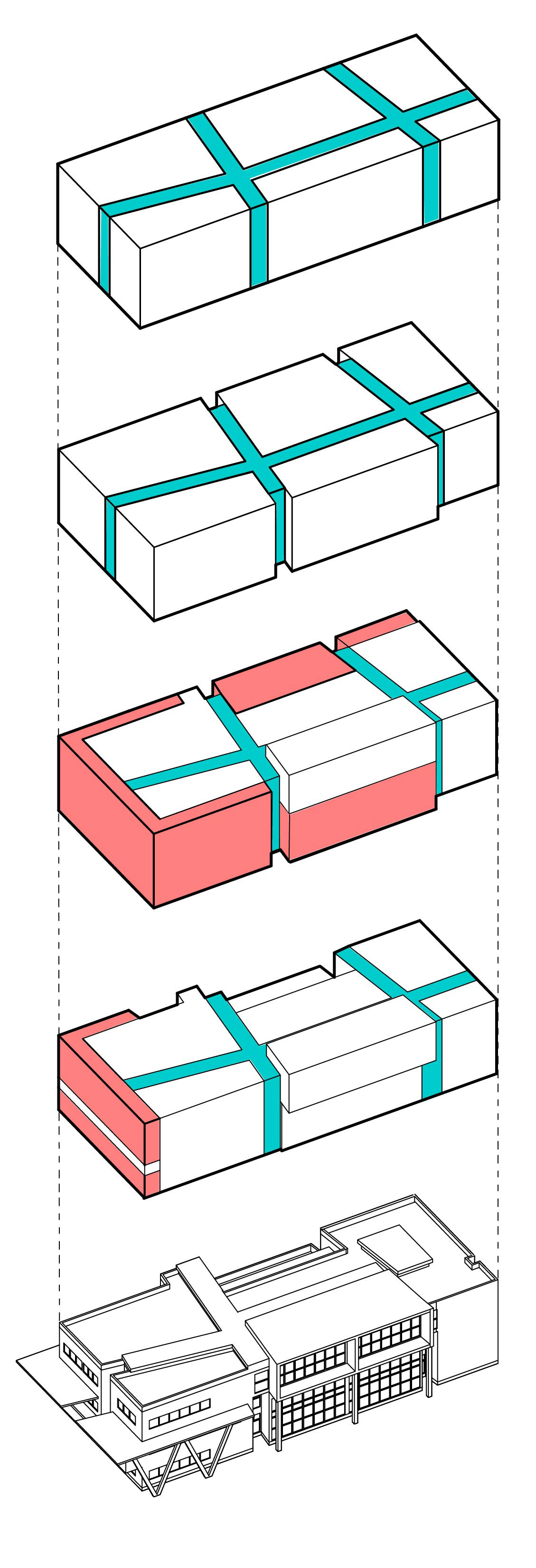
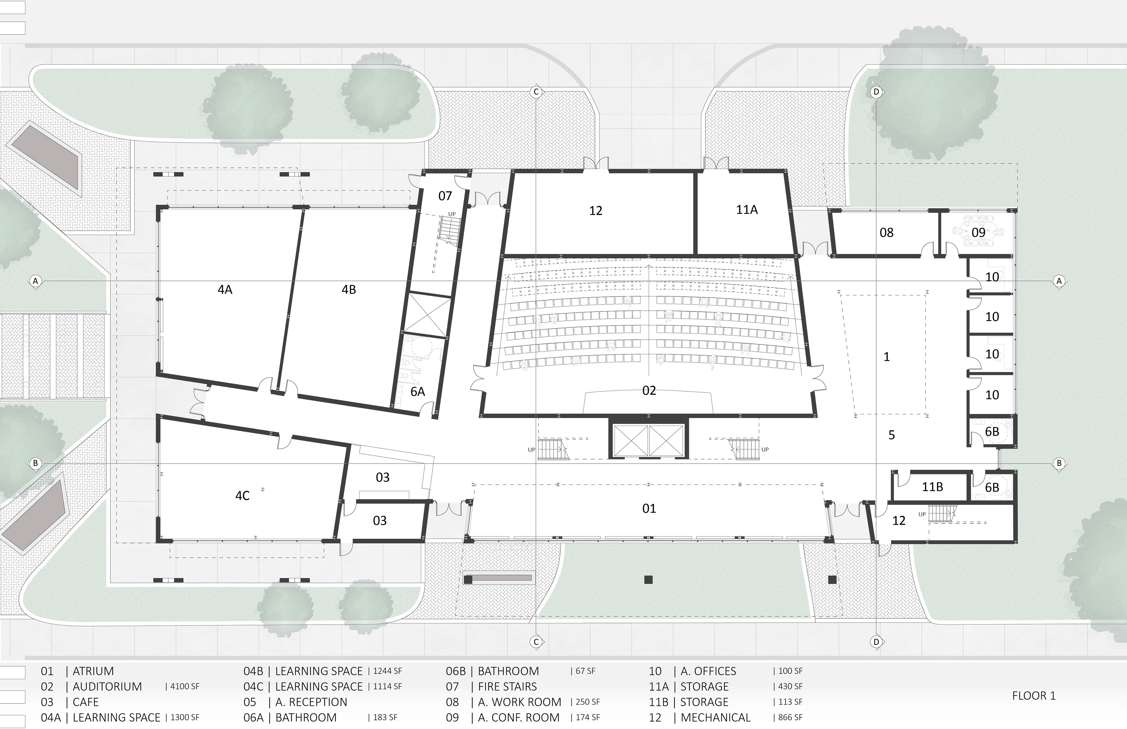
After analyzing the circulation of the site, we drew 3 main paths that aligned to the directions where the most people will be coming from. These paths determined how the rest of our building was set up. Circulation was our main guiding factor however for the interior of our building, we decided to break the main concept of circulation down into two different parts: wayfinding and journey. Wayfinding is the mental process in which people orient themselves within a space and are able to navigate from one area to another. It was important to us that our building had easy wayfinding for everyone inside, therefore, our entire design is shaped by our circulation. The primary circulation follows our three main paths which are repeated on each floor. Along the set circulation path, a person is able to choose their own journey depending on their unique schedule during the day. There are two sections of our building: the administration side and the student side. As another part of our concept, students and faculty have their respective sides but “blend” together where both of their journeys overlap at the center of our building. The auditorium, art galleries, and lounge space are all spaces that both students and faculty will be using. We placed these areas at the center of our building to encourage students and faculty to intermingle during the day. Our goal with this layout was to keep wayfinding easy and for everything to make sense according to a person’s path of travel.

