ARCH 607 / 608
FALL 2023 / SPRING 2024
PROF. MARCEL ERMINY
ARCHITECTURAL DESIGN III / IV
FALL 2023 / SPRING 2024
PROF. MARCEL ERMINY
ARCHITECTURAL DESIGN III / IV
COMMITTEE
RAY PENTECOST
STEPHEN CAFFEY
SUSANNEH BIEBER
SITE LOCATION: Dallas, Texas
SITE ASPECTS: Downtown
PROGRAM: Museum, Theater
TYPE: Individual Project, Final Project
SEMESTER: Fall 2023 - Spring 2024 | M.ARCH
There is a lot contained in this project that I am proud of and would love to show off, however I feel that it cannot fully be realized on this site alone. Please visit the final book that was produced for this project!
Celebration of Excellence Script
During the celebration of excellence, we were giving 5 minutes to present our entire presentations, so if the book is too daunting, feel free to read for a quicker overview.
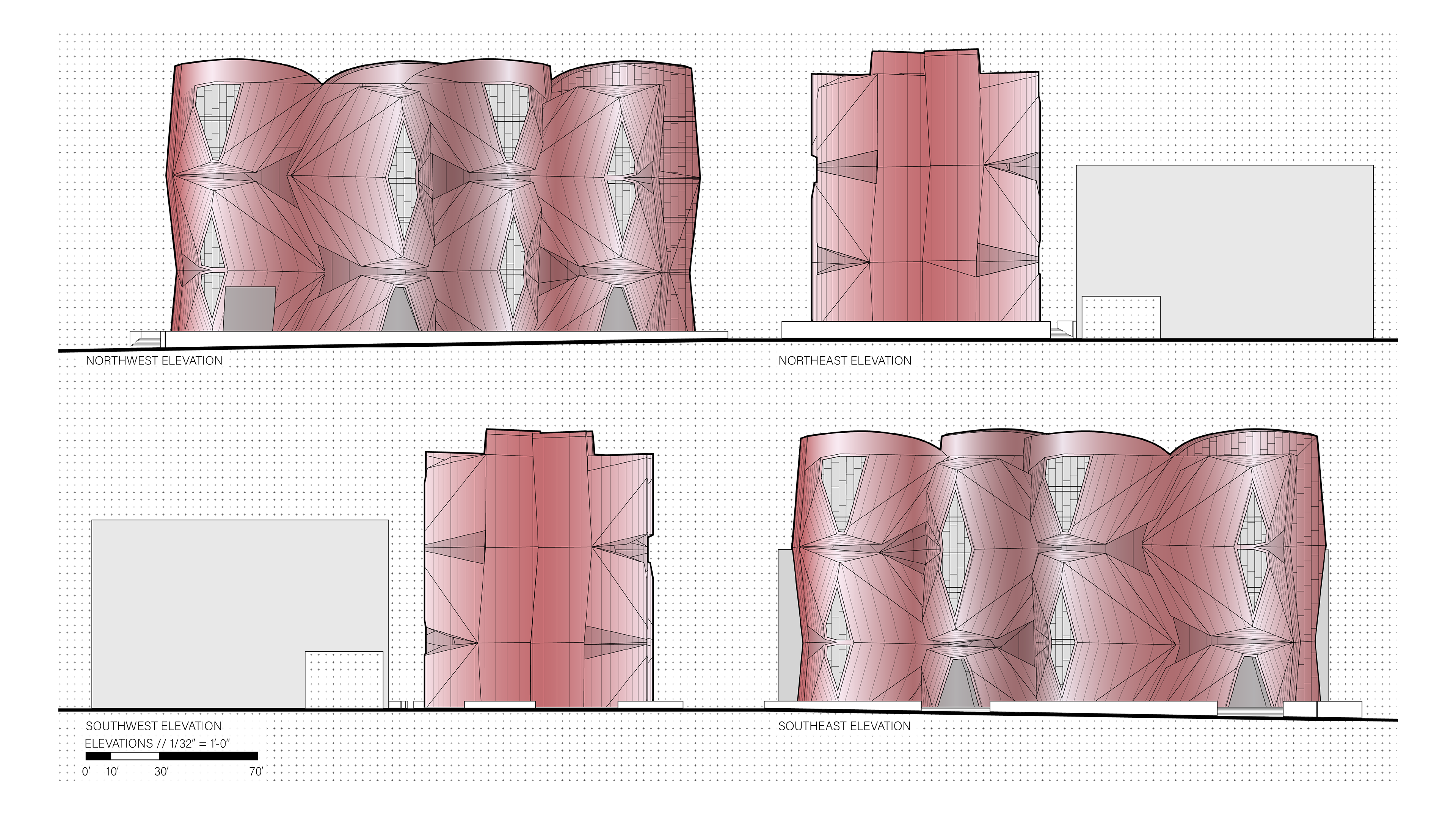
Hello, my name is Rebekah Bryan and this past year I have been designing and developing a Horror Movie Museum located in downtown Dallas. It is seated on an existing parking lot adjacent to the Perot Museum and the Dallas World Aquarium. It is technically part of the West End Historic District, but it is in alignment with Flora Street, which hosts numerous projects of the Dallas Arts District. This project also includes a two screen movie theater that can act independently of the museum. The theater allows the opportunity not only for local movie premiers, but also for access to niche horror movies and fun date nights.
Similar to how the genre of horror has changed through time as society evolves, so has the concept of the museum. Museums have evolved from their origin as a place of study and research and into a new type of public space; something to be experienced. The primary focus of this final study project is to discover what ‘museum’ means in the 21st century, while considering what fear can be architecturally. The main research surrounding this project has been how the museum experience has changed and what it can become in the future, what is architectural horror, and how unease can be introduced to museum visitors architecturally.
There was an abundance of architectural precedents for all parts of the project, including but not limited to, program, concept, form, exteriors, interiors, stairs, technology, parking, horror, and materials. There is a long list of architectural works that were used to guide the project, as well as works that influenced what would not be included in the project. Although in the museum typology, this is not considered a traditional museum project. This project took inspiration from the 2013 book horror in architecture by Joshua Comaroff and Ong Ker-Shing.
Within the book, Comaroff and Ker-Shing explore connections of horror tropes in horror movies directly to architectural concepts and physical works. In the original book there were 9 distinct tropes, or typologies, with four more being added in the 2024 edition of the book. These typologies were used as a foundation for the Horrified project and as a guidance for many design decisions. The sublime, or “the strongest emotion which the mind is capable of feeling,” was not a typology, but a present theme throughout the book. While there were more subtle uses of many of the 13 typologies, two played a large part in the building's design.
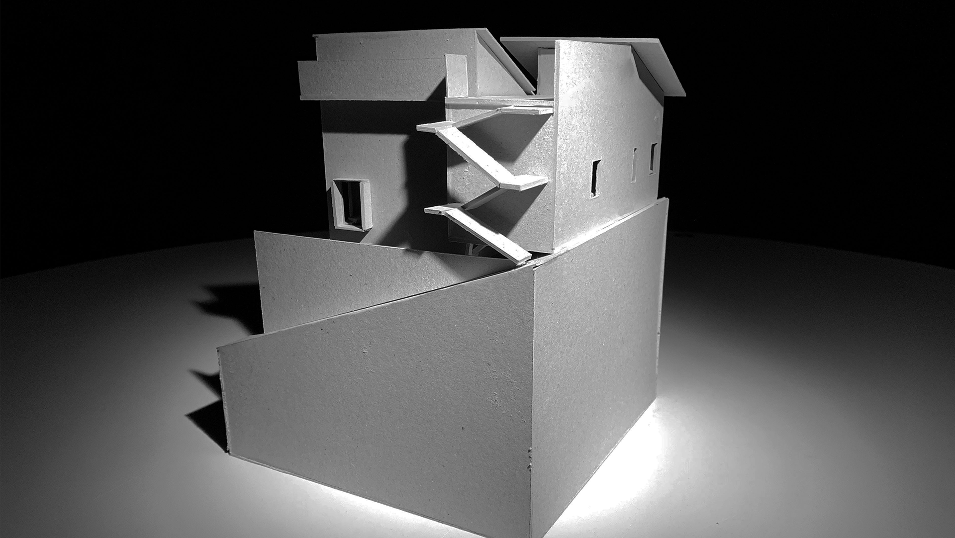
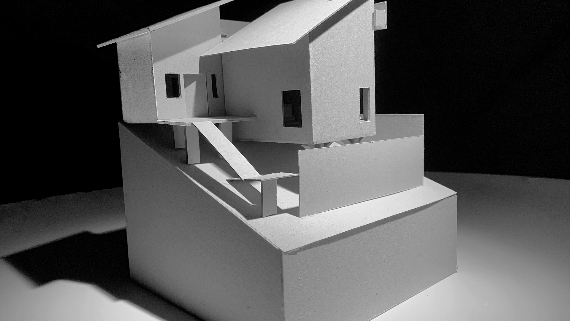
The Trojan Horse was the initial concept used throughout the entire design process. As explained in the book, the trojan horse is “a dissociation or rift that occurs between the contents of a building and its expression.” While my idea of what I considered to be the buildings Trojan Horse changed, the idea remained. In its final form, I see the Trojan Horse being more theoretical as described in the book, with the dissociation occurring between the orthogonal form of the prism and not only the very obvious skin, but the content inside as well. It is fascinating to see such a clean form contain the messiest of the genres.
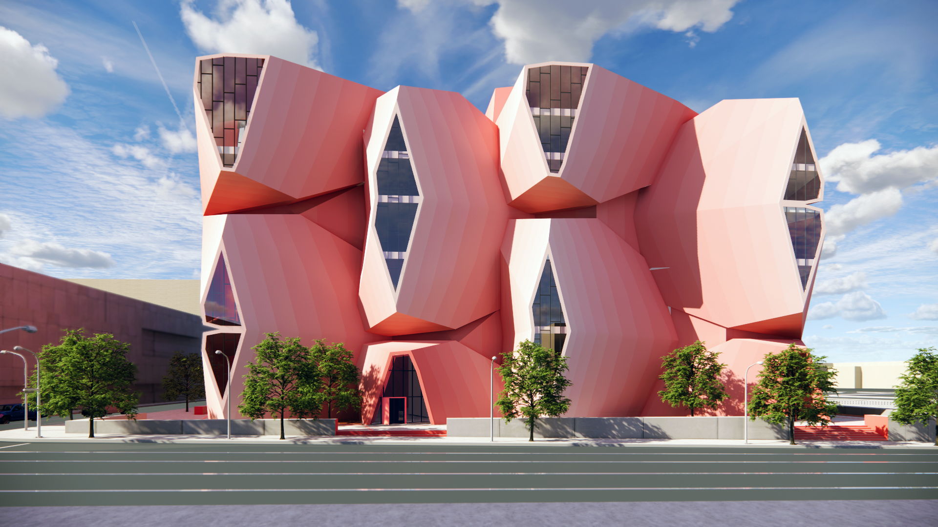
The other, more obvious typology from the horror in architecture book is the blob. There is the more obvious, literal blob, as well as the blob in terms of the disorganization of programmed space, usually in a megastructure. In the case of this project, only the literal blob was used. The idea of the blob in this project was originally inspired by the works of Frank Gehry, specifically the Lewis House. I took this inspiration of form and used it to design an inflatable skin facade as part of an art and architectural history class that I was enrolled in. Once I created my initial design, I could not get it out of my head and implemented it in the final project, although without the inflatable aspect. It turns out, the idea of the blob architecturally was actually a product of inflatable structure experiments from the 1970s, creating a tie back to this project and proving to me that it was meant to be. The blob as a skin evolved from being a piece added on to the building, into something completely engulfing the prism and emerging into the parts of the building.
There is a large mix of literal and more figurative reflections of horror throughout the building. This spiral staircase was inspired by the staircase in Barozzi Veiga’s Szczecin Philharmonic Hall, but the ImageWall metal panels by Zahner actually display the pattern of the carpet from the Shining. More literal designs would be the red concrete of the circulation elements as well as the entrances, while another figurative design element would be the exterior metal panels. These panels, also by Zahner, are a solanum steel, meant to reflect the abandonment and decay of the traditional Victorian house.
Also by Zahner are the metal panels of the skin. The skin is developed around the ZEPPS system, produced by Zahner and invented specially for the exterior facade of Frank Gehry’s Experience Music Project in Seattle. This building happens to now be called the Museum of Pop Culture, and is the inspiration for this entire project, as it is the host of a horror movie exhibit entitled “scared to death”. Behind the skin are the metal panels of the prism. On two facades, these metal panels are actually screens with the ability to display ads and other interactive elements.
Technology is a big part of societal evolution, and its inclusion in this museum is vital. It is included outside through the screen panels, as well as inside through the use of speakers playing spooky noises, and the elevators displaying frightening images or even, a fake drop of the floor. Inside and out, the museum is an experience, heavy on immersion and advancement. My research has delved into the evolving museum experience, the potential trajectory of museums in the future, the essence of architectural horror, and the methods through which architectural elements can evoke unease among museum visitors. Thank you.


