ARCH 406
SPRING 2021
PROF. SHAWN LUTZ
ARCHITECTURAL DESIGN V
SPRING 2021
PROF. SHAWN LUTZ
ARCHITECTURAL DESIGN V
SITE LOCATION: Houston, Texas
SITE ASPECTS: Houston Ballet Parking Lot
PROGRAM: Ballet Extension | Museum
TYPE: Partner Project | Hunter Sliva
SEMESTER: Spring 2021 | 6th
FROM THE PROFESSOR:
“Houston is the city setup for the imaginary, with it’s minimal restrictions of Zoning requirements including no FAR. A formula seeking adventurous structures. No zoning is also responsible for non-consistent city development with pockets of inefficient, under utilized, and less fulfillment within a city’s center. Counter to lack of regulation the economic woes have high and low points of values. Historically growth and inexpensive opportunities forged one of the most diverse cities in the nation.
This project site shares a city block with the Houston Ballet Company and outermost edge of the theater district in downtown Houston. Uniquely located at a threshold of entrances into downtown from I-10, I-45, this site will be the first visible structure and currently used as a surface parking lot. Located within downtown bound by dense urban life of all types;theatre events, office, retail, nightlife, restaurants, church, daycare, multifamily housing, and municipal structures. This location is only a few blocks from light rail stops and connectivity to the larger framework of the mass transit system and thus the broader city and global.
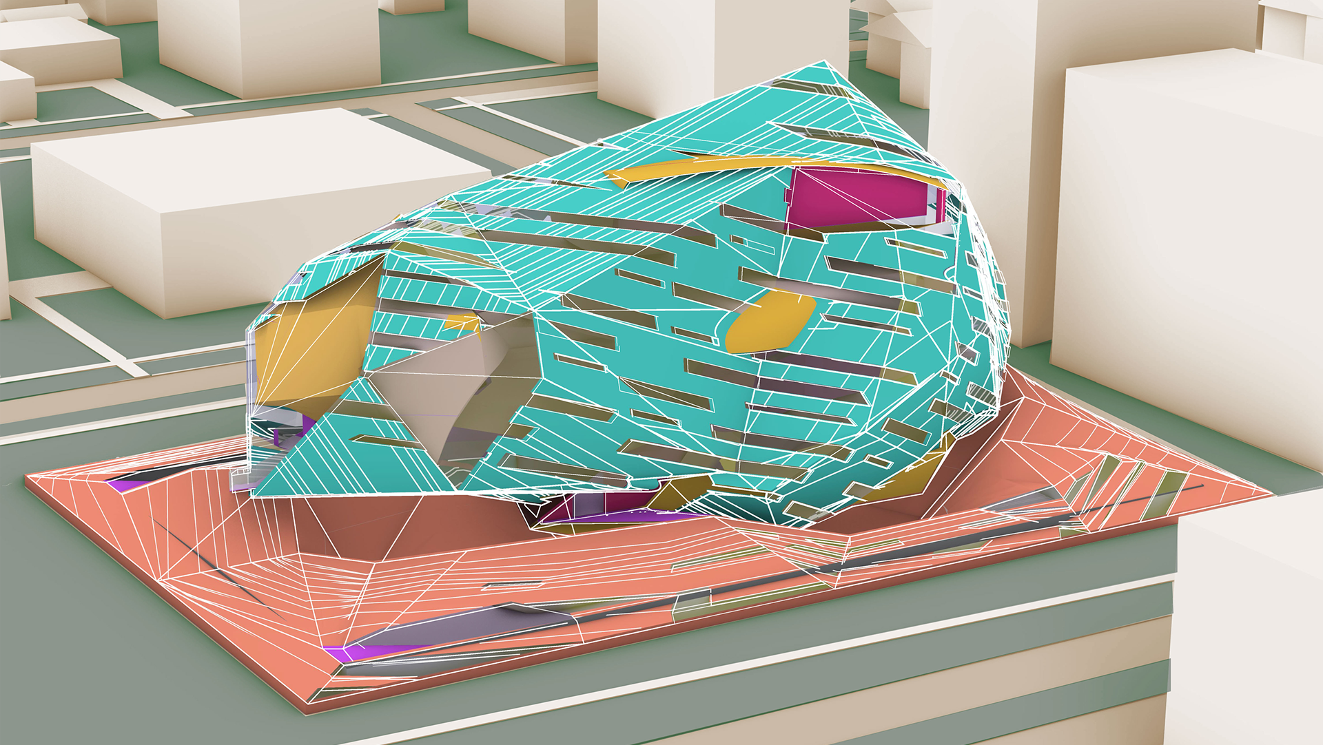
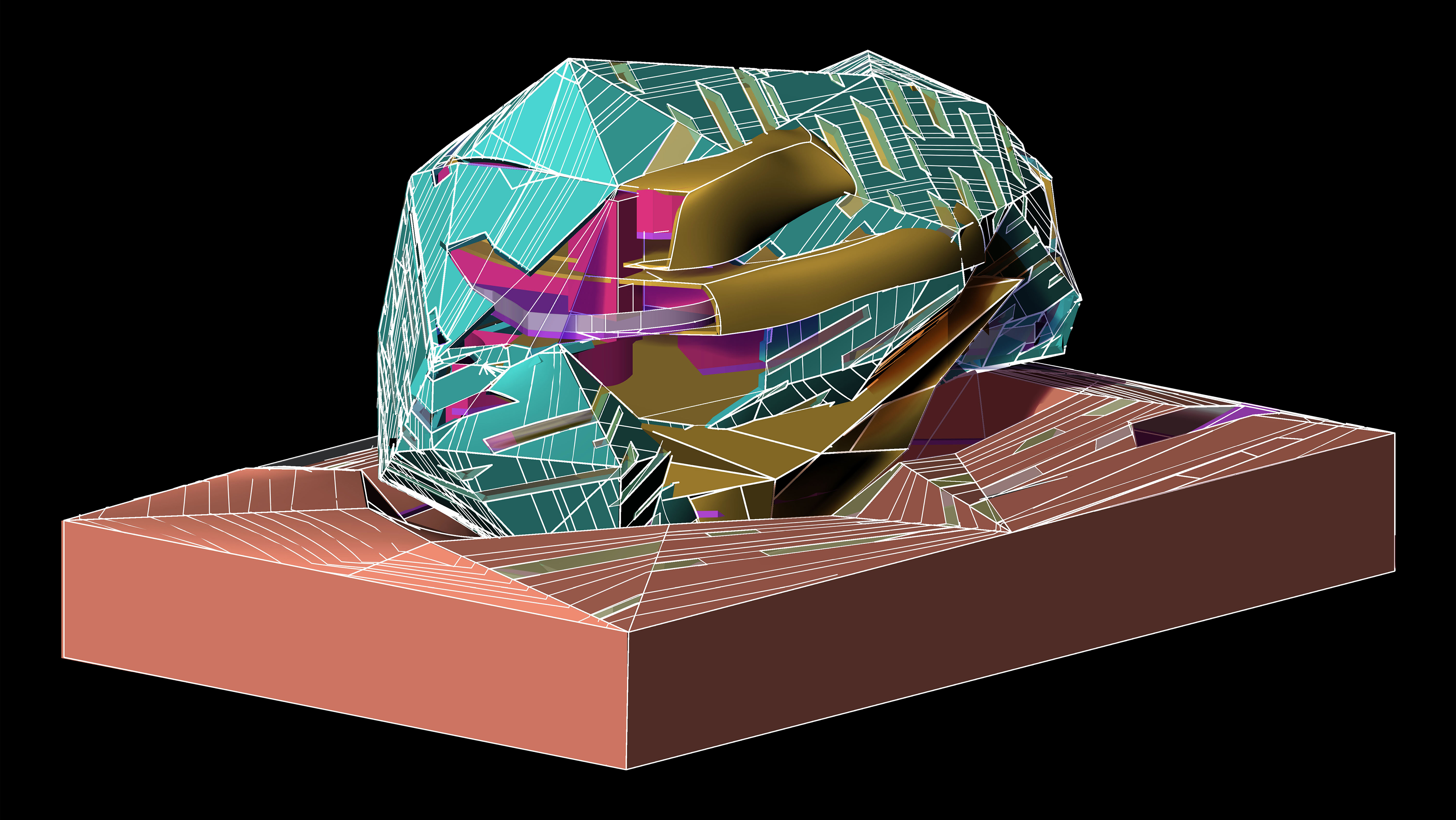
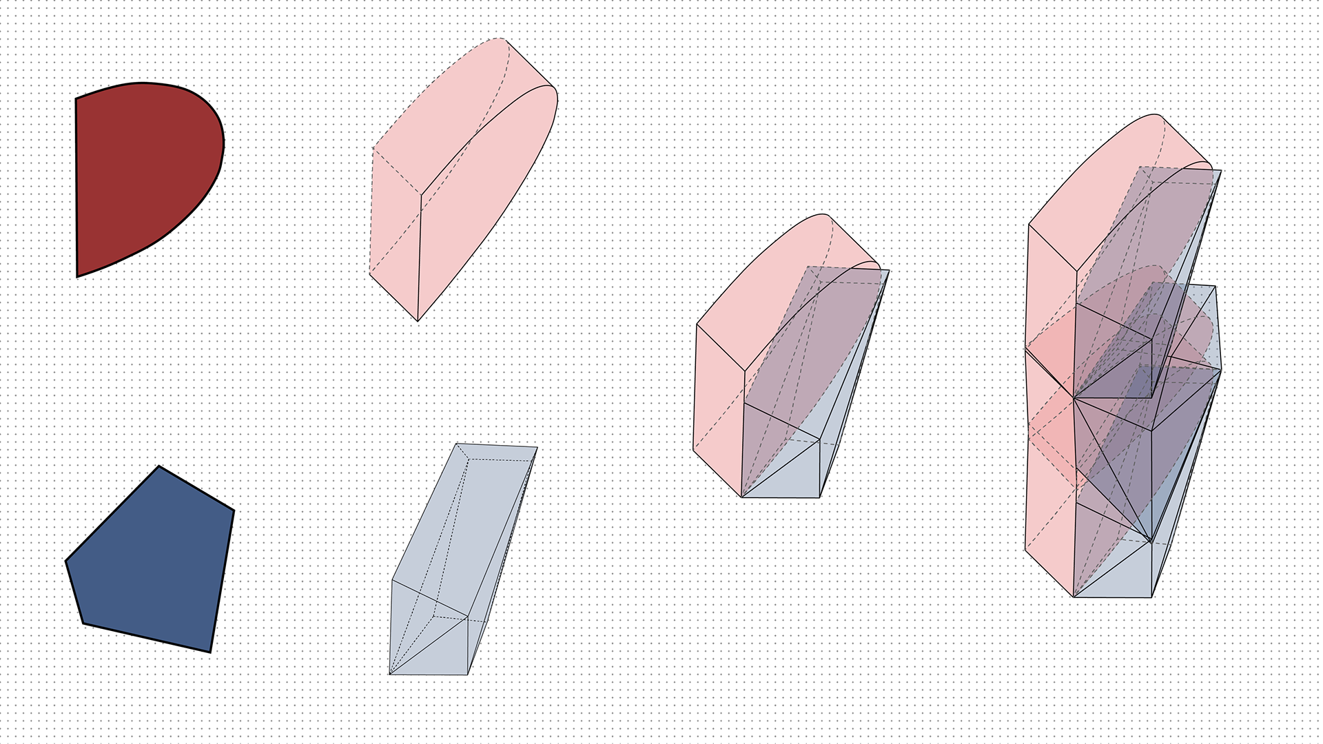
We will start by looking at simple shapes duplicated and/or justified by other shapes to discover the new graphic vessel. Strictly looking at the boolean operations, we will find the new definitions of the architectural edge and corner condition that informs urban space.
In pairs of two, students will address a singular project on a 30,000sf site while only operating on a maximum of 60% build-able surface area. This stems from encouragement of a public engagement with an idea of figural autonomy. Thus asking students to negotiate space within their surroundings, with 50,000sf of program. An underlined theme will take on the charged void, publicly consider, while strictly using solid modeling tactics during the beginning phase. We will design on the premise to an phenomenological and graphic project.”
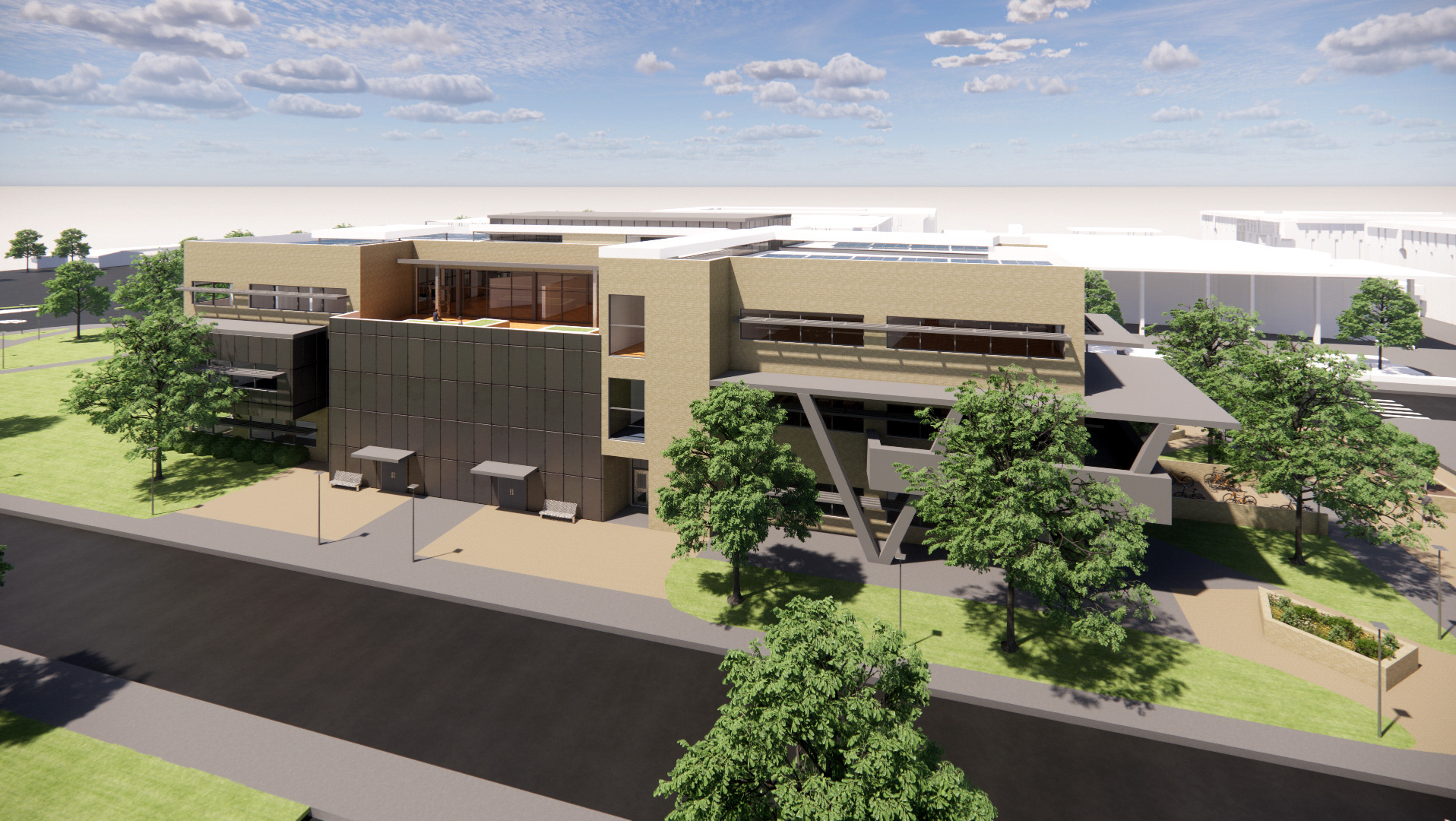
RENDER
FORM GENERATION
CLIPPING OF FORM

SITE PLAN
GROUND FLOOR PLAN
SECOND FLOOR PLAN | MUSEUM LEVEL

THIRD FLOOR PLAN | MUSEUM LEVEL

FOURTH FLOOR PLAN | ADMIN. + CLASSROOM LEVEL
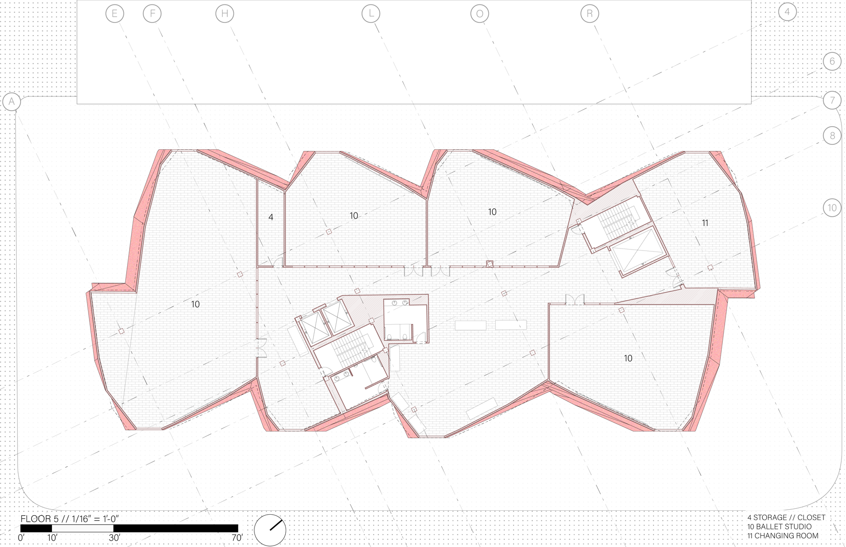
FIFTH FLOOR PLAN | BALLET LEVEL
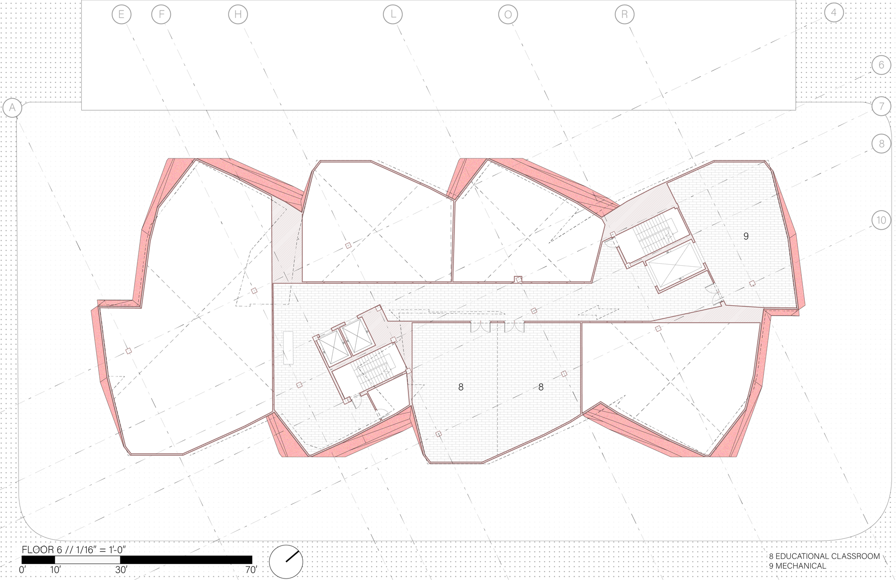
SIXTH FLOOR PLAN | BALLET LEVEL

ELEVATIONS
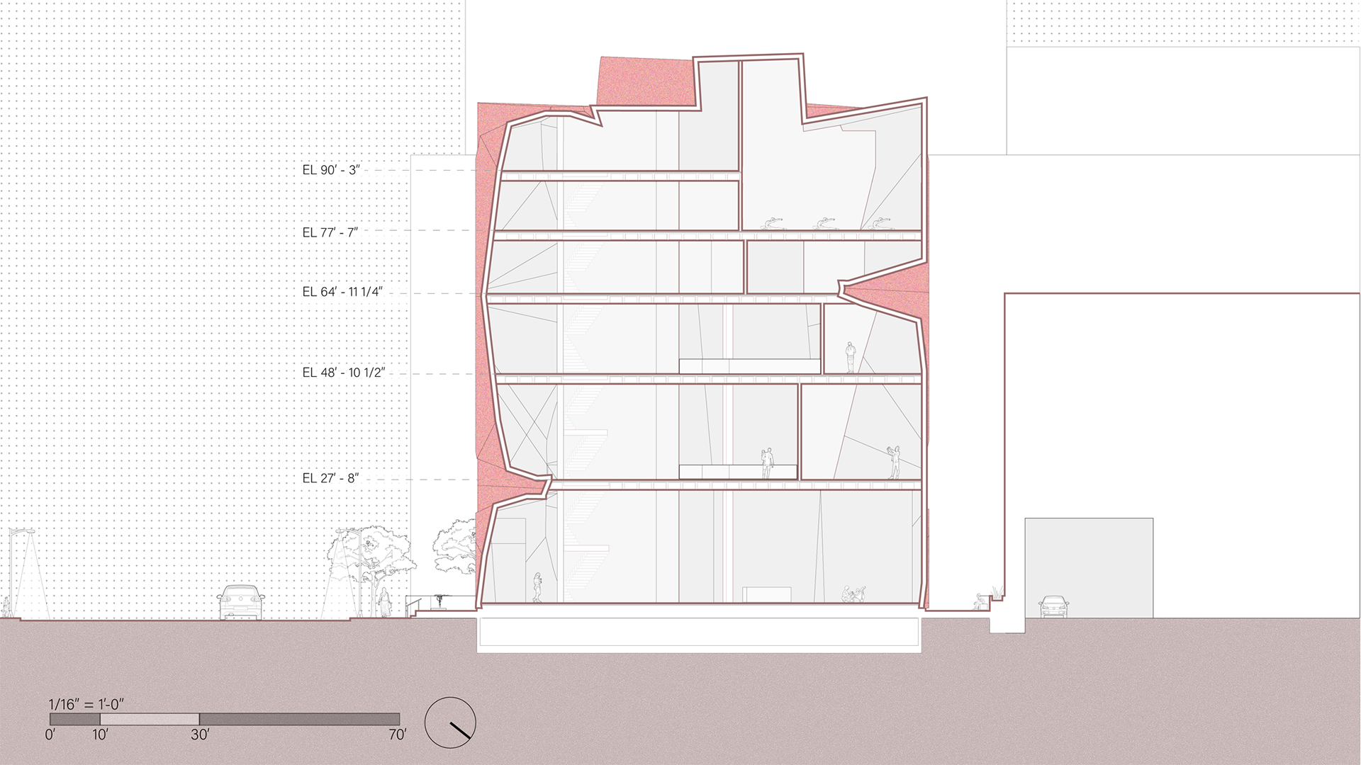
TRANSVERSE SECTION
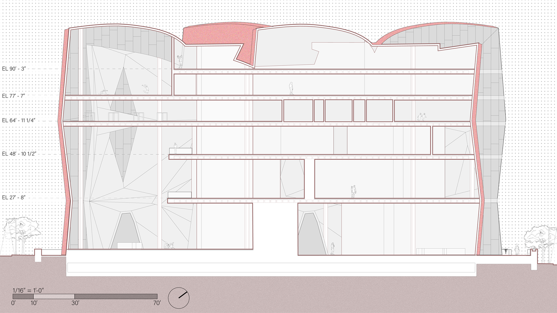
LONGITUDINAL SECTION
RENDER
RENDER
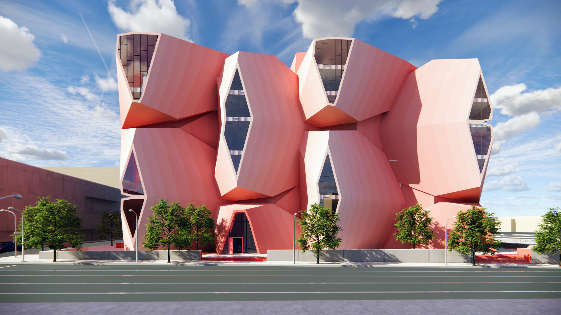
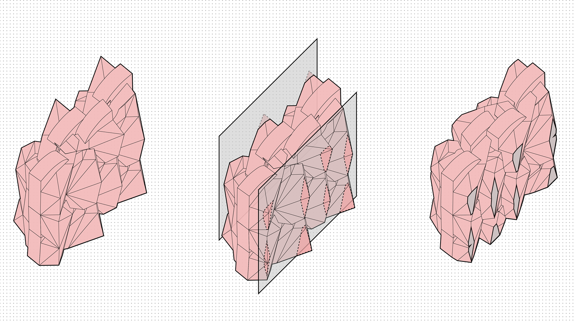
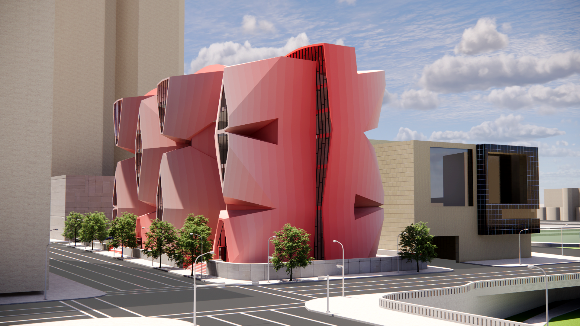
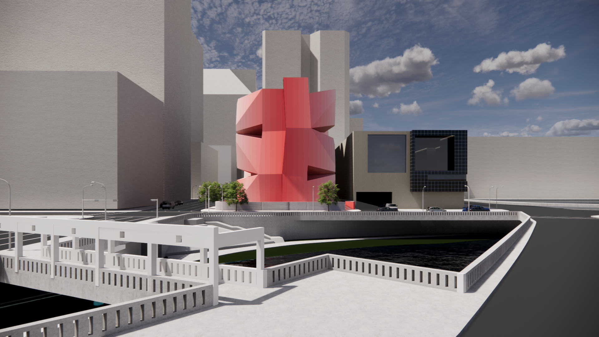
As a studio, we began by looking at simple shapes duplicated and transformed by other shapes in order to reveal our graphic narratives. As a team, we focused on Boolean operations and found a condition which gave us our solids, voids, edges, and corners. Procedurally, we looked at graphic shapes made by graphic artist Ellsworth Kelly and through many iterations, chose two. We extruded them both and performed different variations of them together to make our module. This was then stacked three times, duplicated in a series, and mirrored to create the final project. As a final Boolean operation, we took the model and used two vertical planes to split the outermost extreme corners on the modules creating our windows. After these operations were completed, we took both mirrored sides and slid them along their axis of symmetry.
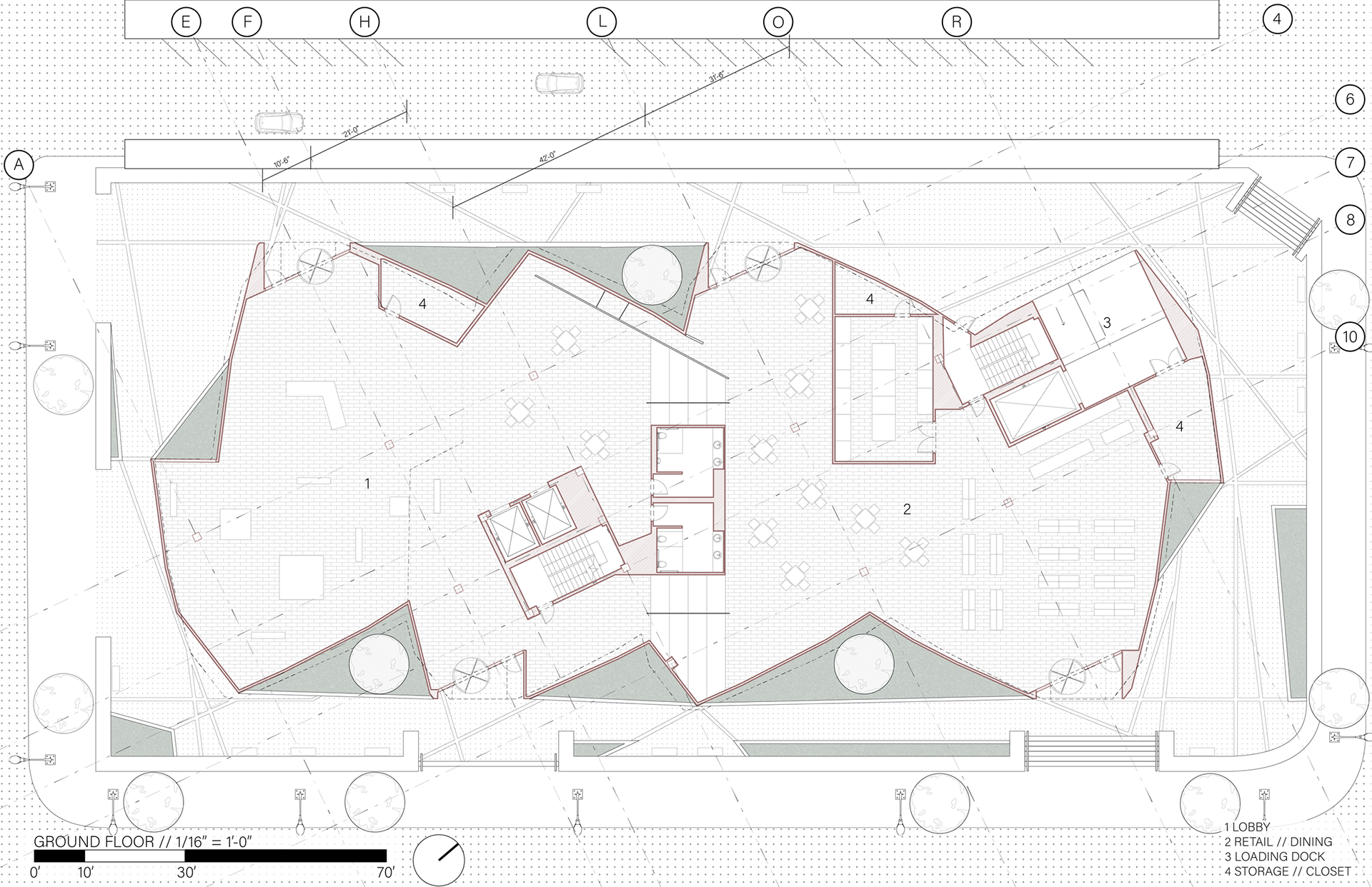
Our plaza has lines built into the hardscape which are extensions of the buildings faceted walls. Raised planters are spread throughout the plaza near the retaining walls and the building itself that were also shaped by the ground lines and building walls. The planters near the building help justify raising the project form for its foundation and structure. We gave the entire site a concrete base to level the height of the space with the street, with staircases at entrances and important points along the edges of the building. The difference in height from the slope of the site is four feet.
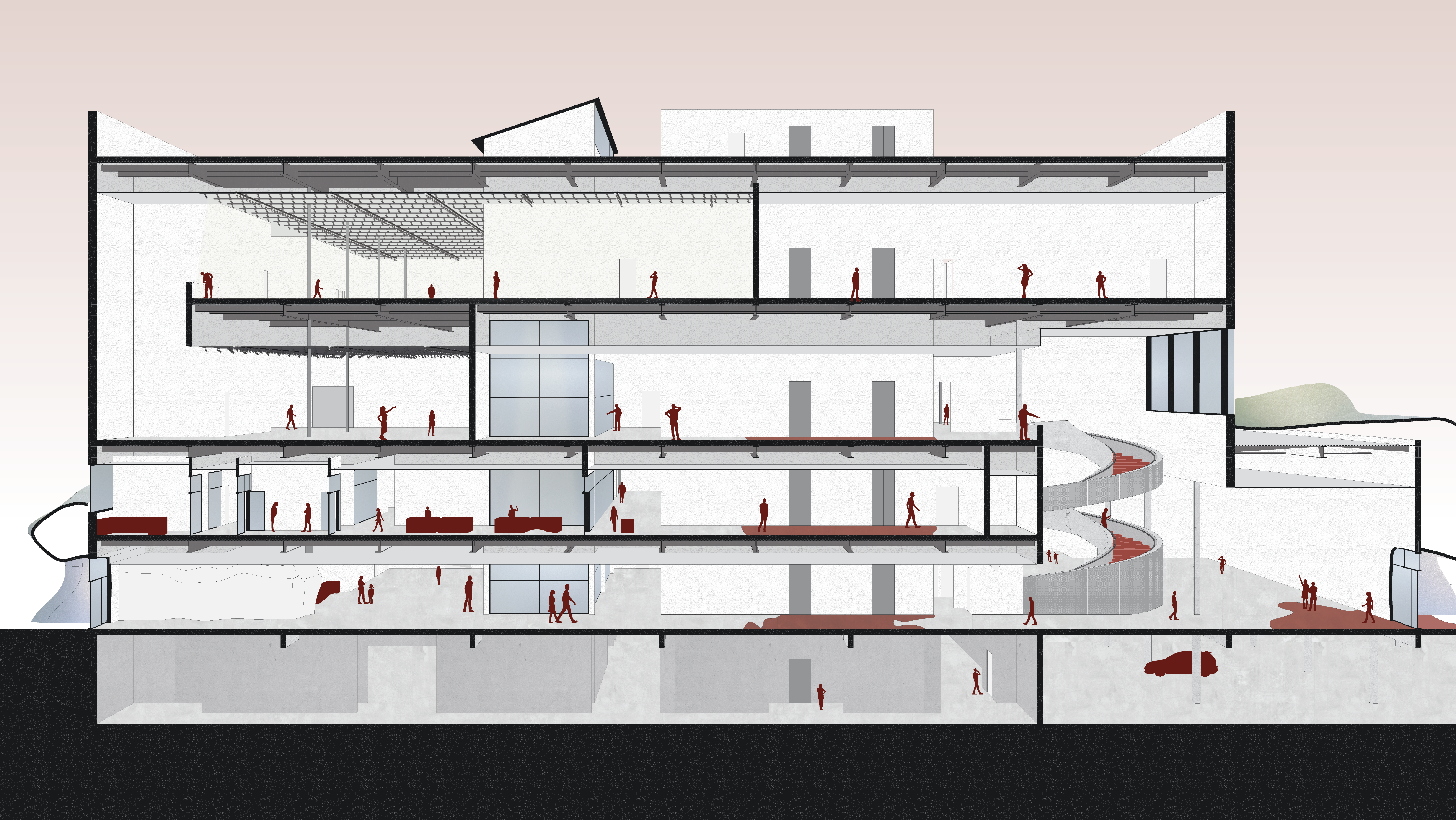
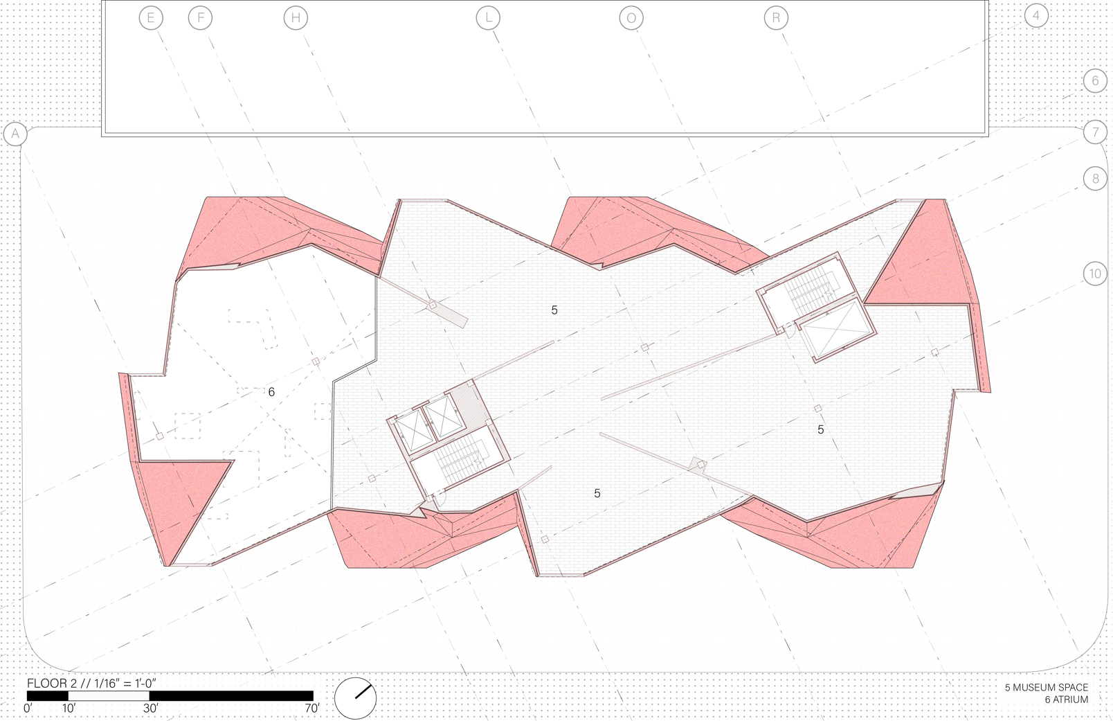
On the ground floor is the lobby which contains a triple-height space above, and a split with a few stairs near the center of the space space to separate the two. This program and the rest of the building are serviced by four entrances. These are placed within the previously mentioned clipped corners with two facing the existing ballet building and the other two facing the street parallel to the ballet. The second and third floor both both have the triple-height atrium voided above looking out onto the lobby. The rotated modules visible on the exterior tilt inwards toward the midline present rotated datums on which we placed our walls. The cores contain stairs and elevators and are also based upon the diagonals provided by extending lines from the exterior shell. Our structural columns are based on the same diagonals as the core with 10.5 foot square bays. We have waffle slabs between each floor and a mat slab foundation.
In the elevation drawing, the charged void between the existing Houston Ballet and our project building is shown. The undulating facets of the shell are in tension with the flat wall of the Ballet.
